 |
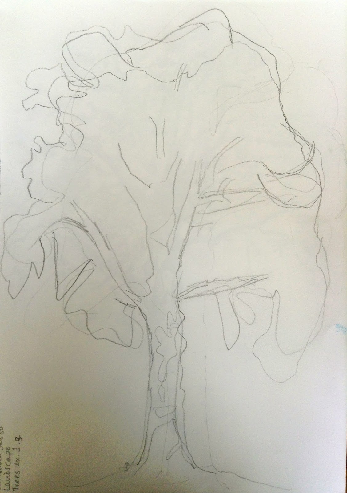
| Basic shapes in outline or shaded areas of foliage |
Exercise 1 Sketching individual trees
I picked a tree which was a little separate from the others, and that I could sit far enough away to see the whole thing (and be in the sun!). I was mindful of needing to sketch in a freer way after the exercises and effects in the previous stage, and in the later stages of using several pencils or other utensils to get a wider range of tone.
These exercises were simple and worked wonderfully to help me grasp the structure of the tree.
I learned that breaking it up into simple parts really works. I was pleased with how easy it seemed to draw the tree approaching it in this way.
Exercise 2 Larger observational study of an individual tree
I picked a small tree which was still next to the support it had when it was a sapling. I picked this one because I love oak trees, it had an acorn despite being so young and because the contrast of the trunk and the post was interesting. I wanted to show this contrast, and the shapes of the oak leaves in the sun in some detail so I picked a fine pen to draw it.
I started well but as has happened before I got caught up in the tiny details at the expense of the whole image. The result was that again I lost the full degree of contrast in the shapes and the final image is less defined than I would like. Also I'm thinking that I should have done the whole little tree rather than a chunk of its trunk. I often avoid doing the whole of something, perhaps because of worry about what I will do in the rest of the paper - how to sketch in the background?
I had taken a rug and initially enjoyed sitting there in the open air on a warm day. I got up and stretched every now and then. After an hour and a half of this one drawing, my back was hurting too much from sitting on the ground and I had to give up. Time to admit that I need to take an easel with me, however cumbersome that might be.
Exercise 3 Study of several trees
I went to the woods near me intending to climb to the top of the hill in the hope that there would be a view down onto trees, like the Greenwich Park view in the course file for this exercise.
As I walked towards it I saw a view I thought might work, and did some composition sketches.
I decided I wanted a view with more interest for me, so carried on to the high ground.
When I got there what drew me was the tunnel of trees bending over the path, with light at the top and lovely enclosed darkness at the bottom, with pale leaves providing detail. I searched around for a while for the right place to put myself where I would be able to see these, and settled down to sketch it.
I did a couple of composition sketches to work out which parts to include and what to leave out. I used a viewfinder to help with this, and the tall thin shape worked best to include both the path and the lightness of the sky while making the tunnel effect over the path the emphasis of the drawing. Having some branches in the foreground would frame it nicely.
My first try was not working too well. I had got bogged down in the detail again, and forgotten the tone, which is supposed to be the main point of this sketch, so I started again.
Well, I'm not so pleased with this. It took me a lot of tries to get the tone approximately right. I found it very hard to do approximate large tonal areas. It was as if I couldn't believe that I could leave out the detail and it would still look like trees. But there you are, it looks better now I've got closer to what I was aiming for. I think I might go back at some point and try again.
I definitely need to work out how to look at something and see the tones 'independently' of the details.
I picked a tree which was a little separate from the others, and that I could sit far enough away to see the whole thing (and be in the sun!). I was mindful of needing to sketch in a freer way after the exercises and effects in the previous stage, and in the later stages of using several pencils or other utensils to get a wider range of tone.
 |
| Simple outline with main branches added |
 |
| Simple outline |
 |
| Shaded areas and texture of foliage |
These exercises were simple and worked wonderfully to help me grasp the structure of the tree.
I learned that breaking it up into simple parts really works. I was pleased with how easy it seemed to draw the tree approaching it in this way.
Exercise 2 Larger observational study of an individual tree
I picked a small tree which was still next to the support it had when it was a sapling. I picked this one because I love oak trees, it had an acorn despite being so young and because the contrast of the trunk and the post was interesting. I wanted to show this contrast, and the shapes of the oak leaves in the sun in some detail so I picked a fine pen to draw it.
I started well but as has happened before I got caught up in the tiny details at the expense of the whole image. The result was that again I lost the full degree of contrast in the shapes and the final image is less defined than I would like. Also I'm thinking that I should have done the whole little tree rather than a chunk of its trunk. I often avoid doing the whole of something, perhaps because of worry about what I will do in the rest of the paper - how to sketch in the background?
 |
| Observational study of an individual tree |
I had taken a rug and initially enjoyed sitting there in the open air on a warm day. I got up and stretched every now and then. After an hour and a half of this one drawing, my back was hurting too much from sitting on the ground and I had to give up. Time to admit that I need to take an easel with me, however cumbersome that might be.
Exercise 3 Study of several trees
I went to the woods near me intending to climb to the top of the hill in the hope that there would be a view down onto trees, like the Greenwich Park view in the course file for this exercise.
As I walked towards it I saw a view I thought might work, and did some composition sketches.
 |
| Sketches of some groups of trees to work out what to draw for this exercise |
I decided I wanted a view with more interest for me, so carried on to the high ground.
When I got there what drew me was the tunnel of trees bending over the path, with light at the top and lovely enclosed darkness at the bottom, with pale leaves providing detail. I searched around for a while for the right place to put myself where I would be able to see these, and settled down to sketch it.
I did a couple of composition sketches to work out which parts to include and what to leave out. I used a viewfinder to help with this, and the tall thin shape worked best to include both the path and the lightness of the sky while making the tunnel effect over the path the emphasis of the drawing. Having some branches in the foreground would frame it nicely.
 |
| Abandoned first attempt |
My first try was not working too well. I had got bogged down in the detail again, and forgotten the tone, which is supposed to be the main point of this sketch, so I started again.
 |
| Study of several trees in pencil on white paper |
Well, I'm not so pleased with this. It took me a lot of tries to get the tone approximately right. I found it very hard to do approximate large tonal areas. It was as if I couldn't believe that I could leave out the detail and it would still look like trees. But there you are, it looks better now I've got closer to what I was aiming for. I think I might go back at some point and try again.
I definitely need to work out how to look at something and see the tones 'independently' of the details.


