Monday 28 April 2014

Stage 2: Working with translucent fabrics


The most obvious thing to do with translucent fabric is to make patterns using different numbers of layers of it.

I had kept some filmy grey fabric that had been used as a luxurious wrapping for a bunch of flowers for mother's day. I don't know what it's made of but it has an unusually crisp texture for something almost transparent.

I cut circles in it and overlaid them, holding them up to the light.

 At this first stage, i was using tape to keep the circles attached, which adds it's own shadow to the image.

The illusion of texture is interesting, like wood or water, from the reflective qualities of the fabric.


The darker line down the left hand side is the edge of the building outside the window.

The deepest shadow is where the fabric circle folded on itself.

The lightest arcs are where the holes overlap. Against the light like this you can't tell which are holes and which are fabric other than by the lack of texture in the holes.

Not sure how I can use this.

I used silver grey fabric this time. I wondered how it would work with very white lacy fabric.


This is what it looked like against white.
 Some hint of texture and lines, but not much interest or contrast.


And here against the window onto my garden. The detail's clear. the colour is slightly less white but there's enough light  coming through.

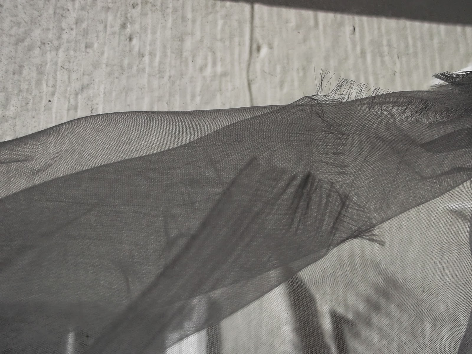
I then tried distorting it with heat.


Difficult to get the distortion without breaking the fabric altogether (hence the holes.

The swirliness of the distortions is appealing.
Not very controllable - would take a lot of practice.
Interesting the way three dimensions show in the variations of shadow.


This takes away the clean flatness, but replaces it with hills and valleys.


Putting it against white background again, the whole thing looks darker, and the hills and valleys are less pretty and more dark and menacing.
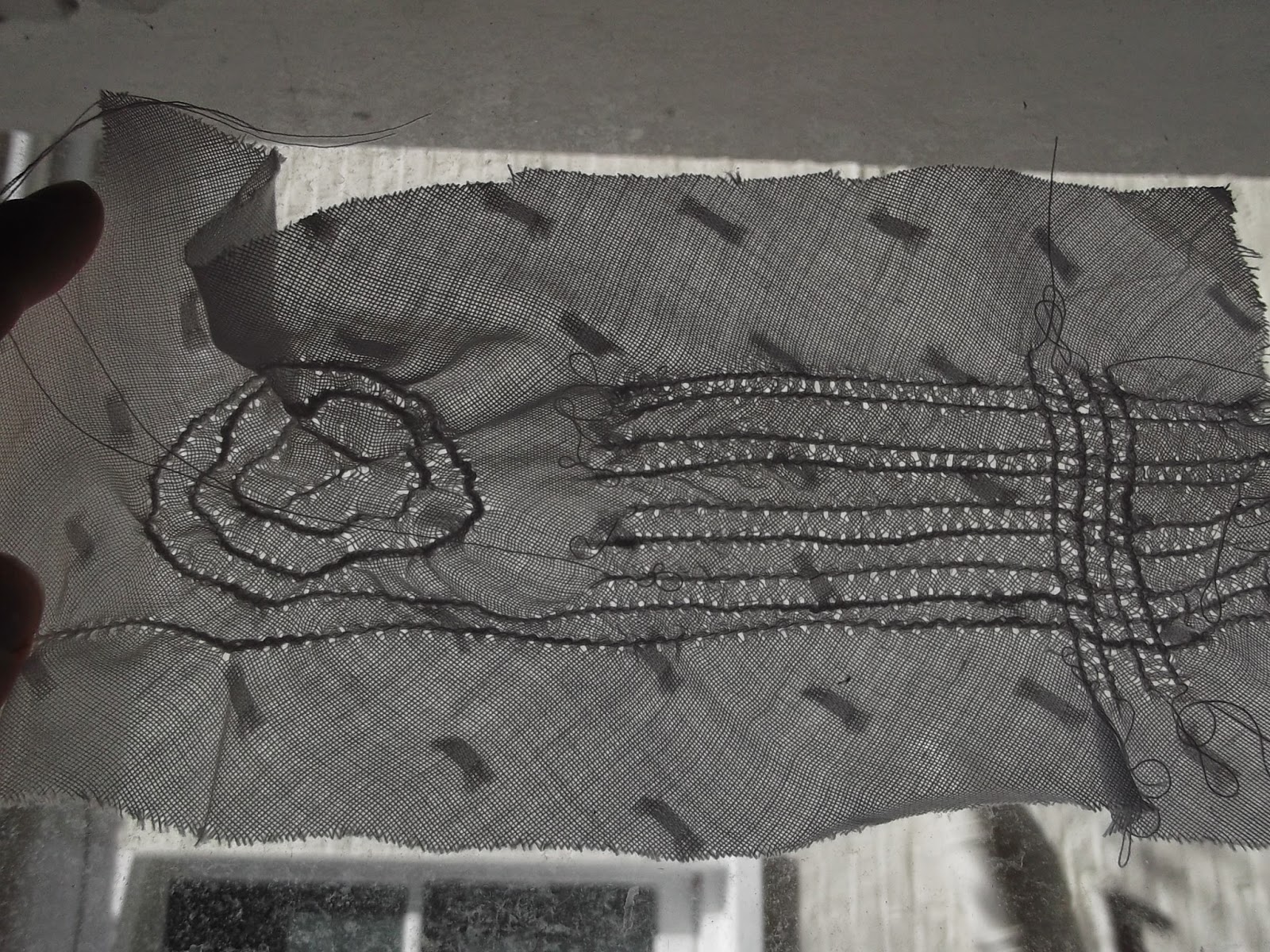


Trying variations:


I fixed two layers together by ironing a strip of hem fix along the middle. This gives a slight dardening of the shadow, and an interesting texture.

The photo looks out of focus (or more out of focus than it actually is) because of the irregular reflectiveness of the fabric, and the staggered holes.


This was made the same way, but using circles of less translucent fabric to contrast with the grey.
Light shining from the front.


Light shining from behind, with a background of decking. The light coming from behind reveals the lacyness of the bottom circle, which is not visible at all when lit from in front (above). And the overlaps of the lower circles also. But the upper circles don't really show so sharply at all at this intensity of light.

You can see how much diffusion of light there is from the fabric itself by the waves at  the top right hand corner.

It would be good to be able to capture that in some way.

Also there is a question in my mind about whether you could make use of the difference of appearance in different light intensitites. Good for a window dressing or lampshade perhaps?


Using shadows and translucent fabrics:
I have used silk painting in the past, and wondered whether the gutta you use to contain the silk paint would increase the amount of light going through the silk. And whether you could get a stained glass effect by shining light through painted silk.

I had also been looking at the way the twilight sky glows behind trees along the road, and wondered if I could somehow capture that contrast between the dark dark trees, and the glowing colours.


As you can see I wasn't at all successful in that!

But when I shone a light through it,
the shadow image was sharp and clear,
and alsmot completely colourless!

Finally, I came round to working with bondaweb. I wasn't sure what image to pick, so I went to my reflection photos, and cropped off one pane of a window reflection which looked promising.


 The aspects of this image I like, and was hoping to capture, are the subtle colours, including the odd colour of the background; the double images that I assume come from light reflecting off both the front and the back of the glass; and the loopy lines.

This photo doesn't really do justice to the glowingness of the light in real life, and I was hoping to increase that too - not asking much!

This is what it looked like when I had laid out a collage of fabric pieces, and yarns on the pale pink base fabric.

You can see some unspun wool and some cut outs of green organza to give the subtle colour changes to the background.

I wanted the whole thing to be translucent, like the window, so used fabrics which did not block the light completely.

I tested out all the colours against the top yellow layer to ensure that the combined colours would end up more subtle and bright.

This is what it looks like with yellow organza ironed onto the front of it.

The bondaweb for this one was in a whole sheet the size of the sample, so that the whole thing has a similar texture to it.

I'm pleased (and surprised) with how well it turned out, and produced most of the effects I wanted from it. It could be a bit more 'mysterious' in the background, rather than bright, and there were some technical difficulties getting the yarn to lie parallel to itself (but these could be overcome). It has more of a sweeping looping look to it than the pattern on the window, and I like that.

Saturday 26 April 2014

Stage 2: Printing onto organza

I am ashamed to say that while I originally got this fantastic
image from Google images, I have been unable to
find it again and therefore track down who took it.
I will keep trying and give them their due when I find it.

I haven't tried this before so I bought a few sheets of the one recommended in  the course notes called ExtravOrganza by Jacquard. I wanted an image with dark and light areas so I could see how that worked, and I thought I might want to layer some netting over it so I chose the strong image above.

I printed it on A4 paper first, and then onto the paper-backed fabric as instructed. It came out almost identical on the fabric. It says to leave it 24 hours so I did.

What I did with it next should carry a bit of a GROSS-OUT WARNING.

I have been thinking, from my interest in the textures and colours of skin, that it would be amazing to print a skin photograph onto fabric like this and then make clothes with it.

What would be the point of that? Well, not much, except if you make it mean something. Like a comment on how we cover ourselves in order to con other people into seeing us as a different shape. Or a different race, perhaps. Or on how the physical bodies of women can represent something unspeakable about being female.

From following through this train of thought, I had this image in my head of a hole in a stomach. So I tried it with the printed organza...


Wednesday 16 April 2014

Reveal stage 1: trying out some fabrics against the light

I pulled together a bagful of translucent and semi-translucent fabric samples to experiment on. I started by trying them up against a light window, flat and folded, to see the effect.

All these fabrics are white, but show up grey against the light.


Muslin folds quite sharply so it may be possible to control the shadows more than with man-made fibres.
The weave gives a distinctive texture.

Polyester netting from around our Christmas tree.
The netting is nicely irregular.
More than one layer makes a darker colour.
The edges are frothy like sea foam.


Fine cotton with a pattern of knots.
The pattern of knots is regular so any folding of the fabric distorts it.
The woven texture is accentuated by the light shining through it.
More than one layer makes it darker.
(You can see next door's window at the bottom of this one)


Bubble wrap.
Again, the regular pattern is distorted when it isn't flat against the window, and brings variations in shadow and light.
The circles have their own individual patterns.


Folded muslin gives lots of control over the degree of shadow, and the top 4-layer fold is surprisingly dark.

The grain of the weave is attractive and irregular, and very directional.

This one is of a polyester fabric. The layers are more subtly different in tone from each other.


The fringe threads seem to be darker than they 'should' be when they overlap with each other.


This is mixed fibre ironed into box pleats.
Again there would be room to control this effect.
I like the way the edge is sharp and shapely.
The texture is again different - rather formal like upholstery.

This is white vest fabric folded on itself.
The folded part looks as if it's the shadow of the other part, and appears less regular.


I thought I would try some 'blackout' fabric with holes in it.
This is the result.
There is no texture to this fabric at all.
Interestingly, the fabric actually appears less dark than many of the others (especially the vest fabric).
The light holes are therefore less of a contrast than I expected.


So I tried making holes in a less opaque fabric using a sewing machine.

This is how it turned out.
Of course I used white thread, which looks black against the light, and contrasts with the rows of little white holes.

I think there might be some mileage in this idea....

Other interest from this one is the way the triangles array round gathered fabric. When we gather fabric in clothes or upholstery there is a sort of convention that we ignore these triangles. But what if I made a point of emphasising them?

This is what this piece of sewing looks like with the light in front of it. I think the next step is to experiment with dissolving fabric in the light of what I have learned today.


And finally, one with colour.
A piece of pongi silk with silk paints.
What I see is that all the colours are softer/greyer,
and that folds seem to make the colour more intense.
The place where it overlaps the window outside is interesting because it actually makes the window more interesting looking.
I'm guessing that overlapping different colours will have an additive effect, but that will have to wait until I have some more time.
As will printing photos onto organza...


Sunday 13 April 2014

Conceal/reveal images: Layers


This building on King's Road that I photographed for the 'manmade' part of the course, uses layers to conceal and reveal, and to add interest.

The gaps in the outer layer draw my eye in to the underlying layers. The green/salmon reflective sparkle on the lower parts of the solar panels increases this effectbby increasing the contrast with the smooth blue glass beneath.


This is a photo I took of a wrapped building on Southwark Bridge Road, reflected in an office building opposite.

The wrapping is to protect workers from falling builders debris, but has a similar effect on me as a person wearing a veil - mysterious and uncertain whether to be curious or feel cheated in some way


The little photo shows it as more monumental and imposing, as if the sheets are keeping whole swathes of people out of somewhere.


This is a barrier in the British Museum, which has clearly been designed to prevent visitors from seeing through, but has been made interesting in itself by making it out of layers of different opacity. What appeals is the way this combines the textures of glass and something softer behind, and allows some light and pattern.


The curling bark of this tree reveals the tree, and conceals the light behind it.

The fence below is on my way to work in Streatham.
I noticed the effect of perpective on it revealing less and less of the background train tracks as it recedes into the distance.

I wonder if this is something that I could use.


The photo below is of stained glass windows looking through Bethlem Hospital chapel.


I have included this one because it is my only stained glass photo, and the intention was to explore layers of stained glass, but it didn't work out the way I had hoped (partly because there was not enough light coming through).

Again, the things that appeal most are the texture from reflected leaves at the top, and distortions in the old glass below.


I have been seeing natural layering in plants, and wondering how best to illustrate this. Parts of plants shade other parts, or cast different colours onto them, and you can't always tell waht's going on behind.

I think this huge bit of lichen on the branch of an old apple tree gives you a good idea of what I mean. I love the strange shapes and the unexpected range of colours.

This photo is of another wrapped buding, this time with geometric shapes in different translucencies.

I really want to use something like this.


It reminds me of a work of textile art I saw in Ontario a couple of years ago....see below


I don't know who made this, as it was hanging on someones wall.


Fashion conceal and reveal
After doing this blog page, I looked through some fashion magazines for this year and made a collage of conceal and reveal layers in my sketchbook. For obvious reasons there was a great deal of use made of this idea by fashion designers. This year particularly, there seems to be more use of translucent fabrics in layers. And of course netting and other varieties of layering.

Saturday 12 April 2014

Reveal Stage 1: thread pulling

The next stage of the coursework is materials-led design exploring the effect of light and shade. Reading through this section I am keen to start, as this is an approach that tends to bring me lots of new ideas and have its own momentum.

Atton Conrade ecouture making gowns out if light photography.


Conceal/Reveal sketchbook work


I wanted to look at how translucent fabrics were, so I made this translucency wheel.

There were some surprises
- polyester is nearly as dense as curtain blackout fabric
- vest netting doesn't let through as much as I thought it would.
- the crinkles and folds in the thinner polythene sheets and parachute silk were emphasised by reflection rather than by the change in translucency.
- There was no as much emphasis of the textures of woven fabrics as I expected eg muslin


I tried pulling threads from a linen fabric, and holding it up against the window. I chose black because I expected it to enhance the contrast. In fact, it showed that just allowing light through can reveal interesting texture as well as the effect of folds and crumpled bits.

This is attractive, and reminds me of some vintage tablecloths etc.

It is limited by being restricted to straight lines, so it would be tricky to use it for 'shadowing' but could be used in several layers together.

This one shows me playing around with this technique a bit. The right rectangle is plain pulling, leaving no verticals. The middle one shows what happened when I tied sections with a thread along the middle. The left hand one I didn't tie them but painted the threads with PVA so they were stuck together a bit and fixed in those shapes. The left hand stripe was done by removing 2 threads and missing 2. The right hand one was alternate threads.

All of these produce different light effects, allowing different amounts of light through, and producing different patterns.


This shows early progress on the last thing I did during this session, which was to try layering, using a thin black fabric. And at the same time to try exceeding the limitations of straight lines by curving the cuts.

This thread counting and pulling took a long time. I'm not really a patient person, and tend to avoid doing slow things like this, but when I commit myself to it I often find that it lets my mind filter through possible ideas. This time, as on many other occasions, I ended up with a finished sample of layers, and a long list of new things to try.


This is what the sample looks like
against a window. 
This is more of a close-up of the
fabric layers. 


Following my tutor's suggestion that I work on my drawing, I have been working through the Light/.shade section of 
 'Drawing from the Right Side of the Brain' by Betty Edwards Harper Collins London 2008 edn. I am looking at how great artists have used rubbers, or crosshatching, to indicate light and shade in portraits, and this exercise above seems to be one way to 'crosshatch' with yarn. The different layers allow a wider range of shading than one layer on its own.

Close up, the crosshatching is what I see. Further away, the lightest shapes are the most visible, and the subtle variations in distance between the threads appears to indicate three dimensional shape. 

I am wondering what difference using white or transparent yarns would make to the effect. And whether I could use this technique to make an image like the 'woman's body is a jug' image from my last sketchbook. Or in fact, a portrait/ face. 


Friday 4 April 2014

Conceal/reveal images: Reflections

This is a photo I took in the courtyard of the British Museum, showing reflections of the geometric glass roof from distorted glass in the windows. In itself it only really has the distorted regular shape to recommend it, but could be the beginning of something.

This is a window reflection in Monks Orchard Road,
showing the effect of double glazing on reflections I think. As soon as I saw it I recognised
a thousand textile art cliches! But then, there's a reason why they are cliches (ie that they
are appealing and intriguing and immediately make you want to try it out). I think this
could be interesting as a starting point for this assignment, because it has reflections,
shadows, contrasts, and layers, and some colour interest.


This was reflected in a curved
glass door in Holborn

This puddle reflection has texture change, shape,
and movement. And strange spots of colour in
the tarmac. I like the small size of the puddle and flatness of the
background contrasting with the huge tree. 


This is not an unusual sight - changes in reflectiveness of the pond in my local park.
This is not unlike the image I chose to make a weaving of last year, in that there is subtle variation and regularity. 


This photo was taken in the same part, of reflections off the top rail of the railings, with raindrops falling.
It was surprising to me how sharp the reflected leaves are in this photo. It makes the blurring well contrasted.
Could the leaves be printed onto translucent fabric and then blurred with heat?