Monday 29 October 2012

Gustav Klimt

So, my questions about high art in a commercial world, and my sketchbook thoughts about ornament, how it is looked down on and that this may be relevant to the attitude of many to textile art, I am brought to finally investigate Gustav Klimt further.

Most of what I have found out is from
www.gustav-klimt.com
But also the virtual Gustav Klimt museum: Click here to go to the Klimt museum

He was born in 1862 in Vienna. He was the second of 7 children of a professional craftsman. He only got to the Art and Craft School because he won a scholarship. He was not therefore one of those gentleman artists who could explore their own truth without worrying about money. He worked as a specialist interior decorator in Vienna with his brother and another colleague from art school.

Klimt design for a theatre curtain Karlsbad 1886
They were so successful at this that he had commissions from the royal family, and to decorate the biggest and grandest theatre in Vienna - the Burgtheatre 1886-8. He was awarded the Golden Service Cross for this work, and commissioned to paint the amphitheatre of the theatre. I haven't been able to find any copies of this on the internet. He got the Emperor's Prize for this, and became hugely famous.

Klimt mural for the Burgtheatre, Vienna
Shakespeare's theatre/ Romeo & Juliet

So he started off as an interior decorator of a very high class type, after a good solid education in classical art, and was a great success. However, he became interested in Art Nouveau during this period, and in 1897 some other artists formed a society known as the Secession, specifically set up to protest about the restrictive nature of the classical art establishment at the time. He was the first president.

He experimented with Japanese, Chinese, Ancient Egyptian, and Mycenaean art. (The first 3 at least I think are more 2D decorative - I don't know about Mycenaean art)

He was commissioned to decorate the University of Vienna, and produced murals which no longer exist having been destroyed in the war - black and white photos were taken at the time...

Klimt mural - Philosophy

Klimt mural - Jurisprudence

Klimt mural - Medicine


According to www.gustav-klimt.com he was 'criticised severely for their radical style and for what was, for the standards of the time, their lewdness.'

(You might say he was going all out to shock his audience. I'm quite shocked when I put these next to, for example, John William Waterhouse's Destiny, painted in the same year. I partly chose this because of the pre-Raphaelites insistence on doing classical better than the establishment.


Or next to the depiction of a young woman in the same year, 1990, by the classical court painter to the Austrian Emperor at that time, Friedrich von Amerling...


Which of these is more decorative? The classical/ pre-raphaelite or the Klimt?
No question that the Klimts are not as 'decorative'. 
This makes me question the definitions I have in my head of 'High Art' and decoration. Surely these Klimt murals are complicated, emotionally expressive, potentially revolutionary by making you think unthinkable things about the establishment.)

Starting in the 1890s he took holidays in the Attersee, and produced a large number of landscapes, which commentators say are very flat, and one suggests he looked through a telescope to paint them. I don't know which of the paintings I can find online relate to this, but the apple tree looks pretty flat to me. 


Klimt - the apple tree 1912 (from Wikipaintings)
The important thing seems to be the colours.

Klimt - Avenue of Schloss Kammer Park
This one struck me as having very sinuous trees
A bit Van Gogh-like. 

Klimt - birch in a forest - wikipaintings
I love the texture of the bark, and the solidity of it.
The background is 2D


Golden Phase 1897-1910

This is the period that has been so popular this century, with lots of gold leaf. I have some examples here, but there are more, of course. 


Klimt- the kiss
you can see some of the interesting use of colour from his
landscapes in the grass, and the use of decoration
in the foreground (as opposed to the background as is
generally done)

Klimt - the tree of life from the Stoclet frieze 1909
Looking at this i can see the use of decoration to show the
texture of the bark of the tree, as in the birch above.
Again the highly decorated foreground is disconcerting in
a painting, but may be more understandable on a wall. 

Klimt - Judith & Holofernes
This is framed in gold, just as the
wall decorations for his theatres
were. Judith was an
old-testament widow who used
her wiles to get close enough to
the enemy to behead him.

Klimt - Danae 1907-8
Great composition,
and of course fantastic portrait painting.


1910 onwards - He stopped using so much gold. For example, in 1912 his Life and Death won first prize at the international exhibition in Rome.

Klimt - Life and Death

In fact, the background was gold at the time, but he was dissatisfied with it and changed it to blue after the event.

Klimt - Expectation 1909
Klimt said this was "probably the
ultimate stage of my development
of ornament."
Just a little about his private life - he is said to have fathered 14 children, but never married, having a lifelong friend in Emilie Floge. She was a successful businesswoman and clothes designer, who bucked the trend for tight corsets.

Emilie Floge in a dress said to have been
inspired by mosaics 


He is said to have designed many of her clothes, and there are some photos of her, but it never seems to say who designed them.
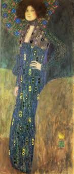
Klimt - Portrait of Emilie Floge
I like the two squares of colour in the bottom
right hand part of the painting, balancing
the strange peacock collar.

Doing this page has made me think about decoration and ornament. 
That decoration can take parts of a painting into the background. 
That Klimt used bright regular shapes to represent natural textures.
That some of these paintings may be seen as obscene, even now 100 years later. Perhaps shocking is ok if its done REALLY WELL! (Or by someone who's already famous).
That even great painters try out different styles and techniques - perhaps that's what makes them great in the end.
It has made me think I could try out more decorative things, as opposed to realistic things. That not everything has to have a meaning. 
That composition is even more important than I thought. 
And that making art might be even more fun than I thought.
And that making unusual or experimental clothes is an all right thing to do in my spare time!


Playing around with bits of drawings


For this exercise I looked through all the drawings, printing, painting etc that I have done since the first assignment, and picked square sections that seemed to me to have potential for further development. I found that almost all of my drawings had one part or another which could be developed further. I was supposed to pick 'at least 4' and ended up picking out 7. I stuck them up on a board. 


Samples for design exercise - 'enhanced' and cropped on computer

I am definitely finding the arrangement of elements/ contrast of colour shape and detail much easier now I have been through the section on this.

And after reading Metropolitan Seminars in Art: Portfolio 5 Composition as Pattern by John Canaday, pub 1958 by The Metropolitan Museum of Art NY. This helped me to understand the difference between composition in two dimensions, and in three dimensions. This portfolio concentrates on 2D composition of great paintings from the MMA collection, from Holbein to Matisse and Toulouse Lautrec via Japanese and Persian decorative art. What I learned was that what matters is different shapes, contrast, line, (as suggested in the course work for this course) and the sensibilities of the artist, and that it isn't something there are rules you can stick to for this. You have to do what feels right to you. Which is liberating in a way.

Picking a small section of a drawing really concentrates the mind on what is most interesting about each bit. I was a little worried that they'd all end up looking the same, but they don't at all - they all look interesting to me, but each in its own way. I have scribbled my responses to each one in my sketchbook. I'm not so sure at this point whether each of these will repay further work. I guess I will know more about that when I've done the rest of the exercise. 

'Big Wave' adjusted by using picmonkey infrared.

The first one I picked was the one that is not in the group above, the one I call big wave. The white pencil is quite faint, so this one is enhanced on the computer to show the lines. I started by following the suggestions in the course work.


Oil pastels on black paper.
The colours were dark for the 'swell' of the wave
and lighter for the reflections and froth.
'Big wave' in white gouache.
I focussed on the curved lines for this one.


Trying out colours and collage
Stripes and curves
I also tried cutting out shapes
to show a different colour underneath
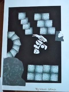
                                                                                                                                                                                   I copied the big wave onto the computer and edited it through picmonkey.com, to give me a variety of
different versions.


I printed off a lot of small squares of the infrared version above, and arranged them in various ways to make new patterns.

I like the way the negative areas become more important and shapeful when the pattern is repeated. For instance, in the bottom right hand corner there is a dark square in the join between 4 squares.


After a while I became aware of having restricted myself by calling it the big wave. I saw a face, and used that as another pattern.


Then I looked back at what I had done. I liked the blue and orange together, but not so obviously stripey. And I liked seeing the face in the middle of the apparently random curves.
I also wondered if I could do something with shell shapes, since the original drawing was part of a shell.
This is what I came up with...

The man of the sea.
This was made with shell-shaped stencils and gouache watercolour,
with aquarelle orange pencil decoration over it.

I have enjoyed this exploration and creative freedom so much that I have spent the whole day 'doing' this one drawing.


Friday 26 October 2012

Textiles 1 Project 4 Stage 2

I chose black and white pictures, (and one 3 colour picture) largely because the example in the course work was in black and white. It wasn't until I'd moved onto the next exercise that I realised that i was going to be doing a colour study of it!


Drawings of some of the 5x5cm composition samples
I like them all, and hope to use some of them for future design work.


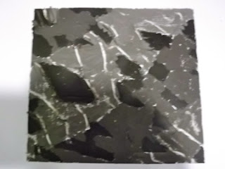
I picked the dramatic diagonal black and white striped one to do some more work on. I enjoyed doing them all but this one appeals to me most because despite being high contrast and clear shapes there's something interesting to look at everywhere in the square.

I did 3 'drawings' trying out ways to represent the surface texture, colour, and shapes of this square.
When it came to the colour study I found it easier than I had expected, and discovered that it wasn't just black and white at all. And the changes in colour gave it more texture. Having said that, I'm not sure any of these showed the shapes or texture any better than my original charcoal representation above. Which of course isn't the point. I think the point is to make you look at the thing in the 3 ways we have studied, so that when you get to the final picture it takes all of them into account.

First representation attempting to emphasise the odd
 triangular shapes in the background, the strong
 white lines, and the broad diagonal lines.
I used gouache paint and oil pastel.
Well, that did seem to work and these what I came up with. I was a little disappointed that the white stripes didn't come out stronger. I had used a white oil pastel to make the lines, thinking to use wax resist technique, but obviously with gouache if it's too thick then it just paints right over the wax! I scraped it off the wax lines, but it wasn't as dramatic as I had hoped. Put this one down to experience, and know better next time.

I also did a version in inks on damp paper. The paper wasn't really up to it, and tore in a couple of places, but the background texture was good. I made the white lines with masking tape and that worked well.

The collage version, below, came out better in some ways. It doesn't emphasise the diamond shapes so much, but it does show the white contrast lines better, and perhaps makes some reference to the more horizontal lines in the original.

Collage version of the same thing


This is what my kitchen table looked like part way through this section.
The small square in the middle is the original postcard seen through the viewfinder.
To me they looked better all together than individually.


So, after this exercise, there was a similar one, but working from a group of real objects. I selected some colourful stones and shells and arranged them on purple paper. I looked at them in various ways, and through viewfinders of different sizes, but in the end went for a single shell.


Shell on purple paper


The first quick drawing was a texture one, which was fun to do in gouache with the stripyness of the shell and the whorls of the worm casts added with the sharp end of the paintbrush.

The shapes were easy to pick, and represent with magazine collage, but then I realised that 'shapes' also related to the composition of the whole thing, and that this was rather boring.


My first two studies for the shell pictures


So I selected part of the shell.


The section of shell I went with for this exercise


Problem:
I was initially procrastinating a bit about this stage of the project because of having no confidence in my ability to produce anything worthwhile on paper. At one point I looked back at what I had done and felt very demoralised. Nothing I had produced for this stage seemed to be working. I wondered whether it was something to do with the examples I had chosen, and thought about starting again, perhaps using a coloured sample for the first section.

After a break, I realised that the style of the coursework for these exercises - several quick studies on one aspect - had led to my having a less focussed attitude to what I was doing, and I wasn't SEEING the way I needed to. As if I didn't have to look so intentionally if the study was only taking 10 minutes! 

Once I spotted that it was easy to get into a different kind of consciousness about what I was doing, and I started seeing and filling in the details that make all the difference. And getting into the flow of it so I didn't want to stop at the end of the day.


I did the colour, and another shapes study (because the shapes were different), and then a few ones trying to focus on the things I found important ie the shape of the 'lips' of the shell, the texture of the pattern on the outside, and the worm casts inside, and the contrast between the shell and the background. And, as if that wasn't enough, the mysterious depths of shadow inside.

Three last drawings of the shell. 

I am pleased with the textures in the first, the colours and wormcasts in the middle, and the contrasts and simplicity in the third. All of them make you look to see inside. Not so impressed with the final shapes of any of them. I'm not sure it's obvious what they represent!

What have I learned from this? That I like strong contrasts. Drama. That there are colours in black and white as well. That I can do a whole load of different techniques in the same session and learn how to do them better and what they are good for. That gouache has to be diluted if you want to do wax resist with it. And to think about composition more carefully at the beginning. Ah, and that white pencil doesn't show up well on black paper - better to use paint.

Making a mental note to remember this - if something isn't working, it might be that I'm not focussing on it.

And finally, I'm so glad I asked for longer on this one. I want to get as much out of this course as I can squeeze!

Thursday 25 October 2012

Selling the Unsellable

LSE Public Lecture: Selling the unsellable. Bringing experiential and ephemeral woks of contemporary art to market.
Noah Horowitz, Director of the Armory Show NY
15th October 2012

My notes on the lecture: 
THINGS TO LOOK UP ARE IN CAPITAL LETTERS
Much of contemporary art is anti-market. Marxixt/ commodity critique.
Process oriented.
'Immaterial art'. LUCY LIPPARD.
Interdisciplinary.

Artprice - 2/3 of the market is paintings. Drawings & sculpture -
Other 2%

Kunstkompass - (artists rankings at the top end of the market)
7/top 20 work in video/film
Supported by market/collectors/limited editions etc.

How to record and sell immaterial art works?

Ives Klein 'chequebook' of immaterial things.

Nicholas Bourriand 1998 'Relational Aesthetics'. Artists are creating experiences
Weightless economy
Artefacts for sale are not the art itself, but a record of the event. Sometimes framed or beautifully presented, sometimes for different parts of the very top of the market. (Private, corporate, museum)
Schematics for engagements.
ANDREA FRASER; MIWON KWON
'It's physical, but it has to be activated.'
eg the Shindler House construction
'Cult of the Artist'.

Struggle for authenticity, embedding
MARINA ABRAMOVITCH

Kiss by TINO SEHGAL

'\slippage between performance, documentation...interesting FIASTER


Some of my thoughts brought up by the lecture:
Odd to hear a man who makes a living from the very richest talking about Marxist ideas and antimarket/commercialism. Made me think about some things I've been reading in Art Theory for Beginners by Richard Osborne, Dan Sturgis, illus. Natalie Turner. Published in 2006 by Zidane Press London.

 They quote Theodor Adorno, of the Frankfurt School ( a philosopher, referred to Freud and Marx) as asking, 'Can art survive in a late capitalist world? By this I mean, is the existence of art as a producer of critical vision imperiled by the commodity culture of mass society?'

I think he meant 'High Art' as opposed to mass media reproductions or kitsch. I'm not sure where I stand on this. Obviously High Art is something like the pinnacle of human achievement. But I'm not sure about the exclusivity thing, limited editions etc. Does reproducing the Mona Lisa as an advertisement really devalue it or make it no better than sweety packaging?

Walter Benjamin thought about this from 1927 onwards and in a book he wrote called 'The work of art in the age of mechanical reproduction.' and the same ideas came up in the 1960s with Marshall McLuhan. He said that the 'aura' of a work of art is destroyed by reproduction, by reducing the distance between the work and the audience. For some reason he thought this, and the ability to see more detail than the artist intended, undermines the uniqueness of the original, and 'called into question its authenticity.' I'm not sure I agree with this. And it rather reminds me of the removal of the screens in front of altars in Catholic Churches so that the congregation could actually see what was going on and join in the service. Can't be bad, can it? Democratisation destroying cultishness.

I was interested in reading about Adorno's idea, because it the problem of making art in a commercial world has been on my mind.
So much of art and design is harnessed for marketing and advertising purposes.
We live in an environment where good design is used for selling so much that it takes an effort of will to see design as intended to do something else.
I guess I think this because I believe that 'Art is a freedom to become something. The free becoming of truth.' Martin Heidegger. And truth has a tendency to fall by the wayside when there's something to sell. (I can say, having watched adverts on tv just like everyone else, and briefly tried to be a freelance journalist).

And thinking about the process of making art, can you explore 'the truth' if you are thinking about what the market wants?

Unless your art is exploring the market. Kiss at an empty Guggenheim, refusing to leave physical traces, memorabilia, or even catalogue pages. Is this anti-market, or as some suspect, a sophisticated way to play it?

An article by Holland Cotter reviewing the show in the NY Times 31st Jan 2010 said, 'Things are a problem for Mr. Sehgal, who lives in Berlin and studied political economy before he studied dance. He thinks the world has too many of them, that production is ceaseless and technology destructive. His art is a response to these perceived realities as they play out microcosmically in the context of the art industry. His goal is to create a counter-model: to make something (a situation) from virtually nothing (actions, words) and then let that something disappear, leaving no potentially marketable physical trace.Link to whole article. This philosophy is laudable, and doesn't stop him from selling his events.

I think I agree with Marcel Duchamp who is quoted in the Art Theory book as saying 'There doesn't have to be a lot of the conceptual for me to like something. What I don't like is the completely non-conceptual, which is purely retinal, that irritates me.' If that means what I think it means, that the only good art is one with an... idea. Having said that I'm not so sure about his readymade objects as art.

The uniqueness of a work of art has to be preserved, by making limited editions, contracts with the artist to arrange a performance in a specific way only. What is this about uniqueness? Does it still apply in this open source world? Or only in the top top echelons of the market?

So where is textile art in all of this?

I think it might be investigating ARTPRICE and KUNSTKOMPASS a bit further.


Wednesday 17 October 2012

Textiles 1 Project 4 Stage 1


This section is about arranging points of interest in space.


Exercise 1:
The first part involves placing small black squares on bigger white ones in arrangements with or without tension. And then drawing lines for similar effect.
I didn't find any difficulty in doing this, so thought I might be missing something!
I went through some magazines and found some pictures which appeared to have particularly pleasing or interesting arrangements of elements, and stuck them into my sketchbook.
I read up about composition on wikipedia, which led me to some information about the golden ratio, and I worked out which of the pictures I had picked had that ratio.
I also had a postcard with 20 tile designs by a William Morris era painter, and worked out what the arrangement was for each of them, and what the result was.

What I learned from all this is that there are some arrangements which almost always work to produce tension or movement, and some that almost always remove it. And that points of interest or attention include faces, more intense areas of colour or light, and textures that are not elsewhere.

Exercise 2:
This starts with finding 5x5cm areas of pictures that have an interesting arrangement of elements.

These are from an Oxfam card.

The white wobbly lines of light make
a great pattern.
These 2 are from 'Flight of the mouse-eared bat'
by Carsten Braun
www.wildplanetexhibition.co.uk

Perhaps the attention is taken too far
into the corner by the brightness.


Photo I took of a shell

Although this arrangement is
a bit more pleasing,
the whole thing is a bit flat.
These 2 are from a photo in
How to Spend It June 2012

I like the way the lines are almost
parallel and the darkness increases
to the right


These are from 

I like the way the curved bits
draw attention


I like the way the negative space
comes out strongly on this one
from the lining, and from the
background.
Marc Jacobs jacket S/S 2012
from Vogue Magazine


Doing this exercise shows me
how much marketing and
advertising material takes these
considerations into account.

\


These 2 from
Malcesine on the Garda Lake
Gustav Klimt
www.woodmansterne.co.uk

Not sure about the slightly
diagonal line here.

More difficult to see just the
arrangement when the patterns
make sense


Having a bit of trouble putting so many photos on this page.
I think I'll do the next part when I've done the rest of the exercises in Stage 5.

Tuesday 16 October 2012

Change of deadline for Assignment 2


christina rogers dr.c.rogers@gmail.com
Oct 16 (4 days ago)
to Charlotte
Dear Charlotte
There have been some changes in my personal circumstances, which mean
that I have had less time than I anticipated to work on this course
over the last month. I expect this to continue for the next month or
two.
As I have been learning a great deal from these exercises, and
therefore do not wish to rush through them superficially in order to
hit the deadline, I am writing to ask if it would be possible to
extend the time I have to work towards Assignment 2.
Would it be all right to send you assignment 2 by 30th November?
Yours, Christina Rogers
Student Number: christina510830
Charlotte Grierson
Oct 16 (4 days ago)
to me
Hi Christina
Yes that would be fine with me.  It is better not to rush things under the circumstances.
Thank you for letting me know.
Best wishes
Charlotte

Charlotte Grierson
Mobile: 07753 602 420

Forthcoming Shows:
Made London
26-28 October 2012

Open Studios
Cockpit Arts Deptford
7-9 December 2012