Louise Baldwin page of 62 group website
Looking at these examples of pieces by Louise Baldwin, my immediate impression is of bright pretty colours in blocks of prints next to each other, both on fabric and on paper or card. It makes me want to try blocks of colour next to each other, but for me they would be different colours, I think with a bit more obvious drama between them.
The second impression is of unfinishedness, and that the stitched parts are not clear all at once. A bit messy even. You can only see parts of faces until you look harder for the rest, and the differentiation between the background print and the background stitched pattern is at first glance difficult to disentangle. If I try some of this stitching on patterned fabrics, how would I do it differently? I suspect I would start with some sort of extension or distortion of the pattern that is already there, and see where it took me.
I can see that she did it differently from this. I'm not sure how. There seem to have been layers built up which have different emphasis of texture, pattern and colour.
I have a large collection of patterned and textured fabrics rescued from disdain and neglect which I would like to use one day. My husband would like me to use them one day, so they don't just keep taking up more and more storage space in the house. In general the idea of reusing materials and yarns appeals greatly, and can of course add to the meaning of made objects, while reducing the cost of making them. It can make them less robust though, and in some cases they have been moth-eaten, torn or frayed in the past. Embroidering on them could improve their robustness. And could perhaps emphasis the fragility, history, or meaning.
I think part of my sketchbook work should be about looking through my collection and seeing whether I can enhance the meaning in some way by what I do with the fabric.
After writing these ideas I have had a look at this:
Crafts council maker CV for Louise Baldwin
It says that she is interested in the way people live on different levels at the same time. I guess from this I can say that she has expressed this well in the pieces I've seen, as that was very similar to the message I got from them!
Saturday, 14 December 2013
Feedback from assignment one
Open College of the Arts
|
|
Tutor report
|
Student name
|
Christina Rogers
|
Student number
|
510830
|
Course/Module
|
Textiles 1: Exploring Ideas
|
Assignment number
|
1
|
Overall Comments
Well done Christina, you have made a really competent and solid start to Exploring Ideas. It is pleasing to have a contents list along with your work and your reflections on Assignment 1. The work is clearly laid out within the sketchbook and supported by your annotation. I can easily see how your ideas are linked to the visual research and then how you have taken these ideas forward into your own work. The reflection work demonstrates you are articulate and self-aware. You are thinking through your own creative process with a critical eye looking for where things went well and how the creative process could be improved.
Assessment potential
You may want to get credit for your hard work and achievements with the OCA by formally submitting your work for assessment at the end of the module. More and more people are taking the idea of lifelong learning seriously by submitting their work for assessment but it is entirely up to you. We are just as keen to support you whether you study for pleasure or to gain qualifications. Please consider whether you want to put your work forward for assessment and let me know your decision when you submit Assignment 2. I can then give you feedback on how well your work meets the assessment requirements."
Feedback on assignment
Conceptual piece: Reliquary for a soft heart.
A good range of visual research has been explored. I can see how you have used this imagery as a springboard into the project. However the research would have been stronger if you had looked at a wider range of contemporary designers who are influenced by medieval artwork. You could have looked at the Grayson Perry Tapestries. Though personally I think Grayson Perry’s work and the D&G pieces are too obvious and there are probably better examples. I would like to know what you thought about the D&G outfit using such religious imagery. Did it work for you that sacred images were used for the purposes of fashion, possibly signifying capitalism and the free market?
I like the concept of the heart piece it is both shocking and intriguing. You are right to mention in your reflection that you did not need to make a complete piece. A set of samples on your storyboard is fine at this stage. I am pleased to see in your reflection how you thought through how you were going to create the textures of the heart’s structure using a variety of yarns and fabrics. I would suggest that you made many more samples showing all the different ways that the surface of the heart could be created. And instead of making an actual heart could you have produced the same reaction in the viewer through an abstract form? This would have released you to explore scale and texture more broadly.
Product piece: Cowrie shell scarf
Your research for this part of the project is of a satisfactory depth and breadth. Because your idea for the product was related to the fashion industry you looked more fully at contemporary design. The drawing for this part appeared more thorough. There are many drawing of the shells in different mediums as you explore the surface and shape of the shell. There are a good number of structured stitched samples as you explore which way to create the texture of the piece. This shows how you have developed your ideas by exploring possibilities. I don’t think you need to worry that the final sample is too stiff. You have recognized this in your refection, adding what you could have done to improve the sample.
Sketchbooks
You have shown you can produce nicely detailed drawings from your research material. There are a number of painted sketches experimenting with colour. The quality of your painting could be improved, possibly in a separate sketchbook.
- Look at using a wider range of brush sizes with a variety of brush textures.
- Try using an ink nib to draw with in a range of colours.
- Explore effects using chalks, charcoal and pastels.
- Sketch from objects around the home or museum and exhibition spaces.
- Keep using lots of colour.
You created a nice collage of the cowrie shell using corrugated card. This method could have been developed to investigate other possibilities in surface texture. I suggest you make a larger number of samples with a range of materials. For example add in your printed fabrics to a collage using hand stitch to create the detail.
There is evidence of a number of technical skills including weave, print, stitch to create structure, pencil drawing and painting. As well as expanding your drawing skills described above I would suggest you expand your range of techniques and materials.
- Use stitch to draw, either with hand or machine embroidery.
- Print onto different coloured and textured fabrics.
- Weave with found objects and more unusual yarns, for example plastics, wires and paper.
- Continue to develop creating structures with fabric and stitch by bringing in fabrics, papers and plastics with curious properties.
- Experiment by combining techniques.
- Take your ideas through a number of processes, for example
Draw print draw stitch draw weave
Don’t be afraid to leave you original image. When starting with a cowrie shell the final piece doesn’t need to resemble the shell.
Learning Logs or Blogs
Your online learning log is clear and easy to use; it would be useful if you added a category list. Your Blog along with the reflective work you sent with the assignment shows you to be articulate and self-aware. I note how you are able to make links to your practice from your research, keep this up.
Suggested viewing/reading
- Look at publications such as Embroidery, Selvedge and Crafts
- Research artists such as Louise Baldwin for pattern and colour, Claire Proctor for form and Audrey Walker for stitch
- Websites http://fiberartnow.net http://www.wgsn.com and http://www.londonfashionweek.co.uk. For current trends in textiles.
- http://sketchbookchallenge.blogspot.co.uk. For on going ideas of how to create a sketchbook.
Pointers for the next assignment
I suggest you separate your sketchbook from the course project work. Use your sketchbook to develop ideas related to and unrelated to the course material. Create a larger number of samples using a wider variety of materials. Mix up the mediums, stitch, draw, paint, collage and print freely. Continue to work with a range of colours exploring ways to express mood. Maintain your good working practices.
Well done. I look forward to your next assignment.
Tutor name:
|
Rebecca Fairley
|
Date
|
10th December 2013
|
Next assignment due
|
3rd February 2014
|
Reading this I am very pleased that my new tutor has taken the trouble to give me pointers about where to go. It's made me keen to get on with that sketchbook/colour work!
I'm not sure about a larger number of samples - I thought I'd done a lot for this one. And I have had trouble working out what should go in a 'sketchbook' and what in a 'course material' book, because of course they feed each other. I will try separating them for this one and see how it goes.
And this feedback made me think about how I would like to have a look at both historical and contemporary textile artists again - to see what's going on, but that it's difficult to know where to start, and how to know who's considered particularly good or interesting. I particularly like the fiberart greats section, and will certainly be exploring there again soon.
My biggest difficulty with this one is going to be finding good stretches of time to really get into exploring, because I'm just starting a new job. My 'good working practices' are going to have to keep me on the straight and narrow.
First try at screen printing
I can see already that there are lots if ideas I would like to explore more, and I've started on the first in my sketchbook today.

This advertisement from Elle was interesting to me mainly because of the background. It is made up of light coming through a screen (relevant for a screen-printing module), and has something of the quality of houndstooth check, but with odd pattern-ground repeating shapes.

I wanted to try different ways to capture something about this. First I tried coloured pencil, and rapidly found that it worked best to use three colours rather than just two.
 Then I tried using paper with holes punched in it. It was obvious that part of the impact is because of the regularity of the holes.
The ideas I tried the worked best were the two with regular patterns of holes in more than one colour, with varying sizes of hole.


I can see that during his part of the course I'm going to have to focus on working out how to screen print as well as I can, and that this will involve doing a lot of practice with various different materials and dyes/ inks. It makes sense to try it out early at least once, so I know what kind of things can be varied while using this technique.
I have a simple acrylic screen printing kit at home, which I tried (without a lot of success) to use last year. So after reading the instructions carefully this time, I decided to do a quick screen print just to give me an idea of where I'm going to have to concentrate my attention.
This was the pattern I decided to go with to start with - texture from the first page of my new sketchbook, aimed at putting a design onto a t-shirt. I wanted to do two colours, to give it a feeling of depth like in the sketchbook piece. I drew it freehand, liking the way the shapes were in lines in two directions, but that the spacing was not so regular or predictable as if I'd measured it out. I think the G is the important part of this design in the context of a t-shirt and that the increasing distance between the lines in both directions, and the corner without texture, would emphasise this. I hope.

I went by the instructions for the acrylic screen-printing kit, rather than the ones in the course work, mostly because they were clearly using different mediums and different kinds of paints/inks.
The first thing was to prepare myself for messy work, cover the outer part of the screen in duct tape, and then trace the part of the design which would be printed, onto the screen using a blue sticky liquid.


This is the same screen at the next stage, where I painted in the parts I wanted to be the greyer paler purple, and then spread on the 'clay'. This is it drying.
Oh, and I took a photo of the paints I used for this, just to show I'm working on improving my colour skills deliberately every time I make something.

This advertisement from Elle was interesting to me mainly because of the background. It is made up of light coming through a screen (relevant for a screen-printing module), and has something of the quality of houndstooth check, but with odd pattern-ground repeating shapes.

I wanted to try different ways to capture something about this. First I tried coloured pencil, and rapidly found that it worked best to use three colours rather than just two.
 Then I tried using paper with holes punched in it. It was obvious that part of the impact is because of the regularity of the holes.
The ideas I tried the worked best were the two with regular patterns of holes in more than one colour, with varying sizes of hole.


I can see that during his part of the course I'm going to have to focus on working out how to screen print as well as I can, and that this will involve doing a lot of practice with various different materials and dyes/ inks. It makes sense to try it out early at least once, so I know what kind of things can be varied while using this technique.
I have a simple acrylic screen printing kit at home, which I tried (without a lot of success) to use last year. So after reading the instructions carefully this time, I decided to do a quick screen print just to give me an idea of where I'm going to have to concentrate my attention.
This was the pattern I decided to go with to start with - texture from the first page of my new sketchbook, aimed at putting a design onto a t-shirt. I wanted to do two colours, to give it a feeling of depth like in the sketchbook piece. I drew it freehand, liking the way the shapes were in lines in two directions, but that the spacing was not so regular or predictable as if I'd measured it out. I think the G is the important part of this design in the context of a t-shirt and that the increasing distance between the lines in both directions, and the corner without texture, would emphasise this. I hope.

I went by the instructions for the acrylic screen-printing kit, rather than the ones in the course work, mostly because they were clearly using different mediums and different kinds of paints/inks.
The first thing was to prepare myself for messy work, cover the outer part of the screen in duct tape, and then trace the part of the design which would be printed, onto the screen using a blue sticky liquid.

When this dried, I spread a clay-like substance as evenly as I could over the top of it, and then let that dry.

Once dried, I sprayed it on both sides with a water bottle, until the blue stuff was gone. All these different steps were to allow the clay to block the paint from going through to the paper underneath. It was quite confusing as to whether I was getting it the right way round or not.

You can see that I had previously used this screen once and had left it unwashed for too long so it was a bit stained before I started.

These are the first two imprints I did of this screen, using purple as in the original cut paper 'sketch'.

And this is the first try on a t-shirt. From this I learned that you have to protect the area around the print from transfer from the frame. Which was in the course instructions but didn't make much of impression when I read it. Now I know!

This is the same screen at the next stage, where I painted in the parts I wanted to be the greyer paler purple, and then spread on the 'clay'. This is it drying.
The next step was to overprint the grey on top of the purple. At this point I learned the importance of marking the position of the screen on the fabric, to ensure it goes in the right place!
This looked interesting, but didn't show up the letters in the way I had hoped.
And the texture was quite stiff - at which point I realised i had used the wrong medium.
I was washing out the screen and thought the way it washed out unevenly was interesting, so I printed another second layer using the half-washed screen.
 |
| T-shirt 1 - two colours screen printed onto t-shirt |
This looked interesting, but didn't show up the letters in the way I had hoped.
And the texture was quite stiff - at which point I realised i had used the wrong medium.
I was washing out the screen and thought the way it washed out unevenly was interesting, so I printed another second layer using the half-washed screen.
 |
| T-shirt 2 Printed with half-washed screen, giving a more intense textured finish to the bottom half. The second colour did not allow the first to show through. So the texture is because of the extra layer of paint under some parts of it. |
 |
| Texture after printing t-shirt 2 |
 |
| This is a detail from t-shirt 1 showing that I did manage to capture some of the repeating irregular holes with shadows that I intended. What didn't work was the contrasting sections of lettering. |
 |
| The colours for these screenprinted t-shirts were mixed from primary colours and white |
What I learned from this first try (in no particular order)
1. Two screens are better than one. I'm also wondering about splitting a screen into 2 sections, as my screen is quite large. But that is probably asking for mess.
2. Don't forget the textile medium.
3. Mark the position of the screen on the fabric/ paper the first time.
4. Protect the background
5. Wash the screen as soon as possible.
6. Try out small repeating images and find out how they work printed in various ways. In layers, rotated, different colours, on different kinds of fabric and patterns.
7. Look up what artists have done with screen printing.
8. This try made interesting texture, but the image didn't come through like it would have done with stencils, or block printing. I need to do a simpler image until I'm better at it. Or try stencils.
Part 2: Man made

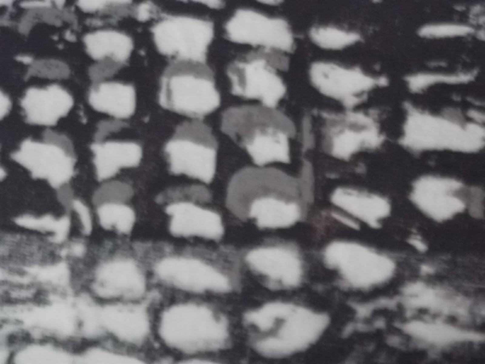
First task was to take some photos of man made things to work on in my sketchbook. I did also have a trawl through my photo library because when I first started Textiles 1: a creative approach I did a walk round South London taking photos and lots of them were if bounding or railings that appealed. And some reflection photos which I haven't yet worked on, like the West Croydon pavement above.

This one is of the ice rink at Canary Wharf. I was intrigued by the way the whiteness is more intense in stripes and how that contrasted with the surprisingly brightly coloured fallen leaves. There are also some reflections in the ice of the surrounding buildings which gives it an interesting variety of colours and brightness.

This is a photo I took of the ceiling of an ancient palace in Rome. I love the way the architect made the squares recede so the light falls so interestingly on them.


Here, there is enough light for shadows, and for the damper parts of the pavement to be more reflective.
The colours are all different in the night.

This one is a photo I took looking into and across Ruskin Park, when I realised that there were regular lines of lights showing where a series of tower blocks are on the other side of the park's darkness. You can just see the more intense darkness where the leaves of the trees are against the sky.

I like the way this one came out, as if out of focus (although I think it's actually because of the low light level). The different coloured light spots are interesting and attractive, and the background is broken up into greens and purples in a way I'd like to try out in the sketchbook somehow.

Here the lights are distorted into the shapes of half staples, with an unexpected right-angle. The less light there is, the more the colour of the pavement is distorted.

Again, the colour changes are quite dramatic in this, especially at the edges of the circle under the light. The reflection on the car is interesting too. And the lights int he background under and between the trees.

And in the end, this not so man-made romantic vista through the trees in Highbury Fields. The little hut there under the knobbles of the trunks appeals to me, with its window all lit up by the lights on the sports courts behind.
Here are some daytime photos I have taken during this period of collecting man made images. What appealed to me about the ferris wheel at the winter wonderland in Hyde park was the lacy pattern and the way it twists because of the perspective.


These office block windows have interesting combinations of linear reflections and partially seen lines inside. They are both in central Croydon.
You can't tell by looking at the one on the left whether the buildings are wiggly or the windows. In fact its a bit of both, I think.


The pavement picture is also about lines, but in this case different patterns and colours in radiating blocks.
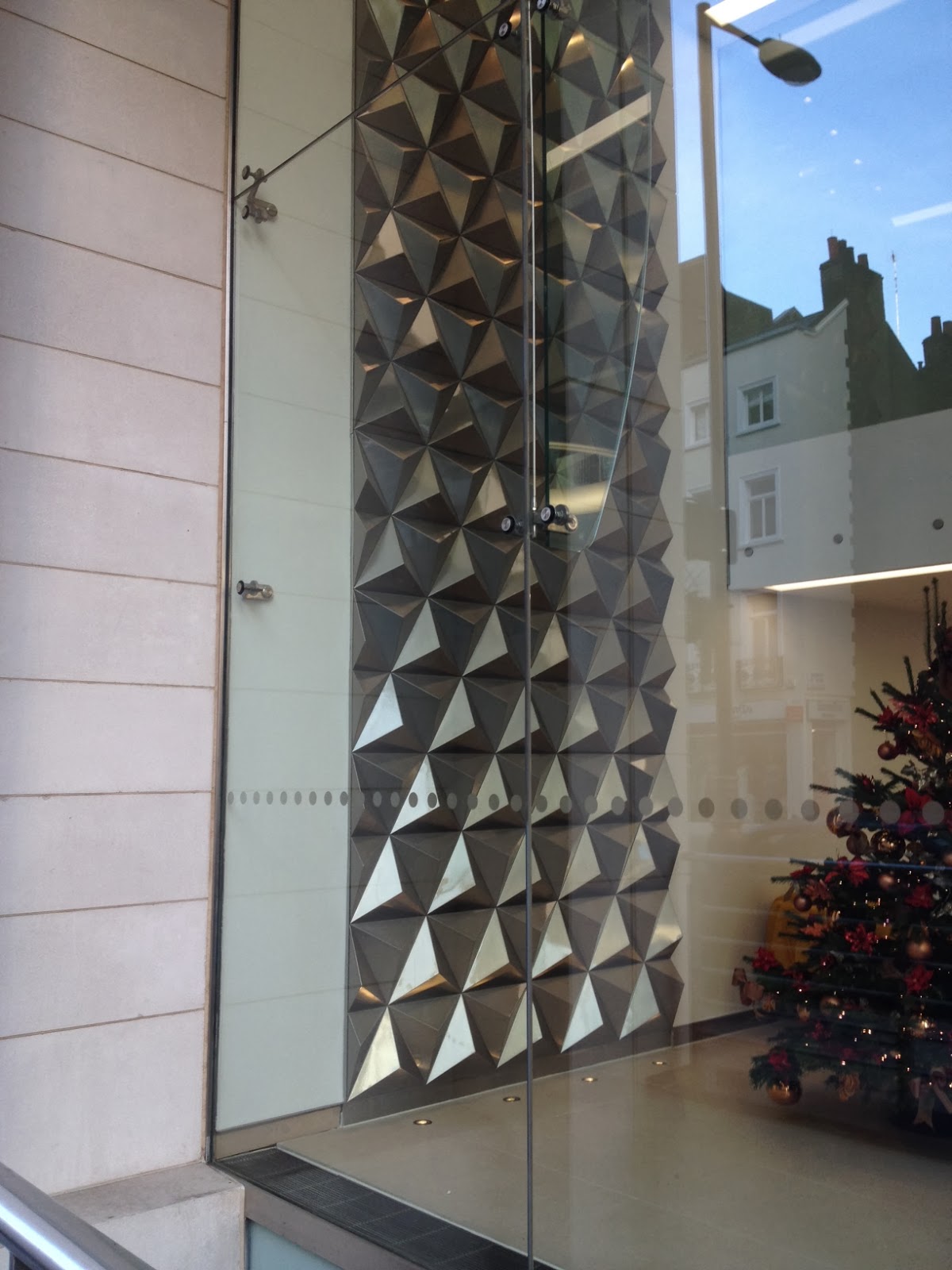
This triangular pattern appealed to my quilting head - it would be easy to do this using triangles of different textures of fabric on each side of the pyramids. But instead of it being the same all the way up, it can have shadows and twists like this wall decoration in the hall of an office building in Wigmore Street.
 |
| Stack Tony Cragg At the Tate Gallery, but I remember being unable to pull myself away from it when it was exhibited at the Royal Academy a few years ago. Why? I think it was something about the perfection of the cube in contrast to the jumble of ordinary things it was made of. Man-made things that I wouldn't usually think of as interesting to look at. |
Sunday, 1 December 2013
Reflecting on Assignment One
Do your finished samples fulfil your expectations? To what extent do they reflect the initial research you undertook for this assignment? Can you see a clear line of progression from source material to preliminary ideas and finished sample, or did you have to change direction at any point?
First I should say that in retrospect I can see that it would have made more sense to pick only one of the 'cultural sources' to inspire both pieces. But I used medieval imagery and ideas for the concept piece, and Ghanaian wax resist and cowrie shells for the product piece. This definitely added to the time I have taken over finishing this part of the course.
For the conceptual piece I was hoping to produce an object that would make the viewer think about what had been lost, and regret that it was a softness of heart. This required me to make something that looked enough like a heart to be a little grotesque, in a container enough like a medieval saints reliquary to hold meaning. I think it does this to an extent. The plain wooden box with worm gold clasp indicates a worn container for something well used. The blue decoration with gold squares inside works to indicate Catholicism and something special without being too kitsch I think. The heart was difficult because of the shape colour and texture being complex and not very easily recogniseable. I am quite pleased with it, but wonder if there might not be a clearer way if demonstrating the same concept? I am sure it works better than my first idea!
Without all the medieval research I would never have got to the idea, nor to the colour or pattern on the lid of the box. In fact, that colour blue has been fashionable this summer and I have been aware of not liking it at all. But in this context it seemed right in view of it's being one if the few frequent colours they used in the 13th century. The heart is not really medieval except that they did keep pieces of real peoples in their reliquaries and appear to have been less squeamish than us about them.
I started thinking very early on about embroidering a cover for a reliquary with scenes and people, but, perhaps because This idea was so early In my explorations I did have a change in direction later on. I wanted something more clearly delivering the concept. And to an extent realised I would not have time to make the first idea. (It was only much later that I re-read and understood that I was not expected to complete the object, just produce samples.)
The second sample - a scarf - turned out better than I had expected in some ways, and less well in others. I was not expecting the pink paint to stiffen the cotton much more than I was planning for. The result is a rather stiff structure that wouldn't hang well round your neck. I did not have time to try it again with more textile medium, or in silk, either of which I expect would improve the flexibility. What turned out well were the batik pattern, and the shapes formed by putting in stitches at different levels of the folded fabric.
Looking at this sampler you may not think it bears any relation to cowrie shells. But there is a reasonably straight line in my working to get here from the initial research. (Other than a short detour into thinking I was going to weave the final piece). I did quite a lot if sketchbook work exploring different aspects of cowries, and different patterns thou could make with them, and was drawn to both repeated lines of them, and to emphasising what was hidden inside. For most of the time I was exploring how to emphasise the 'lips' with texture or colour, but in the end I did a pattern/ground switch and too that colour and pattern into the inside of the 'shell'.
Did you make the right choices and decisions when selecting and developing your ideas? If not, what would you change, and how might that alter the outcome?
For the reliquary, I think I made the right choice. This imagery is much stronger than the original one would have been. I regret not using the anglicorum embroidery technique at all, and many if the images I found were inspiring to me so will no doubt come up again in future.
For the cowrie piece, there was a point at which I decided to go more abstract and I am glad of it. However, the idea I had of making a purse in the shape of one large cowrie is appealing and again something I might develop separately from this course.
How important was the choice of material in determining the qualities you achieved?
I have already mentioned that I might have done better using silk for the cowrie piece, and perhaps silk painting instead of cotton and batik. This would have produced a much floppier result more suitable for wearing as a scarf, but perhaps less pleasingly regular shapes from the fabric manipulation.
For the reliquary, the battered wooden box worked well, resulting in the contents being a surprise. The blue stretch fabric needed to be matt and exactly the right colour. I thought about trying to find velvet for this, but this fabric gives the contrast and feel without being too obviously rich and showy. It gives a good contrast with the shinier gold braid and wire patterns on top. I like to be able to make things with recycled materials, and in this case it was particularly appropriate (even though you can't tell by looking at it). The materials used for the heart are intrinsic to the texture of its surface, which is complex. I am particularly pleased with the two different methods I used to reflect the texture of the fat around the heart.
How did your choice of colours contribute to the overall results?
In the case of the reliquary, the colours I chose were derived from my painting of a real animal heart. I hope that what they do is to differentiate this heart from the cultural expectation of what a heart looks like, and draw the eye to the curious and disgusting realisation that this is what the real thing looks like. The colours of the fabric lining of the box could really only have been bright red, this blue, or gold, in context. Red would have detracted from the impact of the heart, and gold would have made it too much a glorification.
For the cowrie-inspired scarf, I had two options - the fashionable pink/black/white/grey combination, and the warm rich shiny brown/mustard/purple of the back of the shell. I used the black/pink scheme for several reasons:
- it better reflected the sketch of the intriguing inner world of the cork bark that inspired me initially
- some of the attraction of the other palette was in its curvedness, and I couldn't use that in this context
- it was in fashion and therefore conforming more to the instructions for this assignment, and potentially more saleable.
What it did to the overall result was to make it cooler, and more stylised, and more in line with the feeling I had at the beginning about the shell colours being 1950s. I think if I had used the other colour palette, the scarf may have turned out curvier.
Did you try the brainstorming exercise? If so, did you find it useful?
I did use the exercise for both, and found it very useful as it focussed my mind on what aspects I was most interested in exploring and emphasising in my final pieces. I often found myself coming back to the lists I made to remind myself of which choice to make as I went along the design process, in order to keep these priorities alive. Without it, I can easily imagine going a very different way and not knowing why. In other words, I think it allowed me to have a bit more control of the process.
Subscribe to:
Posts (Atom)