Showing posts with label Exercise 1. Show all posts

Saturday, 5 December 2015

Trying out composition on my sketch walk

The instructions for exercise 1 do not actually tell me what I am expected to do! They imply, though that I should go back to the place I did the Project 2 drawings, and rework them adventurously.

Anyway, for this exercise I returned the park where I had done my original drawings of clouds and landscape scenes. My idea was to go back to the one with the path crossroads, but when I got there I could see that I could pick a vista which was more amenable to the composition ideas explored in my last entry. Reasons for this were that the detail in the foreground would have to be of the path (not very exciting), and the distant vagueness and blueness would end up being in the tunnel between trees (a bit of a cliche). So I looked for a view with trees in the foreground (which have interesting textured bark), something in the middleground, and an interesting distant object or two. 
I did my sketches with B charcoal pencil for the foreground, HB for middle-ground, and H for the most distant objects.

Landscape format
This was my first attempt - the trees were interesting in themselves and I could imagine having fun with their texture and the details round their bases. In the middle ground were some other trees, and a bar of houses with some white painted windows and other detail (which I have sketched in here as boxes within the bar). In the distance is a fairyland group of skyscrapers in the City of London. I didn't manage with this pencil to show the shapes or the grey-blue colour of this distant object. It was definitely separate from the rest in real life, with finer lines and bluer colour. Re the composition, I thought that the focal point of this arrangement is actually a relatively empty space in the middle point of the rectangle! Not what I was aiming for at all. Even if I could get the city buildings to obviously be in the distance, they would be in the wrong place in this composition to be the focal point. 


Portrait format
My next try was portrait, just to see what happened to the image.
This of course led to there being only part of the trees visible in the foreground,
and the detail being in the form of twigs and leaves rather than bark texture.
The middle ground detail is more rudimentary, and I felt the need to give it
a bit more depth with the charcoal. The distant towers look almost alien
floating on the horizon, as the blueness is too much.
Again the focus of the picture is the clump of trees below the city
rather than the city itself. This may be because the whole picture space
is divided in the wrong place, leaving the city dead centre rather than just off centre.
And because the portrait format flattens the depth.


This is the same sketched, cropped to put the city on the golden section line vertically.
This has the side effect of making the rectangle less narrow in relation to its height.
It seems to have the effect of making it more the focus, at the same time as making the
twig detail at the top more accessible to the eye movements, and the city looks more at
eye level than it did before. While it's better, I'm not sure its what I was after in fact,
because I want to feel I'm looking up at the magical city.


This is the same sketch, cropped the other way, so as to put the city at the
golden section the other way round. I think it works much better than the
previous ones, with a feeling of it being infinitely far away and unattainable,
like a fairy tale castle (which is what it felt like in real life). The
foreground looks more foreshortened too, emphasising the depth and distance.
Unfortunately the blue still isn't working as it's not grey enough.

Square Format
Using a square format, I felt the need to frame it in the foreground. I thought it would be interesting to use the drooping branches in the composition to 'point' towards the city, which would mean that it didn't have to emphasise itself in the same way to become the focal point. I dropped the blue altogether for this one, and the middle ground needs work too, but the idea, with the city as the target of the branch vectors has potential. There is lots there for the eyes to move around with, and the contrast can easily be adjusted in places to draw the eye around.
Last composition sketch on this walk. I put the middle ground and foreground tree at 5/8 positions, and the city just above the horizon. As I noticed in the duck sketch above, the close-up tree on a landscape format actually makes the eye look past it to experience the full space and depth of the image, ie the focus becomes the city rather than the tree. I added some directionality in the trees on the left and contrast in the middleground (especially on the right), to keep the eyes moving round the image. The tree, and the ground to the right of it, need more detail.

Thursday, 1 October 2015

Trees

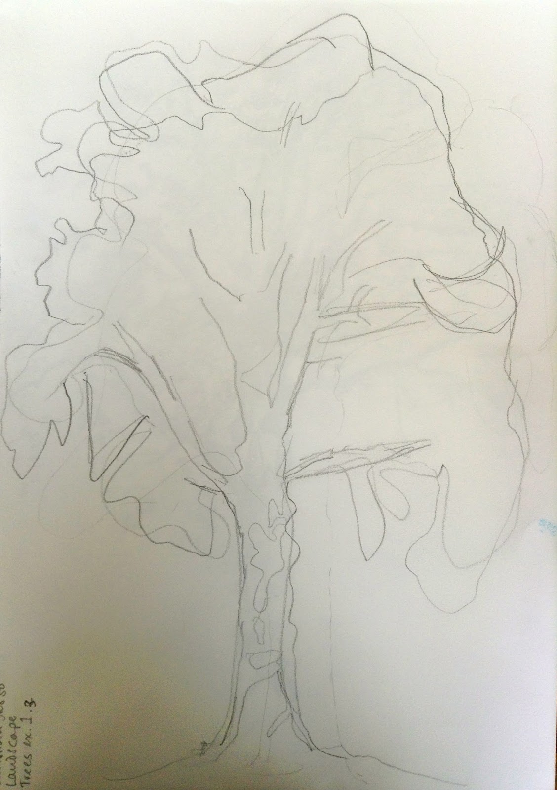
I was lucky enough to have a beautiful sunny autumn day for my first session of outdoor sketching. I went to my local park which has lots of beautiful old trees. I enjoyed slinging a bag on my shoulder and wandering round it looking properly at the trees. I have passed them so many times but never really focussed on them.


Basic shapes in outline or
shaded areas of foliage
 Exercise 1 Sketching individual trees

I picked a tree which was a little separate from the others, and that I could sit far enough away to see the whole thing (and be in the sun!). I was mindful of needing to sketch in a freer way after the exercises and effects in the previous stage, and in the later stages of using several pencils or other utensils to get a wider range of tone.


Simple outline with main branches
added
Simple outline

Shaded areas and texture of foliage

These exercises were simple and worked wonderfully to help me grasp the structure of the tree.

I learned that breaking it up into simple parts really works. I was pleased with how easy it seemed to draw the tree approaching it in this way.


Exercise 2 Larger observational study of an individual tree

I picked a small tree which was still next to the support it had when it was a sapling. I picked this one because I love oak trees, it had an acorn despite being so young and because the contrast of the trunk and the post was interesting. I wanted to show this contrast, and the shapes of the oak leaves in the sun in some detail so I picked a fine pen to draw it.

I started well but as has happened before I got caught up in the tiny details at the expense of the whole image. The result was that again I lost the full degree of contrast in the shapes and the final image is less defined than I would like. Also I'm thinking that I should have done the whole little tree rather than a chunk of its trunk. I often avoid doing the whole of something, perhaps because of worry about what I will do in the rest of the paper - how to sketch in the background?


Observational study of an individual tree


I had taken a rug and initially enjoyed sitting there in the open air on a warm day. I got up and stretched every now and then. After an hour and a half of this one drawing, my back was hurting too much from sitting on the ground and I had to give up. Time to admit that I need to take an easel with me, however cumbersome that might be.


Exercise 3 Study of several trees

I went to the woods near me intending to climb to the top of the hill in the hope that there would be a view down onto trees, like the Greenwich Park view in the course file for this exercise.

As I walked towards it I saw a view I thought might work, and did some composition sketches.

Sketches of some groups of trees to work out what to draw for this exercise


I decided I wanted a view with more interest for me, so carried on to the high ground.

When I got there what drew me was the tunnel of trees bending over the path, with light at the top and lovely enclosed darkness at the bottom, with pale leaves providing detail. I searched around for a while for the right place to put myself where I would be able to see these, and settled down to sketch it.

I did a couple of composition sketches to work out which parts to include and what to leave out. I used a viewfinder to help with this, and the tall thin shape worked best to include both the path and the lightness of the sky while making the tunnel effect over the path the emphasis of the drawing. Having some branches in the foreground would frame it nicely.

Abandoned first attempt


My first try was not working too well. I had got bogged down in the detail again, and forgotten the tone, which is supposed to be the main point of this sketch, so I started again.

Study of several trees in pencil on white paper


Well, I'm not so pleased with this. It took me a lot of tries to get the tone approximately right. I found it very hard to do approximate large tonal areas. It was as if I couldn't believe that I could leave out the detail and it would still look like trees. But there you are, it looks better now I've got closer to what I was aiming for. I think I might go back at some point and try again.

I definitely need to work out how to look at something and see the tones 'independently' of the details.


Tuesday, 14 July 2015

Project 6 At Home Exercise 1

OK, so I'm doing this one out of order. That's because I'm on holiday and don't have access to most of my drawing stuff. But I didn't want to take a holiday from the course too. And project 6 seemed like one I could do (ironically) in the house I'm staying in for the hols.

Exercise 1:
First job was to go round the house drawing every corner. I used a soft pencil and white paper as I wanted the sketches to be quick and loose.

This first drawing with the jars is relatively strong. The tongue and groove at the back puts it in a frame and gives the objects their correct size. As with all these sketches, there couldbe more variation in tone as I used only one or two kinds of pencil for each.


A corner where the ceiling slopes
You can see the bottom of the banisters and the hall rug
in the background
A corner of the porch with jars
and a collection of plastic bags.


This sloping ceiling worked well for me, but there's something not quite right about the angles of the tongue and groove.

The washing machine, and rather disconcertingly
my mother's head looking detached from her body!
Well overdue some help drawing faces!


I'm not even sure which way up this one goes.
I think that's mainly because I went all wrong
with the perspective.


There's something interesting in the contrast between the machine's shapes and the shapes of the dirty laundry, but this isn't the set up to explore this.
Under a kitchen cabinet. The cabinet door worked well
The rest doesn't have much to show what's there.


A rather boring corner.
The angles are better on this one, though


A chair in front of a pile of laundry.
These views seem to work best when there's something soft
as well as the straight lines. I think the shadows on the
chair back work well. I was thinking about tone for this one.


This is a different angle on the same view as above, without the person in the way. It does go well when there is something soft and some straight lines. I was using a much softer pencil for the darker parts of this one and that helped to define the shapes better.

Compared to the lamp by the window below, for example. The shadows on the right of the lamp are so indistinct as to show no form, so needed to be darker, I think.


A fancy radio and a hat hung on the back door
This one has more interesting things to look at that some.
The back door isn't quite at the right angle.
A lamp in a corner by a window.


The sketch below is of a rather daunting part of the entrance hall with lots of angles and unexpected architectural features. Again I didn't pay attention to the tone at all and the result is a flat sketch. I wanted to have another try at this one as there were lots of interesting bits to it, and it has a comfortableness to it which it would be good if I could capture it.


This was my first attempt at this complicated part of the
entrance hall.


This is the second attempt, with  a bit more tone, which gives it much more atmosphere. 

This one made me think this corner would be a good one to try for the next exercise.


I did some other sketches of the house, some of them before I really read the instructions properly, so I'm including them, but not as part of this exercise...


As a textiles person I wanted to try to capture the attractive folds of the home-made blinds. I wasn't entirely successful, and the whole drawing doesn't have enough tonal variation.

The bottom of the stairs was a bit of a nightmare because of the perspective on the not entirely even stairs. I rubbed them out a few times. Also it's just a line drawing. I'm quite pleased that I got as close as I did, though!


The yellow leather chair using sharpies.
The sun was reflecting off the leather and making it bright white in places,
which showed up the wrinkles where someone had sat on it.
The proportions of the chair went wrong so the arms are way too short, but otherwise,
I'm quite pleased with the way this one went with the different textures and tones.


 This corner was easier and more satisfying to draw. I particularly like the way the things on t he desk have different textures. You can see that I did it softly first then filled in some more of the depth of tone. The background I left pale and it gives an idea of the depth of the alcove, and that the desk is the focus.

I didn't think that this view would be so interesting if I did it again from different angles, although it was a close-run second to the hall stand view I chose in the end.
This one was not done as part of the exercise at all, but inspired by those sketches I did this
one of my daughter playing on the Nintendo, in pastels to try to capture the colours I could see.
I put some details in with a pencil, on the hand and the pattern of the pink quilt, but didn't want to overdo it after the detailed lines of the previous drawings.
I like the way pastels work when you use them loosely. I think it worked pretty well,
and reminds me of what it was like to be there peacefully in the room together.


Friday, 17 April 2015

Pets and other animals Project 5 Exercise 1, and some preparatory work for Exercise 3

Exercise 1: Animal line study

First off, I don't have any pets other than small tropical fish, so I went to the park.
The ducks looked good to me, particularly the texture of the female mallard feathers, and the sinuous shapes of the necks.


There are the feathers I mean, and the contrast between the strong textural feel of them, and the clear contrasting shapes and colours and intensity of the blue stripes.


The male colours may be more striking because of their iridescence, but I find them less interesting myself. I like the texture of the females.


This little guy has some strong shapes and contrasts himself.

I like the way the variation in tone in the background gives away the direction of movement.


The texture of the legs is really different, and characteristic.
I enjoyed drawing them.


This Canada goose has texture, strong shape and contrast, and even a nice strong shadow to make him look more 3D.

See how the pattern in the water and the pattern on the back reflect each other.

Drawing this made me want to do a watercolour pencil study of the back of a female mallard.
There were a few drops of rain while I was doing this so got a bit messy...

It was more difficult than I thought to capture the pattern of the feathers,
especially while the duck moved! I found it worked better to represent the way it looked
when I didn't try to be so detailed, but was more loose with my movements.
So I picked one that was asleep and used a fine marker instead.


After expecting to use ducks for exercise 1, there were a couple of weeks when events and the weather conspired to keep me from the park. So I had a go at drawing the fish moving instead...


Once I got used to it, I found it much easier than I expected to draw moving fish. You just have to not be in a hurry, and the fish will come back to the position they were in. Doing this showed me how they came back into their characteristic shapes repeatedly, and also that some 'fish shapes' that I see regularly are actually more symbolic than realistic. Also helped me understand why some of those Japanese cod drawings are so great - they really capture the flow and shapes of real fish.


Fish in tank
Pastels on coloured paper
Fish with background
Graphite

I did some sketches of the fish with some background details.

It is difficult to capture the presence of the water. I tried to do it by using coloured paper. Pastels were not delicate enough.


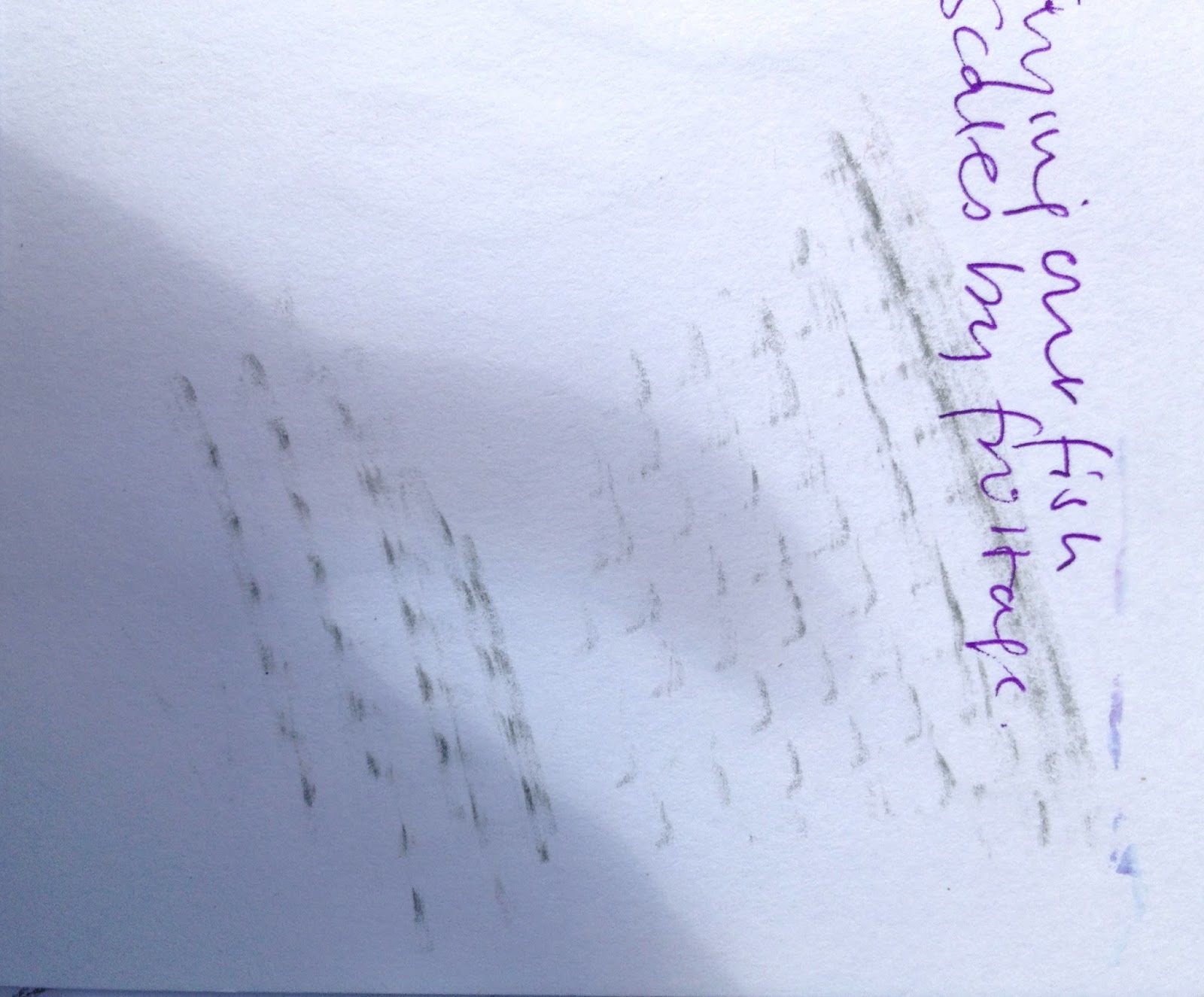
Scales/ texture frottage 
Fish with weed
Sharpie
This one has more of the delicate quality of the little moving fish, and the strands of weed they are moving through. I think there is a lot more I could do to make the background work better. 

The drawings below are a series of sketches of different ideas I had for the final moving fish piece.

Initially I thought that a vertical oblong would be good, reflecting the subject being so common in Japanese and Chinese art and often in that shape.


My sketches for moving animal study

I also noticed that one of the fish (the blue one) spends a lot of time staring out through the glass, and it is an unusual shape and looks rather grumpy head on, so thought it would be a nice subject just on its own. Perhaps amusing in a way (although not much movement!)

Then I noticed how the tank looked when the sun shone on it strongly from the side, casting fish shadows which are shorter than the fish on the wall behind. It looked interesting and could make a good drawing.

Finally, in my textiles sketchbook I had drawn a sketch of the regular rhythm/ pattern the black shapes make when the little fish all align as they like to do, and imagined some things I could do with this in textile. I realised that there is nothing to say I couldn't do that for the drawing as well. In fact, in order to make the textile, it would make sense to do a drawing first, before trying out textile samples.


My textile ideas sketchbook, showing approximately regular patterns of the black shapes of harlequin fish in a shoal, and my ideas about how to use it to design a textile.
The background is only touched in, in the form of a broken line of green for the weed.