Sunday 11 March 2018

My kind of beautiful


One of the things I have been doing recently is being more deliberate about finding out what is beautiful to me. I want to spend today collecting together some of these things, and think about what it is that I find attractive about them.


Simple clear shapes

I saw this on pinterest and
couldn't find the source


31-3_Kesseler_new3.jpg
Turns out I only like these when there's some interesting texture or repetition.


Messy complexity

https://www.waysofenlichenment.net/lichens/

https://littlebangtheory.wordpress.com/
2007/10/21/im-lichen-it-a-lot/


I find that I haven't pinned as many of these as I thought. Perhaps I like structure more than I thought!


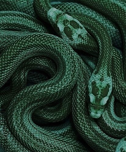
Irregular repeating patterns 
http://exercicedestyle.tumblr.com/
image/101661125662

Another pinterest with no origin image

While these patterns are attractive in themselves, for me there's something about how nature plays with them which makes them even more appealing.


https://dkphoto.photoshelter.com/gallery/
Microscopic-Plant-Cells/
G00005l.MbuYRzEQ/C0000oyPxKwu0APU


http://libguides.mhs.vic.edu.au/
patterns/patternsnature


https://imgur.com/gallery/xEiEDi0
fractal red cabbage appeals to head rather than instinct
jNVcVKH.jpg
fun rather than beautiful


The difference between beautiful and interesting in other ways seems to be whether the image appeals to my head (eg cabbage fractals) or my sense of humour (all those round octopus suckers) or a sexual sensation, or something I would describe as a feeling of fullness in the middle of my chest. I mean my heart. 


Certainly there are more of these ones than any other. 
These are all nature photos because that's the pinterest board I am working off. 
Perhaps another day I could look at other boards!


Hide/protect
http://whimsicalhomeandgarden.com/seeds/

https://i.pinimg.com/originals/44/
df/0f/44df0fef8ffb2172bb42f3eea25a4584.jpg

The inner reality peeking through almost despite the cover, or simply visible.


These seeds hold meaning for me in that they make me think of the self in various ways.
As if the seed were a metaphor for beingness (which I suppose it is in a real way too).
I can imagine making many more small approximately spherical unique objects with this metaphor in mind.

The inside of this one is less mysterious and witheld,
putting the emphasis on the fragility of the cover.


Looking for these images I have noticed also that sometimes the attraction is the way an image triggers my awe - generally at the absurdly powerful yet delicate forces that it must have taken to get there. But this one is also beautiful in its own right as an irregular repeating pattern.
660c30c35c96590fc7a4075153b55d3d.jpg
sensory hairs on the antenna of an ant


And some are pretty, rather than beautiful.

http://www.fungiphoto.com/CTLG/pages/
0483-02.html?&cuid=2341d073a8d35dabf0006b257f425485

https://stylowi.pl/6679049


And then there are branches against the sky, which can be beautiful in a bleak way, or serve as structural contrast to emphasise the colours of the sky.


my photo of branches on nottingham university campus


More images in these categories on my pinterest board nature stuff


Tuesday 6 March 2018

Sketchbook work for 'So you think you know me? - 3'


This jacket is the third in my series 'So you think you know me?' which  items of outerwear which express both how a person is seen, and how they feel inside. This one is for someone who is ESTJ in Myers Briggs, 'the supervisor' who I have dressed as a security guard. My initial thoughts about how to express this steady reliable type were like this:


It seems to me that this type, more than most, would have a rather conventional appearance initially, with recognisable allegiances and clear black and white. Since I love Alexander McQueen clothes there are some of his military style clothes here, but in the end I went for a more conventional police type uniform on the outside. 

And this was some of my exploring to help with the insignia designs.


The way it works is that the outside is how the person appears to others, and the lining is how the person experiences themselves.  For this one the inside was more difficult to visualise. The person who inspired it is often under a lot of time pressure, and described feeling 'inner turmoil'. My sketchbook research for this included these pages:


Initially I had several ideas about how to express this time pressure, and tried out running stick men and something like the turmoil pictures on the left, perhaps making three-dimensional swirls.


This process taught me something about using these techniques, and also that they was not going to give me the effect I was looking for. The running stick men were not really warm enough to relate to, and as you can see in the photos above running in our culture is sometimes associated with success or athleticism. I wanted the lining to feel physically intense with a pattern that indicated that it could be hellish. Which brought me to flames and clocks/ stopwatches.  


These images from google image search had the intensity and confusion that I was looking for. 
I did some sketchbook work and came up with this design for the back lining. During this process I realised that rug hooking would give me the texture I wanted for this part of the jacket. 
The circles are for the clock faces which still needed design work.


Sunday 11 February 2018

Silk painting exploration 2

Following my silk scarf painting, I did some more exploration of this technique, on the principle that the more I do the better I should get at it. This time I was focussing more on the different intensities of colour I could get, and the effect of mixing colours on the fabric. I decided to do geometric type patterns with circles, as this brought up multiple areas for mixing all the basic colours with each other.


This was the first sampler I made. You can see that the gutta wasn't properly laid down through the fabric, and this led to some leakage of the dye. I like the way this works, with different mixtures of colours in the 'overlapping' areas. These colours I made by putting the colours one on top of the other while still wet (rather than mixing them in a palate).
I used black and white as colours of the background squares, and this gave some attractive results.

WHAT I LEARNED FROM THIS SAMPLER:
- thin gutta lines work, as long as you check them
- dye colours are bright and clear, so better not to mix them too much if you want that effect
- works better if you do each colour one at a time, so they are of approximately equal intensity
- this sampler has too many colours and looks busy

This was my attempt to make a pastel colour sampler.
 WHAT I LEARNED FROM THE PASTEL ONE:
- better not to wet the fabric first for small patterns like this one, because it encourages leakage through or round the gutta
- the background was too raw without any dye on it, so I coloured it a very pale blue which was better
- fewer colours is better
- pastel colours together looks ok, as long as there's no leakage, but the impression is totally different from intense colours
- magenta with a drop of yellow makes a good pink
- using pastel colours, you have to be more careful not to put too much water on, so wait for the colour to dry if you want to change it
- I obviously need more practice with this!


As practice in applying gutta and using pastel colours,
I decided to make an opera scarf for my husband,
so picked some of his clothing colours, sky blue, lime green, and charcoal grey
and tried out different patterns of circles and squares in my sketch book.

I pinned the silk to my frame, and drew equal squares on the underside using a fabric pencil.

Then I drew round a jar lid using the squares as a guide.
When the gutta was finished, this is what it looked like.
I have some way to go before I am skilled at this.
But that's why I'm practising!
I attempted to graduate the intensity of the colour from one end to the next.
You can see that because of the rectangular shape of the scarf, and the square shape of the frame,
the silk only took up half of the frame,
and the lack of frame on one side had a corrugating effect on the silk.

This is what the finished scarf looks like.
I like the pattern very much - it looks regular but interesting.
The colour variations in tone and intensity are not clear enough here.
More practice with graduating the intensity of colours is required.

Thursday 11 January 2018

Silk painting exploration

My first attempt at silk painting was on a French exchange, and I still prefer the method used there at that time - drawing with gutta on pongee silk and then filling in the spaces with silk paint or dye. I am attracted to this negative space way of thinking about an image, and also the flexibility it gives you. But the thing I like most particularly about it is the kind of luminous colour you can get this way.

I want to get better at doing it, though, and so last month I set myself some exercises to do that.

First, a couple of leaves that caught my eye:

While I liked them both, the one with the more
dramatic colour contrast and cleaner lines
appeals more for this project.
These leaves had fallen from a bush round the corner from
where I live. What appeals to me about them is
the unusual combination of colours,
and the way they show the plant's strategy
for surviving the winter -
withdraw everything useful that you can
from the leaf before letting it go.
The green parts still have chlorophyll,
the pink/tan parts have been drained of it along the veins. 


The beauty of death. A sketch starting to expore the leaf's visual properties.


This one shows that I had fun exploring it in various different ways -
this one using applique and embroidery.


I made some sketches to help me think about
composition, in the context of a square scarf.
And I tried out some colour combinations,
and texture marks.
This was a sampler I made to explore how to use silk paint, coloured gutta and sharpies
to create this pattern on a piece of silk 


I did another sampler, trying out the effect of dropping paint colours next to each other at various distances,
in spots and lines, to learn for myself how best to apply them for particular effects. 

This is the life-size outline I made for the
scarf, which lies underneath the stretched
silk to guide the gutta. 
 What I learned from doing this scarf:

- Silk paints are paler than they look when wet
- You can't change the gutta lines once they're on the silk
- I was excited, and started before I was completely sure which colours to put where.  Which led me to put them in the wrong places!
- Sharpies can make texture subtly or blatantly.
- The hole on the lid of the gutta bottle needs to be a bit smaller to make the line a bit finer.
...and most importantly,
ALWAYS GET THE COLOUR, TEXTURE, SHAPE AND COMPOSITION COMPLETELY SETTLED BEFORE BEGINNING!

The first scarf, still on the frame


Here is the scarf with adjusted colouring, with edges roll hemmed.
You can see that this one has the dark blue-green in the centre of the sections rather than pink
(IE reflecting the leaf more accurately), the texture is more subtle,
being made with different intensities of the same colour paint rather than with sharpies,
and the green is deeper and richer, which works better I think.