Thursday 28 November 2013

Making the scarf samplers


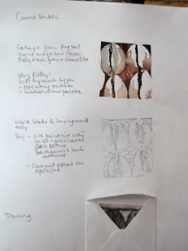
The first thing to do was to finger pleat the pink fabric. I didn't want to iron it, because that would affect the shapes of the lozenges too much. The idea is to make the lines straight, but have them curve due to the fabric manipulation.

This shows the pleats and the wax pattern before I put the lines of wax at the edges of the strips.


I put the wax in one strip only out of four because I would like it if the lips of the lozenges were pink on back and front. I don't know if this is going to work, especially with such unstiff fabric, another reason for this sampler.

I then painted the colours onto each piece using fabric paint. This one shows the black grey and white colour scheme, after the wax has been removed. At this point I realised that if you want white to show through when the wax is gone, you have to have a white piece of fabric!

The piece below shows the 'naturalistic' shell colour combination.


Another thing this sample reminded me is that I need to take more time and trouble over the wax at the edges of the painted sections to prevent running like this.


At this point the warmer colours look better to me. I suspect that the black/grey ones would be better off with white background, and with a paler pink. Or the bright coral red.


The next picture shows what this square looks like when I've sewn together the pink strips. On this side the running paint doesn't show, and the whole thing has something of what I was hoping for - contrast, emphasis of the lozenge shape, horizontals inside.

The lack of stiffness does not appear to be a problem with the fabric manipulation, and in fact is more appealing in a scarf.

The next photo on the right shows this same piece from the reverse side. Here the running paint is obvious and ruins the 'lips' effect at the edges.

 I didn't quite get the proportions right on the widths of the strips, as the lozenges don't hold themselves apart in the same way here as they do on the front.

The sample on the left is the equivalent in the black/grey/pink colour combination. This one is more in line with current fashion, and looks good in a 1950s way. It would look even better, I think, if the white was actually white, and the pink were a little paler.

So, the plan is to make a final sampler just like that. And big enough so I can hem the edges and see what will happen to the lozenges in wear. I also think it would be amusing and allow both sides to be on display, if I make this small scarf in the design with a slit in the middle.


I don't have a photo of the wax pattern or the flat painted fabric, but you can see that I did it in stripes, In order to ensure the paint did not run this time I ironed the white cotton fabric first into box pleats 2cm wide. This made a channel for the wax to run in, so it concentrated in the right place. I then painted the wax in horizontals using the pattern from the back of the cowrie. I used Pebeo setacolours mixed into a brown-black and grey/pearl for the pattern, and a very pale pink for the alternate stripes. I then cut the curved edge of the scarf. Then the smocking.

This shows the black/grey/ white side of the scarf in construction, before (left) and after hemming.

I sewed smocking stitches on the surface of the black/pearl side but on the other hand 1.5cm beneath the pink surface, in order to give a more rounded edge to the lozenges like the lips of the shell.

I deliberately made them next to each other rather than staggered, because the image of rows of cowries together appeals to me more, and has a more 1950s style than diagonal ones.

The hems are simple rolled hems which doesn't work very well with cotton of this thickness, especially after painting, but in the end I like the way it gives a curved 3 dimensional edge, and wonder whether in fact it might be good to allow a loose frill of this all the way along the finished scarf?

The final cowrie scarf sampler, pink side.
Now I really want to find out what happens when I do this in silk, but I don't have time to try before sending it in.

Design choices for the cowrie accessory

This is where I'm getting close to my deadline for this piece, and I have been having so much fun exploring that I haven't decided on a final piece yet. Of course I've had some ideas along the way but as usual find that if I plump for one too early it doesn't turn out so interesting.

These are two of my earlier ideas:


A coat with the front opening curved and emphasised in a similar way to the opening of a cowrie. The rest of the coat being dry pale cream with freckles like the sides of the cowrie. The collar curved round itself like the top of one of the shells, and edged with black. It seems to be necessary to have an asymmetrical hem.

This reflects colour palette and curved designs found in the couture collections.

I think I could manage the curved bodice but don't know how I would make the hem hang right!
This one is a purse design I thought up while doing the woven sample.

It would be a relatively simple matter to weave the back of this. The curved front would be more difficult to work out. A straight slit in the front could be the way into the purse, with a curved satin lining like the spiral inner of a shell itself.

Not quite sure if this would work in reality.

Both these early ideas are representing the whole shell.


Later in the exploration process I had some ideas relating to separate parts of the cowrie shell:

Collar - fabric manipulation
& applique of emphasis lines
Handbag. The severity of the lines and the
clip fastening seems to me to go well with the 'mid-century
modern' colour palette.
These two from the entrance shapes and emphasis. This does appeal to me and seems in some ways the most important aspect of the cowrie.


This collar idea was to emphasise the shape of a slim V collar using the shapes and colours of the back of the arabian cowrie shell. I visualise it in the brown/ yellow/ purplish blue colour palette on something light eg chiffon, rather than linen.

The use of batik to make the white resist markings appeals to me because it reflects the Ghanaian use of wax resist dying, and also the white lumps on the entrance of the cowrie.

This was my preferred option until recently, and I might make it one day.

But in the end I was sorry to lose the cowrie hide/reveal feeling that seems most important to me in a design sense.


Instead, I came up with the idea of making a scarf with the lozenge shaped openings on both sides, revealing a different colour.


Sketchbook design for reversible scarf  in ballpoint and designers gouache.
Trying out different colour palettes combinations of
pale pink/ coral red/ naturalistic/ black white and grey
The top is the front, and the bottom the appearance of the back.
This is the accessory I decided to go for. The red isn't quite right in this sketch - it needed to be more red and more intense. But anyway I decided to use the pink and try out the naturalistic/ black white and grey in small samples. I had some pale pink silk which I used for this, thinking that it may not take the fabric paint or the ironing of the wax as well as the white cotton I used before, so it would be a good idea to try it out before making the final sample.


Saturday 23 November 2013

Back of a shell batik


Arabian cowrie from the back


Looking back at what I've done so far, I saw again how beautiful the pattern on the back of some of these shells is, so I did a bit of work on that this week.

Of course this is the side that the creatures show to the world in real life so is camouflaged for being under water.

The colours are magical and there's a surprising amount of blue in them. You can't see them properly in this photo. And then there are these parallel lines and spots which are in white, pale blue and cream, and give the shell its very attractive pattern.

I wanted to try to make this pattern using a wax technique, partly because of what I learned about Ghanaian textiles earlier in this project.

I decided to have a go at batik for this.

The first thing was to make a colour palette, and then paint the lines and spots on with candle wax melted over hot water.


Batik using candle wax and
tranparent fabric paints.

I couldn't really see where I was putting the wax. I'm not sure what to do about that - perhaps use coloured wax? But there is then a risk that the colour will run onto the fabric.

Anyway, what I thought after doing this was that
1. The colours were too bright and needed to be browned or greyed down a bit.
2. The batik worked better than I expected, but the lines needed to be closer together to get the parallel lines impression.
3. The edges bled (of course) - so I needed to draw round the image competely to contain the paint.
4. I don't want a direct copy of the pattern, more something that gives a similar impression.
This is the page of my theme book with the final image on it.
I am very pleased with this and want to explore this technique more.


Thursday 21 November 2013

Weaving cowries

At this point it was obvious that printing wasn't going to get me the feel I was after, so I went back to the weaving idea.


This was my first thought - lots of entrances alongside each other. I sorted out a selection of yarns to do this with, but after a while it seemed to me that I did want the oval shape to be there.

Like the sketchbook image of knobbles only, it lost something without the 3Dness.
So this is the 'cartoon' I drew to direct my tapestry weaving try-out.
The purpose of the tryout was
1. To find out whether this idea of leaving slits works in tapestry-weaving
2. Whether the ovals should be on top of each other like that, or in another pattern
3. Discover the effects of particular yarns in the weaving, and the effects they have on each other.

What I found out from doing this:
1. I made the warp a little too close together for it to be completely covered as is usual in tapestry weaving. But I like the squared pattern it gives to the oval shapes, and might want to do the final sample that way too.

2. It was difficiult to get the slit to be symmetrical and even, and the edge is not smooth because of the yarns turning back on the edge. Does this matter?

3. Even trickier with different narrrow strips of yarns on the narrow edges of the slits. However, I think this worked well with the pale pink on the near edge, and the blue-grey emphasising the curve.

4. The weft becomes uneven when I pull it tight to make the slit open up a bit. This may be less obvious when there are several rows of ovals. Can I use this uneven quality?

5. Good contrast between silk and wool shininess on the right hand side. I noticed that I needed a slightly oranger version of the dark pink, and tried a couple of different ones out on the third oval. The grey is a good colour and dry texture. I tried out a bluer version but it didn't have the dryness, and didn't look right against the cream so I will be using the original grey - upholstery twine!

6. Even though it takes much longer I am much more confident experimenting with weaving than I am with printing.

7. Thought about whether the edge patterns should taper at the top and bottom, and decided that they should on the right but not on the left.

8. The ovals need to be  a little more extended at top and bottom as shells are not actually oval, and it emphasises the organic nature of it better.

9. I stopped at the third oval because it was obvious that this is going to work nicely, and I knew what I needed to know to make the sample. I put the beads and spots onto the third one at the end.

10. I prefer the way the unwoven warps look to the 'crocodle skin' I tried at the top. It goes better with the dry, seaside, bleached look of the rest of it.


So, that's as far as I've got while I haven't been blogging.
Next step - think about whether it is going to be a collar or a bag.


Cowrie entrances

I did some sketchbook work thinking about emphasising the patterns round  the entrance of cowrie shells. There are bright shiny hard 'teeth' that sometimes look like white lumps in a semi-regular row, and sometimes more like horizontal lines in a range of coral colours. They are more prominent on one side of the entrance than the other. They are closer to the edge of it on that side, and on the other there is a 'lip' of shinier, sometimes pink, smoothness between it and the entrance itself.

Here are some of my sketches exploring these things...


This one is of the knobbles only, on prepared sketch book paper.

It looks kind of interesting, but shows that there isn't enough context.


Collage on textured paper prepared by rubbing wax crayons against sisal rug.

The contrast was rather strong but it did get the 3D quality I was looking for.


This one was done with gouache, aiming to get the colours in the interesting colour palette from Georgio Armani A/W 2013. The mauve isn't quite lilac enugh, and the dark blue is just off too. The whole image doesn't really suit these colours!


I decided that I wanted to see if I could print a repeat pattern of these shapes, emphasising the white lumps around the entrances.


I used this photo tumblr_m7bldjN2x81ra81xco1_500.jpg
as a starting point...


Collage & tracings for printing
I traced a pattern and transferred it onto lino, cut it out and printed it onto white cotton:


This did emphasise the white lumps, but only by concentrating the printing paint around them. This wasn't really my intention, but I decided to go ahead and do the rest of the print to see what happened.

The image looked very like fruit with seeds in it - partly because of the more regular oval shape of the linocut. Something to consider if I go for this idea.


The grey patches were printed on using a compressed foam stamp cut according to the tracing.

The colour turned out quite a lot bluer than I expected. I used Paynes grey acrylic paint lightened with white.

The stamp was difficult to cut cleanly in detail.


This picture shows what happened when I used a different grey that I made up from combining indigo, velvet brown and white.

It does give more of an idea of the 'lips'.

Finally, I did another print using the same stamps but with more paint, to capture the regularity and linkedness in the original photo.


Cowrie Curves

I wanted to look a bit more at the curviness of the cowrie images, as there is something about that that particularly appeals to me. I found some images on the internet which seemed to me to relate to this....
Maryrose Watson | winner of Peter Collingwood trust fund award, 2011
from www.rugwweaver.com

This has something of the straight lines/ curved ovals contrast that appeals, as well as a subtle asymmetry and amazing innovation. 

By Ixchel Suarez from ixchel-tapestry weaver

This shows a visually interesting subversion of the usual parallel lines behind the pattern of a tapestry weave. The two of these together have certainly made me think about how I could express something of the cowrie feel in tapestry weaving. 

This is one of the ideas that came of it.
Barnacles, from pinterest Amy Thomas STW

I kept coming back to this amazing photo. It has the same quality of emphasising both the entrance to the shells and the curviness of the rest of them, but intensified by the colouring, directionality, and randomness.  This made me think that I should explore a bit more of the entrance patterns of cowries.

Starting the second sample - exploring cowries

After a work-enforced break, I am coming back to my blog to catch up with what I have been doing. My last entry was about the first sample for for assignment 1 of Textiles: Exploring Ideas, inspired by 13th and 14th century medieval images. The first sample was more of a conceptual piece, and the second one is supposed to be different. While I was doing the work on the first one, I kept coming back to, and noticing, images which are related to the cowrie shell ideas. I decided that I would go along with this for the second sample, especially as, since I had already extended my deadline, a bit of extra time from changing themes would be ok.

Arab cowrie
What appeals to me about them is:

The oval/ not oval shape - curved

The way the pattern emphasises the entrance, drawing the eye and curiosity inwards.

The contrast between the soft, curved, blurred shapes and the hard shininess

The fantastic pattern on the back of the arab cowrie

The slightly uncomfortable feeling that there might be something a bit too female about  the shape.
Tiger cowrieseashellsbymillhill.com

The colour palate - bluish white, coral/copper, palest pink, mahogony. I noticed when I first started collecting images of cowries that theres something rather stylishly 1950s about this colour palate, that asks for clean shapes and geometric patterns.

I wanted to try out some more repeat patterns this time, as I like the look of repeats often, but haven't done much work on them myself. Also because of the sketchbook work I did initially with cowries that led me into squares because of the calabash shaker image.


Sketchbook work:


I printed out some repeats of one of the cowrie photos I found online. I like the way this reflects the 1950s idea somehow, and the wood background is a good colour for this. Repeating it emphasises the spots and the entrance even more, and the 'teeth' shapes, which are also suprisingly regular and hard.

But the unchanging regularity of it is less appealing, rather deadening.


Earlier, I had found an appealing picture of lizard skin on pinterest. It had some of the same qualities as cowrie shells - the irregular oval shape, 3 dimensions, and lines in the middle of each oval. But each one was a slightly different shape with different proportions. This led to an emphasis on the similarities between them, and was more appealing.


I printed out some more of the original cowrie images, and played around with different arrangements of them.

The top one with alternate shells upside down, gave an attractive regular curvy line, and the whole thing lost the feminine feel, and the emphasis on the  pattern round the entrance to the shell.

I played around with various star shapes, but again, these didn't add anything.

I tried regular rows again, but this time against a background of straight lines. I used strips of gold tissue because it was the coppery colour which I thought could reflect the highlights in the spots. I like the way the contrast hightened the blue in the white shell, and the curvy 3D nature of the shells.


Monday 4 November 2013

Couture A/W 2013

I've been looking at the designer shows online and in magazines to get an idea of colours, textures, shapes, etc.
All the images here are from style.com.

Last season was all about black and white, with a lot of geometric patterns and contrasting strong warmred,  or rich mid-blue. What I see now are these themes:

Chloe Spring 2014
Ready to wear

Black, white and flesh pink:
Bouchrer Jarrar
Fall 2013 couture

There's a reason why this Bouchrer Jarrar design is first on the list -
the contrasts of colour, flow, and twisted shape
are all great ideas for a cowrie shell.

The DKNY colours include a bluish pale grey. I find this combination of strong and pastel interesting and different. And relevant.

It makes me want to try out some unusual combinations myself.

Phoebe English
Spring 2014
Ready to wear

DKNY pre-Fall 2014
The textures are a combination of cotton/ heavy, and chiffon/light.
Shapes are clean, still quite geometrical.


Black, white and bright orangey red

Akris collection

Christian Dior
Fall 2013
This one has an oddly more blue red in the hat. The dress itself is dark coral with lacy texture making it look even more coral like.

The Dior dress looks like a pumpkin witch for halloween it's so orange.

That seems to be the thing these all have in common - the strength of the red.

Miu Miu emphasised it even more by making it shiny.
Giambattista Valli
Fall 2013 couture
Miu Miu Spring 2013
Ulyanka Sergeenko
Fall 2013 couture


Rich pastels:


Electric Feathers
Spring 2014
Ready to wear
Giambattista Valli
Fall 2013 couture

Suddenly the flower colours are back - pretty and flowing.
Georgio Armani
Spring 2014
Image from fashionista.com


Soft-textured grey (and fleshpink):


Chanel Fall 2013
couture
I would like to try to
keep something of the
natural variation look
in the texture
Chanel Fall 2013
couture
This one has obvious
shell-like textures
Ulyana Seergeenko
Fall 2013 couture
Here is severe, dry, but
curved
Valentino Fall 2013
couture
The slits for sleeves have
something of the 'hidden/ revealed' quality of the cowrie


 Some relevant shapes which could be useful or inspiring:

Zuhair Murad
Ready to wear Spring 2014
Zuhair Marad
Spring 2014
Black embroidery on white

Atelier Versace
Fall 2013 couture
Attractive curve to the slit
Atelier Versace
Fall 2013 couture
Emphasised edges
draw the eye
Jean Paul Gaultier
Fall 2013 couture
False coat look
Maison Martin Margiela
Spring 2012
Shapes on the bodice
made with beads/
buttons
Maison Martin Margiela
Spring 2012
Printed shapes and coral
emphasis
Moncler Gamme Rouge
Spring 2014
Zip as hide/reveal