 |
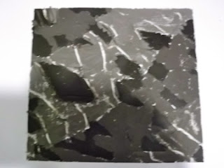
| Drawings of some of the 5x5cm composition samples I like them all, and hope to use some of them for future design work. |
I picked the dramatic diagonal black and white striped one to do some more work on. I enjoyed doing them all but this one appeals to me most because despite being high contrast and clear shapes there's something interesting to look at everywhere in the square.
I did 3 'drawings' trying out ways to represent the surface texture, colour, and shapes of this square.
When it came to the colour study I found it easier than I had expected, and discovered that it wasn't just black and white at all. And the changes in colour gave it more texture. Having said that, I'm not sure any of these showed the shapes or texture any better than my original charcoal representation above. Which of course isn't the point. I think the point is to make you look at the thing in the 3 ways we have studied, so that when you get to the final picture it takes all of them into account.
 |
| First representation attempting to emphasise the odd triangular shapes in the background, the strong white lines, and the broad diagonal lines. I used gouache paint and oil pastel. |
I also did a version in inks on damp paper. The paper wasn't really up to it, and tore in a couple of places, but the background texture was good. I made the white lines with masking tape and that worked well.
The collage version, below, came out better in some ways. It doesn't emphasise the diamond shapes so much, but it does show the white contrast lines better, and perhaps makes some reference to the more horizontal lines in the original.
 |
| Collage version of the same thing |
So, after this exercise, there was a similar one, but working from a group of real objects. I selected some colourful stones and shells and arranged them on purple paper. I looked at them in various ways, and through viewfinders of different sizes, but in the end went for a single shell.
 |
| Shell on purple paper |
The first quick drawing was a texture one, which was fun to do in gouache with the stripyness of the shell and the whorls of the worm casts added with the sharp end of the paintbrush.
The shapes were easy to pick, and represent with magazine collage, but then I realised that 'shapes' also related to the composition of the whole thing, and that this was rather boring.
 |
| My first two studies for the shell pictures |
So I selected part of the shell.
 |
| The section of shell I went with for this exercise |
Problem:
I was initially procrastinating a bit about this stage of the project because of having no confidence in my ability to produce anything worthwhile on paper. At one point I looked back at what I had done and felt very demoralised. Nothing I had produced for this stage seemed to be working. I wondered whether it was something to do with the examples I had chosen, and thought about starting again, perhaps using a coloured sample for the first section.
After a break, I realised that the style of the coursework for these exercises - several quick studies on one aspect - had led to my having a less focussed attitude to what I was doing, and I wasn't SEEING the way I needed to. As if I didn't have to look so intentionally if the study was only taking 10 minutes!
Once I spotted that it was easy to get into a different kind of consciousness about what I was doing, and I started seeing and filling in the details that make all the difference. And getting into the flow of it so I didn't want to stop at the end of the day.
I did the colour, and another shapes study (because the shapes were different), and then a few ones trying to focus on the things I found important ie the shape of the 'lips' of the shell, the texture of the pattern on the outside, and the worm casts inside, and the contrast between the shell and the background. And, as if that wasn't enough, the mysterious depths of shadow inside.
 |
| Three last drawings of the shell. |
I am pleased with the textures in the first, the colours and wormcasts in the middle, and the contrasts and simplicity in the third. All of them make you look to see inside. Not so impressed with the final shapes of any of them. I'm not sure it's obvious what they represent!
What have I learned from this? That I like strong contrasts. Drama. That there are colours in black and white as well. That I can do a whole load of different techniques in the same session and learn how to do them better and what they are good for. That gouache has to be diluted if you want to do wax resist with it. And to think about composition more carefully at the beginning. Ah, and that white pencil doesn't show up well on black paper - better to use paint.
Making a mental note to remember this - if something isn't working, it might be that I'm not focussing on it.
And finally, I'm so glad I asked for longer on this one. I want to get as much out of this course as I can squeeze!

No comments:
Post a Comment