I once 'got my colours done' by a lovely woman with House of Colour, and this is what she came up with: I am a summer which means that the natural colours of my body, eyes, hair etc are cool and muted (at least compared to pure colours). She then tried lots of actual coloured fabrics against my face, and came up with a hierarchy of which colours are best for me to wear.
You can see that my very best colours are all dark or bright, although not as dark as black or as bright as neon. They look darker and brighter on me than they would on a person with a 'winter' colour range.
So how does this professional analysis relate to the colours I have chosen myself? If Joseph Albers was right, I should be naturally choosing colours in the summer range.
Here are some of the things I have made to test out that idea:
Skin stole (detail) has a base of slightly nude pink, with marks in mid-pink and coral, all muted colours. But perhaps that's cheating as it's meant to be like skin and naturally I used mine as a base.

One the right is the outside and below the inside of a piece I made to express how different I feel inside and out. You might think that the outside appearance is more cool and clear, but in fact the pale blue is slightly greyed. The inside is also slightly muted and despite the hotness of the impression it gives it is actually a cool pink.
On the left is a cloak which has
 colours that are obviously outside
 the 'summer' range. But I made this
cloak to reflect the personality and colouring of one of my daughters, straying deliberately from my usual
colours.

This is a t-shirt I screen printed. At the time I was telling myself off for making it so grey-looking!
On the right is a rather unsuccessful drawing of a duck skeleton. Looking at it now it seems obvious that the colours
I chose were awkward and clashing because of being in different colour families, (among other problems.)
Hm. Interesting.
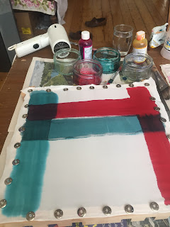
To explore this a little more, I decided to try to match each of the biggest colour patches using silk dye. And secondly to overlay them on the silk so I could see what kind of colours they make when mixed together.
Here are the first two colours. The red was easy - just a touch of yellow added to the magenta. The green a mixture of cyan and yellow. where they overlap they make the dark purple of the hanky. The actual green is more like the deeper one where the two green lines overlap.
As I want them to bleed into each other I haven't put any gutta on the silk, so the edges are irregular and it looks pretty messy. I was using a hairdryer to try to reduce spread.
Unfortunately there was one colour, the cornflower blue, that I can't mix using the three primaries and black which is all the silk dye I have. It ended up looking blue-grey and very watery, which mucked up the look of the square.
I do like the way the edge of the purple vertical line has run in a wiggly pattern a bit like fjords.
The final square against the light. It looks sort of like tartan, and making it has certainly reminded me that since I like creating fabrics myself it might be a fun exercise to repeat this square on a loom, using yarns of the best colours.
It is striking that it is made up almost entirely of medium-dark colours, with some brights, meaning that there's not a lot of contrast. I wonder what it would be like to put one or two of the paler of my body colours into this square? How would the contrast affect the way the other colours appear?
What I have learned from this colour exploration:
- Joseph Albers was probably right!
- I need to work out how to make cornflower blue
- These colours blend together beautifully, so if I stick to them my work will blend together too (and if I don't it will look awkward and jarring, like the duck skeleton)
- Some of the overlapping colours haven't mixed (see the vertical green row), presumably because they were dried out before the second was painted.
- These dyes are very radiant so don't look much different against the light.
What I could do next time:
- Try redoing this square with cornflower blue too. With gutta separating the colours, but sticking to the idea that where they overlap gives another good colour. That way I wouldn't have to use the hairdryer and the colours would have more chance of mixing well on the overlapping squares.
- Redo the square without gutta (which looks too white) with one or two of the palest colours from my palette. Or with the silver gutta I have which would fit into my palette.
- Experiment with a smaller selection of colours to find out how the colours interact with each other.
- Some of the colours are darker than I can make with a single application, and it would be good to have a record of all the colours in different degrees of intensity, so I could try out each colour in one, two, three etc layers.
- Try to replicate the fjord pattern.
- Repeat the exercise on my loom.
Ah! This might help to explain why I want to paint all the rooms in the house rather intense moody colours! (And why my 'winter' husband would rather they were all stark white).


No comments:
Post a Comment