Wednesday 28 November 2012

Reflection for Assignment 2


Student Number: christina510830


The coursework for this assignment took me through the basics of colour, composition, developing a design, and printing and painting on fabric. Looking back it seems extraordinary that I have become aware of so much I didn’t see before, in such a short time. 

The colour section revealed how much work I need to do to become competent at seeing and mixing colours accurately.  I have, during this part of the course, found some tricks which make it easier for me, (for example starting with white when it is a pale colour), but essentially it is a question of focus of attention, and of regular practice in my sketchbook. I now notice when there is an interesting colour combination, or the effect of restricted ranges of colours, and make up colourbags for these. 

The pattern section and the work I did on it in my sketchbook have changed for ever the way I see things. Around me I see more and more of the influence of density of pattern, colour, repetition and scale on the movement or power of images. I found the exercise choosing small sections of drawings particularly clarified this, because of taking the distracting ‘meaning’ out of the picture. 

The research point looking at a textile at home helped me to understand that such things intrinsically reflect the cultural mores of the maker, and the owner.  And my reading on art theory confirms that this is as true for fine art as it is for textile crafts. I have started a process of thinking about the relationships between fine art, craft, design and decoration with the help of reading from the booklist, internet, and museum visits. 

The section on developing a design taught me a process for working from drawings towards new ideas, which I found inspiring and rewarding in itself, and produced a wide variety of ideas for me.  And another process to help me think about texture, colour and composition and what is important to me in each image. I have done some of this work since then in my sketchbook, which confirms that this process clarifies the concept for me in a way I did not expect. I have some way to go before these two processes become automatic, (for example I did not think of doing it for my final ‘single image’ sample, to its detriment) but when I do translate these exercises into practice it makes a great difference, so I aim to do it routinely.

The final section on printing and painting involved more design development, and also learning and practicing a variety of techniques. I enjoyed the hands-on creativity of both these aspects, and developed in both during the exercises. One sample worked much better than the other, probably because I applied the processes of the previous exercise before starting it. In all the sections above I have found myself wanting to explore more as I moved on to the next one, but this last was the most inspiring for me. 

During Part 3, I intend to continue to apply these techniques regularly in my sketchbook so that I can make the most of the opportunity this course is giving me to improve what I make. 


Tuesday 27 November 2012

Project 5 Stage 4 - A larger sample

Looking at what I have done already:

I put out all the things I had printed during this section of the course, and thought about what I wanted to make the larger sample with.

I like the 'daisy' pattern, with it's background/ flower centres made with bubble wrap. It was freer than some of the others, and could be joyful with the right combinations of colours and fabric. I am also drawn to the slightly twisted formality of the pale green spikes in strict squares, so could do something to enhance that concept in some way. I really enjoyed printing with the relief stamps in various combinations, and feel rather proud of how good the linocut conker cases look when printed, so I could explore those more. I also enjoyed using small stencils to make shapes of uncoloured background. The foam stamps, circular relief stamps, and eyes didn't work so well, possibly because they weren't so interesting or versatile in design terms.


A series of ideas for the larger sample:


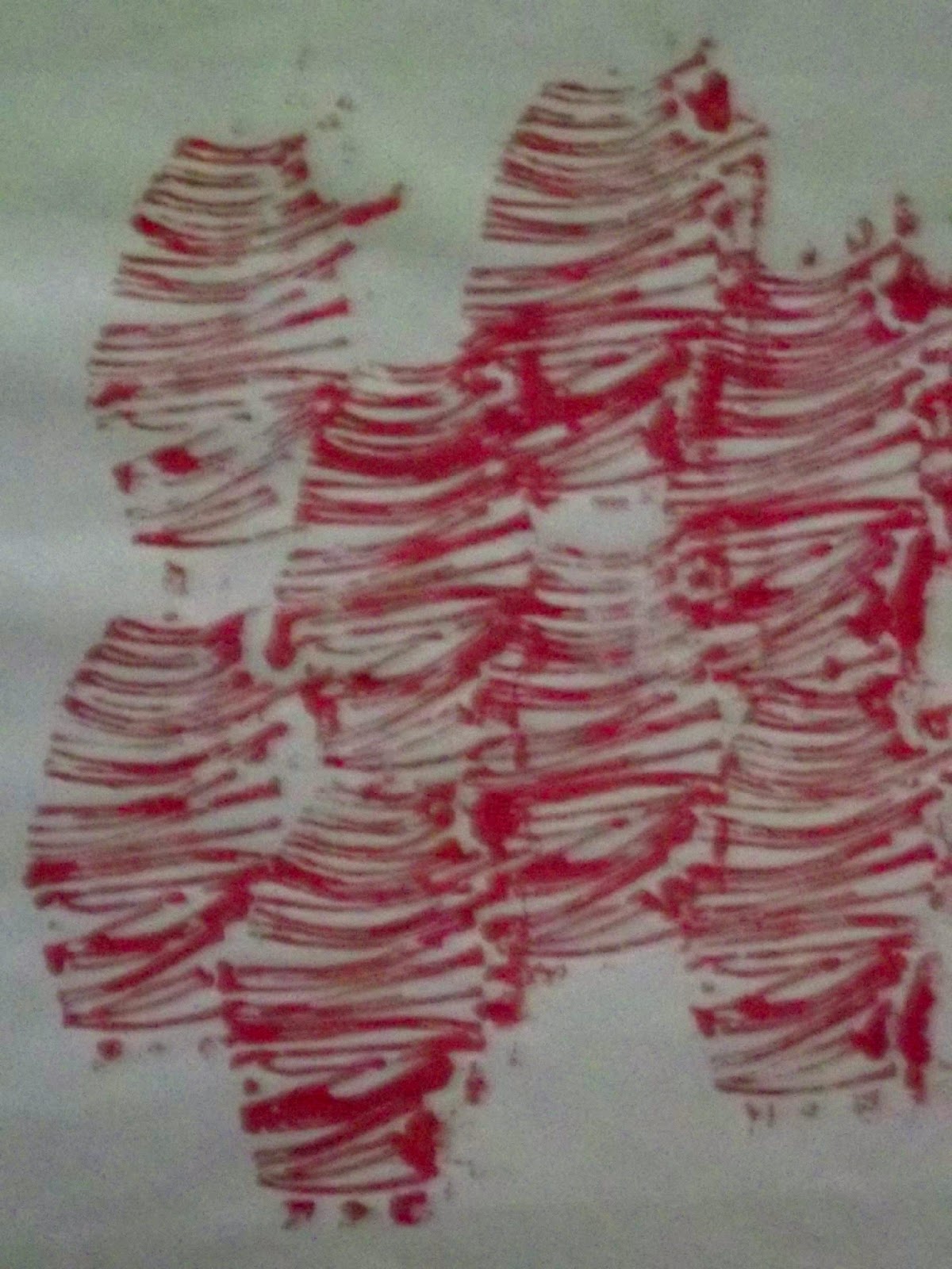
A very bad photo of my sketchbook page of ideas for the non-repeating sample

My ideas included a pretty 'wallpaper' of daisies with a large iris looking through a 'tear'; Reptile skin-like overlapping block printed shapes, with an eye coming through; a conker case on a background of spikes, with a pupil peeking out from inside; a formal repeated pattern of irises alternating with a curved diamond shape for the negative space...etc. I was liking my pupil stencils when I drew these!

I abandoned them all when I did a small version of the pupil on a silver background reflecting the texture of the fabric it was on. The pupil turned out quite deep adn glowing, as I had hoped, but it didn't really look right without the rest of the eye, and I decided to go with a more abstract image.

An only slightly better photo of some ideas for the repeating pattern.
The top left is the static repeat of the conker case, The middle one is a series of daisies using bubble wrap for the centres, and relief print for the petals, on a swirly background of bright Markal paint sticks. The next one is the relief 'leaf' shape, using stencils to highlight some of them in an abstract pattern, but generally making the most of the interesting wormcast look of them when they are close together in strings. The last was a general idea of using the same relief stamps but in two directions and metallic paints.
The magazine cutting was to show the pale yellow, blue and rust colours I wanted for the background of the conker case idea. Attached is the fabric I tried out different colours of the linocut on.

Repeating Sample:
I chose to go with the larger version of my conker case print for the larger repeating sample.

I wanted it to look autumnal, and to make you wonder what was inside. I thought that making an interesting texture in the background while leaving the centres of the prints untouched would do this best.

The fabric needed to be quite fine to allow the delicate lines of the linocut to come across clearly.

And I needed to pay attention to making the stencils out of robust material and to getting them the right way round.

Once I had chosen the dark green fine cotton for the fabric, I found a magazine advertisement with lovely rust colours on it to copy for the background texture and the outer background of the case.

First I taped it down to my printing pad.
Then I cut out 12 circles of sticky backed plastic so that the background texture
would not get onto the 'negative' space in the centre of the conkers.
Then I mixed up a lot of the pale yellow in the rust, to roller onto the background.

Once I had finished the three colours on the background, I removed the circles
of sticky-backed plastic and waited for it to dry.
I made a stencil out of thin but strong card, and drew a line to ensure that the inner
and outer parts of the stencil would correspond in the same way each time.

I used a stiff square-ended brush to stipple the paint onto the area revealed by the stencil.
I repeated this with a different colour for the inner circle of the case.

The final layer was the addition of the linocut print in a paler colour.
I had initially thought I would do it in dark brown, but did
a test on a scrap piece of the same fabric and found that it did not
show up well, so decided on pale green in the end.
What I learned from doing this sample:
1. Doing a couple of pages of ideas in my sketchbook meant that I quickly worked out what would work, and also what I liked enough to think in more detail about even at that stage. Obviously there are some things that work in pencil and paper that may not work so well in the end, so some try outs are needed before moving on to the big sample.
2. Doing some colour tries on the fabric I'm going to use is important to make sure the combinations really act the way I expect them to. As it was I discovered that the colours look much clearer and brighter on the back of the sample, presumably because they were not subdued by the relative lack of contrast with the background treatment.
3. I like the way the stripes of different colours look on the masking tape. A bit like the colours on the selvage of industrially printed fabric. It makes me want to use that in a piece of fabric that i have painted - a bit like tartan with the contributing colours coming out in various different stripes.
4. Because of the detailed linocut print going on top, I didn't need to be so careful about the stencilling. I could probably have done it all much more quickly with a block print (if only I knew where to find the right stuff to make it out of). I will ask my tutor about this today.
5.  I love these colours. I have made a colour bag with them. The rust, dark blue, forest green and mauve go remarkably well together.
6. In this sample the horizontal stripes made by the roller on the background contrasts with the circular shapes. The insubstantial pattern of the background contrasts with the delicate tracery of the linocut pattern, and I think this produces an interesting tension. The colour of the linocut contrasts with the darker richer colour of the rest of it. Those richer colours harmonise with each other. I don't think that the contrast between inside and outside the conker cases is as obvious as I had hoped.

A Single Unit Piece
For this sample I chose to go with the relief 'leaf' print idea, but to use colour as well as the stencils and proximity effects for areas of interest and movement.  I realised that it was going to be a dance of leaves, so I went with the seasonal autumn colours again, this time less subdued and more joyful. There is a brittleness to leaves in the autumn, and I wanted to reflect that in the fabric, so I chose a rather stiff but translucent organdie in pale yellow.

Once it was fixed to the printing pad I drew a dancing pattern, influenced by a Japanese painting of a dancing woman with a fan. Then I cut stencils of masking tape in the shape of combs/ half leaves and placed them at the key edges of the shape I had drawn.

Then I dampened the fabric and sponged it with paint in pale shades of yellow and orange.

Once that had dried I began relief printing with various leaf colours. I made the prints close together and therefore highly textured at the edges, and brighter and further apart in the inner part.

Compared to the planning I had done for the repeat sample, I was making most of the decisions about placement and colour as I went along.

Dancing leaves sample.


What I learned from doing this sample:
1. I found that the acrylic paint stuck rather thickly to this fabric, so it is palpable, took a long time to dry, and stuck to the iron a little.
2. This sample shows me that I need to think more about colour when I am planning to make things. I still don't have a lot of confidence in using colour, and this is generally the last thing I think about when I'm doing a drawing in my sketchbook. The first sample worked better because I had found something to copy the colours from. Which makes the colour bags a very good idea! And next time I need to remember to do the 3 part study bit of the designing consciously so that I don't miss colour out.
3. In general, I didn't know if I'd have time to do any more than the first larger sample, so I didn't plan this one so thoroughly. And this is what the result is...that it just isn't so effective. I believe that this is at least in part because while there is contrast there is no harmony bringing it all together.
4. Although the yellow fabric is lovely to touch, and makes me think of delicate fragile things, it doesn't go with the heavy printing and wide range of intenisites and tones of colours. It would have been better to try out several different kinds of fabric before starting.
5. I still think this is a good selection of source material for a design. But I think I have yet to use it in a way which makes the most of what i think of as the wormcast texture. Perhaps I should have used a heavier weave and strong colours.
6. In addition, perhaps with this fine fabric a smaller pattern would have been more appropriate.


Saturday 24 November 2012

Project 5 again - trying out more techniques and ideas

I have done some more experimentation with printing today.

Conker case

Drawings of conker cases from my sketchbook

I did these sketches some time ago, of the cases of unripe horse chestnuts that I found in the road. I liked the way the case was so spikey and thick and there was an intriguing inside which you couldn't quite see.

Since my first attempt to linocut the sharp bits, which didn't work so well, I have tried out other linocuts, and discovered some of the trick to it. 

I decided to have another go, but this time using the outside of the bottom drawing, combined with the inside of the middle right one, as I thought that would better give the idea of the hidden inside.


Linocut of conker case
I thought this was a bit ambitious and would be rather tedious to do the cutting, but in fact, I loved it. I had been missing doing the craft part of textiles during these exercises in drawing and printing, and I think the physicality and precision of making the linocut appealed to the same senses.
Linocut on sketchbook paper
I delighted at the way it looked when I printed it. - a bit like one of those toile de jouy prints in the delicate and detailed monochrome lines. And the differences between each impression were charming. 

When I printed a few together on organza, it looked soft, bulging and mysterious, slightly uncomfortable.

This does appeal to me, but I need to think a bit more about materials and colours to bring out these aspects of it.


Linocut on organza


I wanted to try out some background colours to see how they worked with this linocut on top.

My first thought was that I hadn't tried on damp fabric yet, so that was my next attempt.
 This turned out to be interesting but blurry.
Background colours on damp fabric


I then tried going the background with Markal paint sticks, which worked a bit better with the rather rococo look of the print.

I did a series of these next to each other. The image is essentially static, and the arrangement static.

For both of these I was using stencils made out of sticky backed plastic, but this was not robust enough to use with these materials and the detail was lost.


Conker case markal paint sticks and linocut prints on calico.
Once I was most of the way through I realised that the strange appearance of the central lines was not due to poor accuracy with the lino, but to my having used the stencils upside down.

Background texture
Silver Pebeo textile paint directly from
the roller onto black cotton
The course instructions suggested reflecting the texture of the fabric.

While using the roller with the lino, I saw that the paint was drawn into unexpectedly delicate lines under the roller. I tried monoprinting with it, but it didn't really come out. So I tried rolling directly onto the fabric when there was very little paint left on the roller. This led to a lovely texture.


As above, only in 2 directions


Rolling in two directions gave an even more woven look. It was interesting that in this case it also made squares like this.


More experiments with a roller

This was what happened when I did the same on Indian shiny fabric, using a layer of toned down ultramarine, and then gold.

I like the depth of this combination.

I think I want to try out more ways to add layers to a piece of fabric, and how it changes the look.


I liked this silver on black so much I made it into a clutch bag.

Block and relief prints

Collage of arches
Before moving onto the sampler section, I thought I should have another go at block printing, because I hadn't really found a material that had worked well for me in the previous section. I bought some foam from an art shop which I was told would be suitable, and made a block from one of my experiments in the design exercise.

I cut out the foam and stuck it onto a piece of stiff card, and used that to print.


Red acrylic arch stamps on cotton voile


Unfortunately the next time I printed with this block, the top layer of the block came off onto the paper.
The marks in the middle are made with Markal paintsticks with the colours smudged with water.

So, it turns out that this foam is not useful for block printing after all. I have looked on other blogs and found that other students have used large rubbers, but again I have not managed to find any large enough. I will have to ask my tutor what to use, but will not have time to try out something new before my assignment is due in.


This is what the roller does after having gone over the arch block.
This could give an interesting background to something.


Sunday 18 November 2012

The Textile Book - art, craft, or design?

The Textile Book by Colin Gale and Jasbir Kaur pub 2002 Berg


Reading further on in this very ambitious book, I have reached a series of chapters about the different types of textile worker. Well, some of them anyway. The chapters are entitled The textile designer, The Designer-Maker, and The Textile Artist. I found this slightly annoying as the repeated thesis of this book is that such distinctions are more about the market than the practice of textiles.

Having said this, it was useful to have some distinctions drawn, if only to contradict them. So it seems that a professional textile designer, has most of their work being driven by a fairly strict brief, and while they can be freelance, they are often employed by an organisation to do this job. And that some organisations train their textile designers in the house style. I was interested to find out that Liberty designers are trained in botanical drawing. It sounds as though there is limited scope for individuality here.

The book goes on to say, and give some interesting examples, that someone starting as a textile designer can go on to apply their design skills to other areas, and that this can lead to the separation of the design process from the making process, for profit reasons.

Designer- Makers appear to be largely from the affluent West, are more often motivated by the physical sensations of making, and the mastery of their craft. They tend to sell their produce to specialist markets or as luxury goods. This description did make me wonder about the skilled craftsmen and women of non-Western cultures. Presumably they are driven by similar satisfactions and their produce is appreciated by people with disposible income in their own countries. I do not really understand why there is a difference between this and US/ European craftspeople.

Finally, the textile artists. What this book says about this agrees with my impression that there is not yet a clear idea of what this actually means. There was some discussion as to whether it 'should' mean the equivalent of fine artist, or whether, since textiles have something particular about them, the wish to be accepted as a fine art is in fact a wish to limit ones practice to someone else's rules. Perhaps for culturally elitist reasons. I suppose that since anyone can call themselves a textile artist, it will eventually mean the group of people who wish to do so. The book rather reassuringly went on to say that since most fine art, and most textile art, is in the 'low to middle' art section of the market, such distinctions are somewhat moot.

I don't know quite where I stand on this. I deliberately chose to do this particular textile course because it resembled a fine art foundation course, rather than the craft-based courses which predominate. I wanted (and definitely still want) to find out what twisted path my creativity will take me on, rather than learning to more accurately produce a particular style or technique. Believing that what I make expresses something about me that may not be expressible in any other way. Or may be most effecively communicated in this way. Even that I may learn something about the inner me by seeing what 'comes out'. The emphasis, therefore is much more on ideas (concepts I suppose) and following subjectivity than on technique or even the finished product. This is not something that can be coded for and done by someone else. And while I am in awe of master craftsmen of many kinds, and I am attracted to the physical qualities of textures, fabrics and yarns, I do not see myself dedicating myself to mastering a craft. Unless, of course, that turns out to be a necessary step in my journey to express my inner truth!

So, it looks as though I fit best in the textile artist definition, at least at this early stage in my creative development. Although of course I have a great deal of learning to do before I can really call myself that! But having said that, I do feel uncomfortable with the Cinderella Art model of textile art. That if only the fine art establishment looked this way without prejudice they would see how fine we are. I am guessing that if we are really 'fine artists' then we will not restrict ourselves to textiles only. Because what we are doing is not 'Textiles', it is 'Ideas'.

After getting this far in The Textile Book, I thought for a while in my sketchbook about how the use of textiles as a medium can carry a message in itself. And I suspect that this is a much bigger subject than I have understood yet. More surfing for textile artists required I think...


Surfing for textile art

I spent a session looking for textile art on the web today, and these are links to some of the things I found most interesting.

Julieanne Long at Prism Textile Art

These strangely coloured shapes appeal to the part of me that is intrigued by vessels that hide things inside. They look like nests, mussels, something shaped to protect vulnerable creatures from the harshness of nature. I love these shapes. I wouldn't have thought to do them in black and red shiny strips, but it works.

Marilyn Carter at Prism

These lovely regular translucent rectangles lulled me into a feeling of beauty and comfort and then I saw there were bank notes. And it was much more complex and interesting than I had at first thought.

Catherine Dormor at Prism

These are full of open weaves and curves. The colour's like straw or raffia. It's difficult to see from the photo how 3D it really is, or is it all an illusion?

Prinkie Roberts Reflection II 2009

This series of nude women in layered fabrics and long stitches in various colours really appeal to me. I think the strong colours and relative lack of pattern in the figures lend power to their poses. The background and stitching gives interest and texture. I would like to try a stitched nude myself.

Wednesday 14 November 2012

More project 5 - experiments on paper and fabric

Making foam stamps and relief stamps for printing


Seaweed
The 'seaweed' idea I was exploring in print
during this stage
I wanted to try making a stamp to print the seaweed shapes from the previous stage. I liked the way the curved stem gave a strong but interesting vertical, and this contrasted with the movement of the horizontal fronds.

I hadn't been able to find any high density foam so I tried making them from a baby sponge, stuck onto an off-cut of wood.

Foam stamps, and superimposed
string relief in the bottom right.


The foam picked up too much paint in some places, and too little in others. This gave an interesting 3D curved look to them, and might be useful to produce something else in future, but that wasn't really what I was hoping for. And the fronds didn't separate out, or have any movement to them.

So I stuck some thin upholstery twine in curved lines to a piece of cardboard, using PVA. I let the string take it's natural curve rather than trying to impose a shape on it, to see what it would look like. I  printed the fronds with that in a contrasting colour. There was much more detail, and much easier to print. The edges of the cardboard started getting printed too, so I cut them off. I decided that rather than persevere with the foam stamps I would try making a layer of these string fronds.


I liked this - there's something intriguing about the curved lines in different intensities of colour. Again it looks as if it is in relief - like mummy fingers or something wrapped up.


I did it again, but this time with the lines staggered so as to have no space between the shapes.


I like this one even more. It reminds me of worm casts and organ pipes but more organic and strong. It would make an interesting background for something I think, or perhaps something in its own right if I could put in some shadows or highlights in interesting colours. Or if I could bend it a bit, it could make the whole thing look curved and lumpy. Rather like those Geiger alien architectures.


I then tried out what this relief stamp would look like superimposed on itself in different directions. First in red, and then in two colours.


I think these are both potentially interesting things, the one in two colours especially.


While I was trying out printing on a variety of different kinds of paper, I saw that wrinkles or folds in the paper made discontinuities in the pattern which I thought might be worth exploring.


So I tried folding a piece of paper in various ways and then printing with this stamp on it. It doesn't look much but I like the idea of using folding in this way, and I think I will be trying more of this in future.


Japanese circles

When I was doing the pattern section of this course I copied a Japanese painting in my sketchbook, to try to learn what it was about the lines that made it so like a dance. And then I tried doing the same but with colour.

Charcoal copy of 'Woman Dancer
with a Fan and Wand'
from the Museum of Modern Art NY 
Using colour to make
the movement


I noticed that some of the movement was due to the swirly circles at the bottom of the skirts, so I tried using just the circles to make the movement. 


I wondered whether I could print these circles,
and see what happened when I tried it.

I made a relief stamp with a
thicker kind of string
It was clearest on standard computer
printing paper (yellow), and most blurred
on white tissue (below)
stuck onto cardboard.


I used it on various different kinds of paper. I was surprised how the kind of paper didn't seem to make any difference to what this stamp looked like, even though it made a big difference to others eg the foam seaweed stamp, and the linocut.


Printed on pulp hand-made paper
using pebeo fabric paints.
The linocut doesn't show in this photo
but in fact came out very well, showing all
the detail, on this paper.


The seaweed foam stamp has its 3D look on all these papers, accentuated by the fact that I hadn't washed the red paint off completely and some of it came out in speckles under the yellow for these prints.

I liked this effect and I think I will try to use it deliberately at some point.

By this time I was thinking I should try making a carpet of these circles to see where it led me.


Japanese circles, seaweed foam and seaweed relief
printed on dark green linen with an irregular weave.
Printed with acrylic paints.
While this looks good on the textured background given by the fabric and the seaweed relief print, I think there is not much more potential from this Japanese circle stamp. I do love the movement of the original dancing woman, though, and I can see the idea of her coming into other things.

Something I learned from doing this was how much the surface you are printing on effects the result. (See how badly the seaweed foam stamp came out on the dark fabric above.) So it's always important to make a test print or two.


Iris

In my sketchbook recently I did a drawing of the iris of my eye, because it is intriguing visually, with lots of layers, glowing intensity, reflections and dark lines, as well as having a large number of potential meanings.
The iris of my eye, drawing in charcoal, pencil, oil pastel, and a stencil of the reflections.
When I was drawing the charcoal and pencil one, I was struck by how many different layers there were, even in a black and white drawing like that. Making the stencil, I was surprised how sharp and geometrical the reflections were.

I've put a big version of this because I love the way it glows.
The colours are oil pastels in layers on black paper,
and the lines are scratches made with the end of a paintbrush. 


I stencilled the reflections in pale blue pebeo texile paint onto more black paper.  I got some advice about how to make the shapes sharp and stop the paint from getting under the edges of the stencil from 'Printing by Hand' by Lena Corwin, published by Stewart,Tabori & Chang 2008.

I'm not sure about the shape of the whole thing, but the reflections came out very well, making the flat paper look as if it's made of a lump of jellified oil. The paint should have had more green in it.

I then moved on to the black rays out from the centre, and decided that string relief would work. I wound string round a large and a smaller doughnut shape of cardboard and then used it to print some patterns. I used acrylic paint with textile medium for all the following.


This pattern gives some regular negative shapes.
I thought the semicircles might build into something like
a landscape but it was too regular for that. 


This was made on the matt side of brown envelope paper
with two layers of the smaller relief stamp in different intensities of red.
This looked better to me, almost like sea anemones or seeds
down a microscope. I like the way one colour takes over
from the other on different sides of the image. 
Printed on white poplin. I used various different colours of paint of similar intensity for all the small circles, but you can't tell that in this photo. The larger circles are centred around red circles printed using bubble wrap. The pattern on the left is pretty and fairly regular. The one on the right is more organic looking and spikey. I like the way the bubbles underneath make it look under water. I was pleased that the two circles overlap as intended at their intersection giving a darker circle like I have in my iris. 
Printed on almost transparent yellow organza. You can see a couple of pages of Vogue underneath keeping my printing pad clean. (This was taken before I realised that a hard surface is better for stencils!).
This time I tried to print several layers together - both circles of 'rays' and also stencil the black parts of the iris on top.
I used pinks for the black parts. Perhaps the pale pink inner circle didn't work so well.
You can see the stencil card on the bottom right. 


This is the same iris with the reflection stencil added in yellow.
I put white paper under the fabric,
but sadly the background still hasn't come out
as the lovely pale yellow it is in real life.
You will have spotted that I accidentally reversed this image
through not thinking it through properly when I made the
relief stamps. The stencils are of course reversible.

For this one I did the reflection stencil in complementary purple.
I must have put it in the wrong place because
one of the reflections is outside the ring of rays. Anyway it makes
a lot more sense for the reflections to be light in colour,
Once again, I started this exercise wondering if I could do it, not least because I haven't been successful in finding suitable foam for the printing pad or for making stamps, and because my attempts to print linocuts have so far been rather pathetic. But yet again, once I got into this exercise I got carried away by the exciting exploration of it all, and not only gained confidence but found out how to do things along the way.

So far it seems to be a matter of being ridiculously ambitious and getting help from books and the internet when needed. I thought I would have to ask my tutor for lots of advice about the fundamentals, but so far that has not been necessary. I made a printing pad out of an old square tile, some blanket, and a thick plastic shopping bag. I have even found a supply of high density foam this week (Cowling & Wilcox Ltd, Camberwell).

I was initially worried that I didn't know what I was supposed to produce at the end of these exercises.  But once I settled into it, it became obvious which drawings and ideas appealed to me, so I just got on with working with those, without worrying too much about what was going to come of it in the end. And obviously this has led to a whole lot of new ideas and techniques and combinations of things for my sketchbook.

And the other result of this is that yet again I wish I had a month or so to explore these things more, and see where they take me, but I don't, I have till the end of November to complete this section. Reminding me that this is the introductory course to build up a source book and a way of working to take with me into other courses.

Friday 9 November 2012

Project 5 Experiments with printing and painting

Stage 2
Experimenting with techniques

I've been thinking I want to make an artist's stamp to mark my sketchbook and course work with my student number, so I used that for my first try at lino cutting. I researched artists' stamps on the internet, chose my 'font' and transferred my design with tracing paper. I was pleased that cutting it out seemed easier (and somehow less dangerous) than I remembered from school. Initially I tried using my water-soluble ink, thinking that printing is usually done with ink, but it didn't work at all as the ink didn't seem to stick to the lino at all. I suspect this is because it is water-based.

I tried gouache, which was better, but it seemed to either clog up the grooves or not cover the lino enough. The way it looked reminded me of wood cut prints I had seen in the past eg William Blake's illustrations.

I began to think that I had made a mistake choosing to print letters in this way, as the natural irregularity of the print meant that the letters and numbers were very inconsistently printed. Fabric paint worked best of the three. It became clear that the lino needed to be cleaned out between prints, and that the question of how much paint to use was very important to the final result. And that the depth of the cuts also makes a big difference to the final result. But that in some ways having letters and numbers meant that these issues were made obvious with my first try (ie a good thing).

Getting carried away by the success of this, I did another lino cut, this time of a section of conker case I had drawn in my sketchbook back before they had all gone hard and brown. I printed this onto calico in a block of squares without gaps. Then another with rotations of the block.


Conker linocut 1

Conker linocut 2
You can see the stripes of green where i put the paint on with a thin paintbrush.

Obviously the pattern isn't showing very well. Next time I will chose one which 'tiles' better.

Perhaps even try it out on the computer first to see what it will look like before cutting the lino.


This one, with a rotating block, gives a white diamond shape at the corner of 4 blocks.

Although this first attempt shows that I need to pick and chose the image better, and get some more skill at the printing itself, I'm starting to see the potential of block printing to do interesting things.

After this one, I tried out what would happen if I overprinted with just the hooks painted in a different colour...


Conker linocut 3

This looks more interesting. I like the sharp dark red hooks, and the contrast between that and the vague greenery background.

I was surprised at how well the hood details came out after my difficulties with seeing the detail of the block as a whole. Not sure why that is other than that there is less detail, and the colour is more intense. Something to work out by further experiment.


Conker linocut 4


This is what it looked like when I printed only the hooks and the curve of the outline.

I like the way that rotating the block makes a shape which could be the conker in its entirety. And that this shape could be repeated regularly to make an all over pattern.


Finally, I tried a more random and closer pattern of blocks in two different colours. 

It looks more textured, lumpy even, or like boiling or an explosion.


More printing experiments to follow.


Looking on the net for information and inspiration, I found this very appealing website:

http://thetextileblog.blogspot.co.uk/search?updated-max=2012-09-28T17:38:00%2B01:00&max-results=7&start=2&by-date=false

The phrase (from that blog) 'creativity creates its own journey irrespective of whether you are twenty or seventy' appeals to me, starting my creative experiments as others of my age are anticipating the inevitable decline.