Showing posts with label Part 1 Feeling Memory and Imagination. Show all posts

Thursday, 21 May 2015

Thinking about animals

I took some photos of the fish in my kitchen fishtank, so I could see if they would be an interesting enough subject for drawing.


These ones are quite striking because of the big wires in the background. It's an interesting design feature, but detracts rather from the fish I think.

The orange of the fins is strong, and almost looks as if it's not attached to the body.


The colours of this fish are much more subtle, which goes nicely with the more feathery weed.

I tried to photograph it in various different angles to see if I could capture the movement and think about how I would draw this fish.


Friday, 17 April 2015

Pets and other animals Project 5 Exercise 1, and some preparatory work for Exercise 3

Exercise 1: Animal line study

First off, I don't have any pets other than small tropical fish, so I went to the park.
The ducks looked good to me, particularly the texture of the female mallard feathers, and the sinuous shapes of the necks.


There are the feathers I mean, and the contrast between the strong textural feel of them, and the clear contrasting shapes and colours and intensity of the blue stripes.


The male colours may be more striking because of their iridescence, but I find them less interesting myself. I like the texture of the females.


This little guy has some strong shapes and contrasts himself.

I like the way the variation in tone in the background gives away the direction of movement.


The texture of the legs is really different, and characteristic.
I enjoyed drawing them.


This Canada goose has texture, strong shape and contrast, and even a nice strong shadow to make him look more 3D.

See how the pattern in the water and the pattern on the back reflect each other.

Drawing this made me want to do a watercolour pencil study of the back of a female mallard.
There were a few drops of rain while I was doing this so got a bit messy...

It was more difficult than I thought to capture the pattern of the feathers,
especially while the duck moved! I found it worked better to represent the way it looked
when I didn't try to be so detailed, but was more loose with my movements.
So I picked one that was asleep and used a fine marker instead.


After expecting to use ducks for exercise 1, there were a couple of weeks when events and the weather conspired to keep me from the park. So I had a go at drawing the fish moving instead...


Once I got used to it, I found it much easier than I expected to draw moving fish. You just have to not be in a hurry, and the fish will come back to the position they were in. Doing this showed me how they came back into their characteristic shapes repeatedly, and also that some 'fish shapes' that I see regularly are actually more symbolic than realistic. Also helped me understand why some of those Japanese cod drawings are so great - they really capture the flow and shapes of real fish.


Fish in tank
Pastels on coloured paper
Fish with background
Graphite

I did some sketches of the fish with some background details.

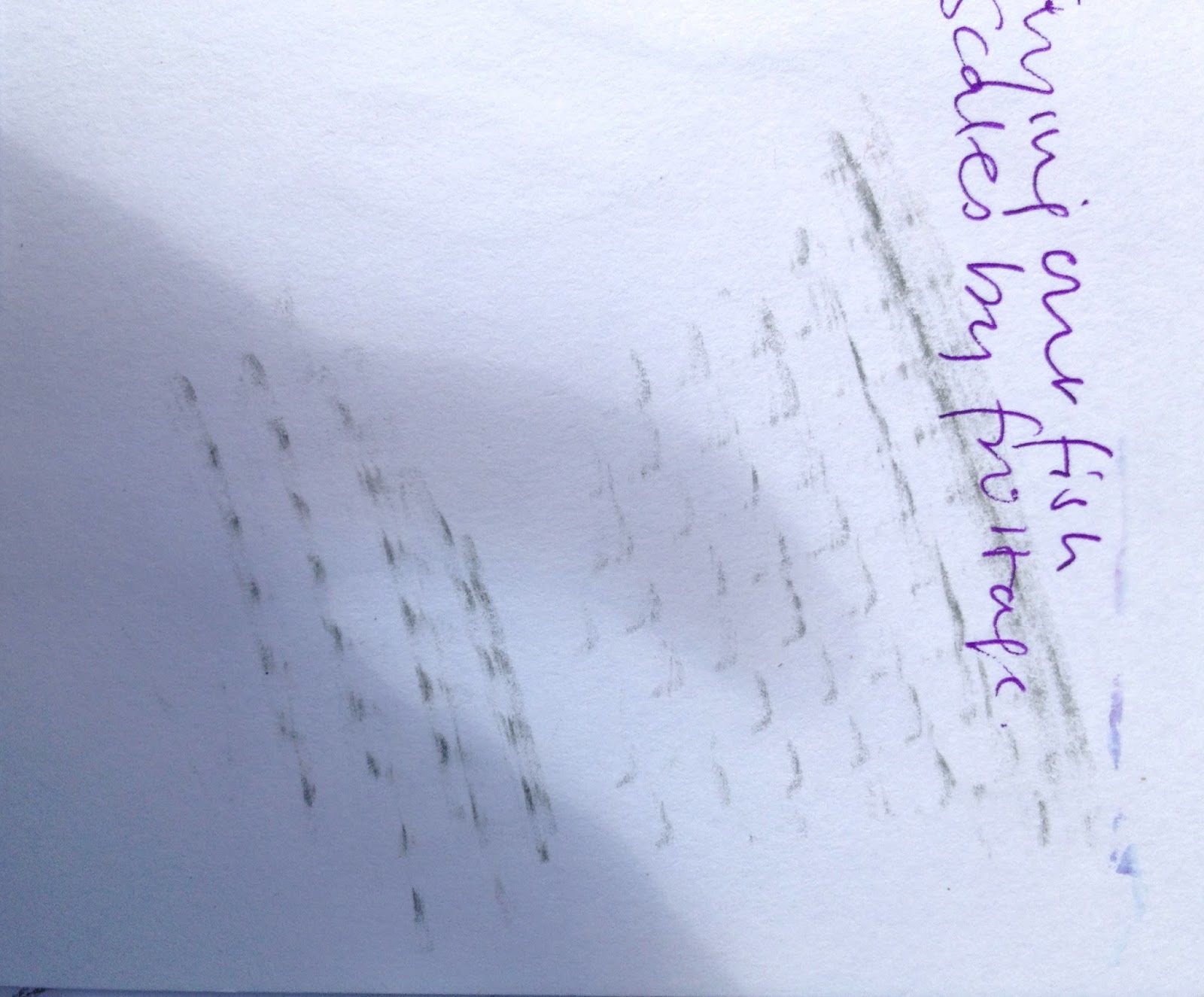
It is difficult to capture the presence of the water. I tried to do it by using coloured paper. Pastels were not delicate enough.


Scales/ texture frottage 
Fish with weed
Sharpie
This one has more of the delicate quality of the little moving fish, and the strands of weed they are moving through. I think there is a lot more I could do to make the background work better. 

The drawings below are a series of sketches of different ideas I had for the final moving fish piece.

Initially I thought that a vertical oblong would be good, reflecting the subject being so common in Japanese and Chinese art and often in that shape.


My sketches for moving animal study

I also noticed that one of the fish (the blue one) spends a lot of time staring out through the glass, and it is an unusual shape and looks rather grumpy head on, so thought it would be a nice subject just on its own. Perhaps amusing in a way (although not much movement!)

Then I noticed how the tank looked when the sun shone on it strongly from the side, casting fish shadows which are shorter than the fish on the wall behind. It looked interesting and could make a good drawing.

Finally, in my textiles sketchbook I had drawn a sketch of the regular rhythm/ pattern the black shapes make when the little fish all align as they like to do, and imagined some things I could do with this in textile. I realised that there is nothing to say I couldn't do that for the drawing as well. In fact, in order to make the textile, it would make sense to do a drawing first, before trying out textile samples.


My textile ideas sketchbook, showing approximately regular patterns of the black shapes of harlequin fish in a shoal, and my ideas about how to use it to design a textile.
The background is only touched in, in the form of a broken line of green for the weed.


Thursday, 9 April 2015

Reflecting on the course so far

I have been thinking about how I have been working on this course (or not, as for the last few weeks). I have stalled in the middle of sketching my fish. I think I have got caught up in the idea that there is a drawing way to do things that is different and mysterious to me. I have been finding it difficult to use my sketchbook freely for experimentation, in the way I used to when I was doing a textile course. I think this is because I was trying to use it in the way I thought a drawing person would use it, rather than in my usual naturally-following-my-own-path way. This obviously hasn't been working for me, and with good reason - I'm doing this course to explore my interest and inspiration not anyone else's!

I remember my tutor telling me to do exactly that at the beginning, but it's only now that I have tried bending my process to the way I thought it should be and failed, that I get it.

So now I'm back using my sketchbook the way it works for me, relieved and excited again. And starting again on the animals project, using ducks because I find their texture and shapes and characters so much more inspiring than my little fish.


Tuesday, 3 March 2015

Feedback from Assignment 1


Tutor report


Overall Comments

You have submitted a good selection of work for the first part of the course, which evidences good progress and appropriate reflection documented in your Learning Log.

Throughout your exercises you have demonstrated an experimental approach to the work; often beginning with the structured process recommended in the course book before continuing in a direction which is more personal. For example, the use of thread in the temporary drawing or the collage material brought into your assignment work, which I will discuss later. This willingness to experiment and consider the relevance of the exercises to your own interests suggests you have great potential for developing your individual practice.  

The exercises with expressive marks do evidence the beginnings of experimenting with the variety of marks that can be made with a particular media. However, this could be developed to give you a greater vocabulary of marks to work with. For example, as well as experimenting with pressure and positioning of the medium, smudge with your fingertips; draw over the marks with an eraser or score the paper first to leave indentations that remain as you draw over the surface. The more variety or marks you can make the more lively and engaging your drawings will be. Julie Mehretu is a good artist to look at:


Untitled (brigade) 2005

You have identified in your Learning Log and I would agree that some focus on your use of tone would be beneficial. You have made good progress over the course; from the initial drawings that appeared to have little contrast in tone to the ‘bauble on plate’ drawing where you used a fuller range of tones including the addition of white to add highlights. It is worth noting that even if you can’t observe a full range of tones from white to black it is often necessary to use the full range in order to create the illusion of form. If you are working in graphite it is better to use a full range of grades to get the desired effect. For example, a sharpened HB can give crisp and accurate lines and indent the paper but is less effective for creating tone. Having a range of grades 2B, 5B, 9B etc. alongside this would allow you to create a variety of tones and marks. Don’t be tempted to use one grade for the whole drawing as this will really restrict the possibilities for developing the drawing.

It is good to see that you have attended life-drawing classes and continue to draw and experiment outside of the course requirements. The more you engage with drawing and reflecting on the resulting work the quicker you will make progress. 
I believe that you are intending to submit work for assessment in order to work towards a textiles degree. As you are probably aware assignment 1 is used as diagnostic and is not part of the assessment work. When you submit assignment 2, please let me know if you are definitely intending to put your work forward for assessment; I can then give you feedback on how well your work meets the assessment criteria.

Feedback on assignment 
Demonstration of technical and Visual Skills, Quality of Outcome, Demonstration of Creativity 

It is good to see that you have revisited your assignment work and made several further drawings based on your reflections of the first. There is great improvement in both your technical ability and creativity in the series of drawings you subsequently created. 

You experimented with composition and this has led to a more ambitious composition that has challenged you. The development of this is evident in your supporting work. The horizontal format drawing is particularly successful as it draws the eye across the surface through the linking of the three objects. The tonal quality in this drawing is greatly improved and you have considered the background so that the drawing is balanced and convincing. 

A rapid way to experiment with composition is through the thumbnail sketch. For example, a series of 15-20 small boxes drawn on one page of your sketchbook, which you fill with every combination of your chosen objects you can think of. You can afford to be very quick and ‘loose’ with these thumbnail sketches; they do not need to be ‘perfect’. Below is a visual example of the use of thumbnail sketches to develop composition:


Texture through mark making is another area that you could develop through experimentation in your sketchbook. Observe the textures of objects around you and try replicating them in your sketchbook. You can develop this through both observation of textures and getting to know the media you are using and what it can do for you. It takes time to build this up but it is worthwhile as you are building on the vocabulary of marks available to you when drawing. It would be worthwhile experimenting with mixed media to develop textures etc. as a means to tie it to your textile practice.

In your final drawing you have been inventive with your use of collage, which adds contrast and interest. It is good to see the development of your work to this point where you have simplified the information to focus on the various forms of the objects. The use of the yellow paper to highlight the original colour of the chair and add tonal range is very effective. It may be the digital photograph, however, it is difficult to see any detail of the chair legs. It would be worthwhile drawing into the chair further to bring in some further highlights, perhaps using white or grey within the objects on the chair to bring back some of the form.  
Sketchbooks 
Demonstration of technical and Visual Skills, Demonstration of Creativity 

It is clear that you are experimenting with composition and drawing outside of the projects within the course. It would be good to see you sketchbooks at some point in the course to see what you are capturing and experimenting with.

Learning Logs or Blogs/Critical essays 
Context 

You use your blog effectively as a means to capture your thoughts and developing work. You have reflected on relevant artists referred to in the course and sought out other appropriate artists. To develop your critical thinking, reflect on the work of others and then relate to your own work. For example, ask yourself what is successful/challenging about a particular artwork and then use this to reflect on a piece of your own work; or use it as a focus when starting a new piece.
Suggested reading/viewing 
Context 

TRACEY drawing and visualisation research is a really good resource for drawing and is accessible online at: 
The Drawing Research Network is also accessible from that link and details drawing events, exhibitions etc. that are currently taking place.

The Jerwood Drawing Prize Catalogue Archive is a really good resource for contemporary drawing too: 

Pointers for the next assignment

Action points:
  • Build up your vocabulary of marks through further experimentation with media
  • Use a full range of tone within your drawings from white to black to help render form
  • Use thumbnail sketches as a means to rapidly explore composition
  • Pay attention to texture and experiment with recreating your observations in your sketchbook
  • Work back into your assignment drawing to bring in further highlights and tonal range
  • Use your reflections on the work of others to critique your own work


Tutor name
Deborah Harty
Date 
1/3/15
Next assignment due
t.b.c.


Thursday, 12 February 2015

Submitting Assignment One again


Assignment One drawing


Additional Reflection (to be read with original reflection on assignment one dated 11th December):

This drawing is very different to the one I did the first time I drew these objects, in December. Working on them in the way I now have has led me to think much more about composition, but it has also allowed me an opportunity to put more of myself into the drawing - by using collage, colour and emphasising the parts that are most interesting to me. In this case the hairy scary troll foot and the yellow simplicity of the chair.

What I could do better if I spent more time on it - taking the crinkles out of the paper - they reflect the light and cast shadows that interfere with the image. It's a bit of a shame to take the colour and reflections out of the copper spiky candle holder, but I thought that would detract from the 'story' element of the drawing. I might use the candle holder in another picture, and if I were doing this one again I would take it off the chair and perhaps have something with a simpler shape instead.


Sunday, 4 January 2015

The chair is yellow

What I didn't tell you is that the little chair is yellow. And it seems a shame to leave out of the drawing that very important part of the visual experience of my objects. This is what it looked like when I was drawing the sketches in the last blog entry...


Ever since then I've been mulling over how best to convey the yellowness of it, at the same time as practising seeing the blocks of light and shade, and came up with the idea of blocking it out in yellow collage. I don't really know where the limits of 'drawing' come, and whether using collage is allowed. I even wondered whether using colour at all is supposed to be included in this section, but I guess I can do what seems right to me.


I also wondered if there was a better background for this piece, as the floorboards are rather boring, a little confusing and don't add the texture contrast I think would work best. So for the next sketch I tried this textured rug.

The light is also in a different position - coming from behind the chair rather than from the side. I thought this gave a clearer pattern of light/shadow.

The background paper is again the brown wrapping paper I used before, really because it is a bit rough (as opposed to the yellow card) and takes graphite pencil, but also because I thought it would be able to take the rather watery glue I was using.


Once I had stuck on the brighter yellow parts, added a couple of highlights with white paper, and drawn in the rest of the chair with graphite pencil, I saw that I would need to use something sharper for the more detailed parts of the other objects, so I switched to pencil.


Sketch of yellow chair - collage, graphite pencil and 2B pencil

What I learned from doing this one: The collage on brown paper shows the shape of the chair while showing where the light is. It overwhelms the other objects, though, and the crumples in the brown paper make shadows which confuse the picture. The other objects need to be in a stronger material - I think ink would give an intense enough line for that. Or perhaps a darker brown collage for the objects on the chair, and ink for the troll foot. I think the more textured floor/ background is good, but needs to be more of a contrast with the foot, and this would be true if the troll foot was in ink.

So I used this combination: collage in yellow and brown, graphite pencil, and ink, on ironed brown paper!


Friday, 2 January 2015

Composition in ink

This is how I've decided to arrange my objects.
It works well with the light behind I think
Not sure about the floorboard lines in the background - have to think a bit more about that.
I still love the w;ay the foot looks in ink, but the other objects look a bit sad on top
like that.

Monday, 29 December 2014

Rethinking my assignment

After this exchange it dawned on me that I have been working up to assignments in textile modules by doing sketches and samples, and there is no reason why drawing assignments would be any different. In fact, that is one of the most useful ways I have found to learn how to be better at it.

So I approached this assignment in something like the same way, thinking about how doing sketches could help me to get the most interesting arrangement and perspective on my familiar objects when I do the final drawing.

My previous drawing of these objects had two issues which I wanted to explore a bit in these sketches.
First, the relatively narrow range of tone, which meant that the particular qualities of the individual objects was rather lost. Particularly the darkness of the furry foot, and the metallic reflections of the lotus. For my first sketch I was interested in trying a way of drawing that would allow a wider range of tones.

Secondly, the objects in my initial drawing were in a big clump, which was interesting to draw, but perhaps not so much to look at, and I wanted to try a few different arrangements to see if I could do something that would engage the person looking at it a bit more. This would also mean thinking more about the background and whether there needs to be something there to frame it or not.

As well as these issues, I haven't done a great deal of drawing with these types of materials, and I'm very aware I need to try out all of them a bit more to see what I can do with them.

Trying out drawing with ink and stick, and using continuous pencil lines.
I think the lines I made with the stick were much more interesting and lively, and I like the way the thickness and intensity of the line varies. At this point it dawned on me that with these very different kinds of objects, different materials might work better for each one. How then do I decide which material to use to draw all of them together? Could I use more than one material in a single drawing if that seems best? Might be difficult to keep it united as a drawing.


Horizontal arrangement
Graphite pencil, using roughly prepared paper to give mid-tones, and a rubber to give the lightest tones
eg on the metal spikes and the claws.
This technique gives its own background and allows me to play with objects coming off the edge. It certainly makes the metal look more reflective than my previous drawing. and I rather like the way it looks as if the objets are emerging from a fog. The horizontal arrangement makes it look as if they're on a shelf. There wasn't room for the hat, but I am not too bothered about that as it was not very interesting to draw in the end.

A close up quicker sketch of the objects in a clump using conte crayon on white paper.
This close-up is a bit too confusing, and only meaningful if you already know what the objects are. I felt the need to use brown to outline the lotus because the contrast wasn't obvious.. Again the hat is squeezed out to the left and not recognisable. I was worried that if I gave the clump of objects a broader perspective they would be hanging there in space, and I know from my first try that this doesn't look quite right.

I decided to try losing the hat altogether, and put the objects on a child's chair in order to frame them a bit. 


My first try of this arrangement turned out like this -
not enough room on the page for the size I was drawing it.
So I pulled out a bit. I didn't bother to fill in the details
for this one as it was obviously still too close in.

And a bit more.
But it still just looks like a jumble of stuff on a chair.
So for the next one I tried standing back and arranging the objects more naturally on the chair, as if they had been left there as part of everyday life. Naturally the slipper had to go on the floor...

This one seems better to me, as an arrangement.
It is more understandable, and it has a bit of a story going on about how it got to be like that.
The chair gives it some three dimensional presence. (It's a bit to short).
The little sketch in the corner is how it would look if there was more space to show the slipper underneath, which seems to work best of all, so I did it again on a bigger piece of paper, making space for the whole chair this time.

My final composition sketch.
I think this one is funny as well as narrative, because of the surprising 'shadow'.
I put in the floor boards but it's very hard to get the perspective right with them. I might see
how the final drawing looks without them.
Looking down on the chair is the way it should be, because it is a very small chair!
Thinking about the materials I should use for this drawing:
I find conte crayon and graphite pencil easier to draw with, and the graphite pencil background preparation worked well. It would be easy for me to draw this composition like that and come out with a result that I would feel good about. On the other hand, I really like the way the ink and stick drawing looked, and it seemed to go well with the strange clawed slipper. I don't really know whether I could effectively draw the other objects with this technique, so I will try that out next.

I am aware that my tutor gave me 'permission' to draw in more textile ways if I wanted. I am wondering if I could try drawing this arrangement with a free foot on the sewing machine? Lets see how that goes, too.

Thursday, 11 December 2014

Assignment One and Reflection

Assignment One: A Personal Still Life
Pencil on cartridge paper 

Why I picked the objects I picked:
Objects that interest me, and say something about me...

  • My favourite cap - practical, and warm and comfortable for wearing in the garden, or in town. 
  • An upholstery tool that I used only yesterday, which was made and used by my grandmother, who was born in the 19th century when they had to make their own tools.
  • A beautiful copper candlestick in the shape of a lotus flower, designed and made by one of my daughters at school.
  • One of a pair of ridiculous (and rather battered) troll foot slippers which my husband used to wear to tell our children 'scary' stories.
How this assignment went:
I have to say that I did not, at the beginning of this project, believe that I would be able to draw something like this already. 

The troll 'toenails' went much better than I expected, using the spots and lines shading together to make the shape of them. I was expecting the cap to be the easiest part, but in fact it is the object which worked least well of them all. I think this is at least in part because it is dark brown so it was difficult to get the contrast between that and the shadows correct. I don't think I managed that. 

The copper spikes look much more of a contrast with the background fur in real life, because of the copper colour, but I think that I managed to get the soft reflectiveness of them rather well (for a beginner anyway). I'm thinking now that perhaps I could have got a sharper line for them if I had used a harder pencil. 

While I was drawing the hairiness of the ankle of the slipper, I was kicking myself for choosing it, but in the end tried shading the negative spaces and that worked reasonably well to show the shagginess. 

Overall, I can see that the range of tones is limited by my decision to use only one pencil for the whole thing. I found it much more interesting and engaging doing this drawing than it was the previous one of a bauble on a plate, and I hope that the affectionate and amused feelings I have when I look at these things will have come across in the drawing.

Reflection on my progress: 
Demonstration of technical and visual skills: I have to say that I don't feel very skilled at drawing, but I have already experienced a great improvement in what I draw in the few exercises I have done so far, and keep finding that there are things there that I didn't see before, suggesting this improvement reflects something real. Examples are in my sketchbook work after exercise 1, where I drew a still life, and the longer I worked on it the more I saw (and the better the drawing got). I can also see a lot more expressiveness in my sketchbook, since I stopped trying to get all the details right and went for how it feels. I am going to have to get into the habit of this, as its a new way of doing things for me, but I think the life drawing is a good way to see that this change is coming. 

Quality of outcome: Not sure I can really judge this, other than that I am pleased at how most of my drawings have turned out during this project. In fact, I'm worried that you'll think I always draw as well as this and will think I'm going backwards in future projects! The ones that went not so well were often the ones I was less interested in, like the shading four tones exercises, and drawing the tones on a dinner plate.

Demonstration of creativity: I suspect that my choice of objects for the assignment still life would be called creative, and a little risky, as was my trying out drawing with charcoal on fabric. I think it's a bit early for me to have a personal voice in my drawing. However, it is already being used in my own personal creative process as I have been using what I have learned from the exercises to progress my own interest in my sketchbook. An example of this would be my series of drawings of bean pods exploring further the effective differences between using outlines vs. shadows vs. incomplete shapes, after I had found this out in exercise 2 and talked to my tutor.

Context: I did some research about Schiele as well as the assigned research, because my personal interest had been piqued, and I think that it helped me towards being a bit freer with my drawing. I guess I am generally quite articulate (she says inarticulately), and aware of what I'm doing, thinking and feeling, and I think this comes across in my learning log.


Research Point: Odilon Redon's expressive use of tone

Odilon Redon Le Buddha 1895
from www.artunlimited.com/catalog
This image seems mysterious and somehow ominous with occult meaning, mostly because of the use of shadow. Unfortunately I could not really tell from the image or information online what was used to make the marks.

I found another image, stronger if anything, of an etching called 'In teh shadow people are weeping and praying surrounded by others who were exhorting them'. This seems to have been an illustration from a book about the Tempatation of St Anthony. I cannot reproduce it here, but here is a link to a clear image of it.

It is possible to see from this image that the deep atmosphere and ominous feeling are created by cross-hatching lines. The light only lightens the shadow in one area of the prison, the rest of the people being left in darkness so their features are not distinguishable. The cross-hatching not only gives the tones, but the impression of something texturing the darkness. This is particularly effective on the floor, which not only has a graduation of light and dark within the shadow, but also the variations due to the texture of the floor. And in the background, more figures, who are so dark that we cannot be sure whether they are people or something else. 

Sunday, 7 December 2014

Talking to my tutor

I spoke to Deborah on the phone yesterday. It was very reassuring to hear her voice and make some kind of connection with her. I haven't really had that with my previous tutor, and felt as if I was learning a bit in a void. I had noticed that other people at the life drawing class had been a lot freer in their drawing, and of course had seen that in the Egon Schiele and contemporary artists as well. I asked her about this, and we talked about it a bit. My notes were:

Use charcoal or watercolour - something you can't control so much
Re textile person - go the way you want to go eg wire drawing, stitched drawings, draw on collage etc
Free to experiment

Today my first sketch was lines:

Bean pods
The colours are an artefact of using a flash


My second sketch like this:
Dried bean pods I'm saving to grow next year
Charcoal in sketchbook
Trying to use tone rather than line to show the shapes and shadows
Much happier drawing natural objects 

And my third one like this:

Dead bean pod and live beans
Conte crayon on brown paper
Using harder and softer pressure on the crayon
I like the free feeling this gives the sketch very much
Colour might help differentiate object from background a bit better for this one, particularly as the beans pop with purple.

Thursday, 4 December 2014

Project 2 Basic Shapes and Fundamental Form

Exercise 1: Groups of Objects

I chose to draw a pile of books with a soft pencil case on top of them. It was in a dark room with a lamp to the right.  I liked the idea of drawing them with charcoal on a piece of crumpled old brown paper, so I did that.

I think using these materials gives a good idea of how neglected the pile of books feels to me. The books were my daughter's school books from last year and had not been touched since then, so looked neglected and dusty.  The crumples and folds on the brown paper are very interesting in themselves, but may detract from the understanding of the image. On the other hand, it makes it look monumental, like a huge pile of ancient stones.

Using charcoal makes it easy to reflect the big difference between the light and shadowed sides of the books. I am pleased with the way this worked, and with the thin lines which were all I could see of the pages. The effect was slightly marred by me smudging the dark side with my hand while I was trying to draw the pencil case on top. I didn't really manage to convey the relative softness, or even the actual shape of it here. Also the light behind the books was quite complicated which I think confuses this image a bit. 
The day after drawing that, I decided to try another arrangement of stiff and soft shapes in my sketchbook. I took more care to set it up so that the final picture would show the contrast of stiff shapes and soft ones more. As I was drawing it, it took a long time of working on it before it began to look like what I was seeing (about half an hour). The important things seemed to be the relationships between the different degrees of shadow. Once I had those about right, the whole thing started looking three dimensional. So better, in the sense of more understandable, but not so good from the atmosphere/ expressive point of view.


Exercise 2 Observing shadow using blocks of tone

Bowl and jug
Conte crayon
As I drew these shadows and reflections, it became more and more interesting and complex, and by the end of it I could see things that I didn't/ couldn't see at the beginning of the sketch. It was only in the middle that I thought a blue crayon might have been better for white china.


Exercise 3 Creating shadow using lines and marks

In this part of the exercise I made four different grades of tone for each one, using different materials - pencil, ink, felt tip and graphite pencil. I found it a little difficult to get them in the right place without drawing an outline first, at times, especially around the lid of the box. The most difficult one to get predictable variations in tone with was the felt pen. I was surprised at how the dots of ink turned out, and think I will try that again in future.

Quick loose line drawing using pencil to try creating shadows with line.
I was initally using quite long lines to define the shapes, but quickly realised that shorter ones are more effective sometimes, and allow more variation in tone, The most difficult parts were the handles of the cups, because the shadows are complicated there and any variation changes the shape the handle appears to be. Whereas less accuracy on the larger shapes seems to be less of a problem.


How difficult did you find it to distinguish between light from the primary light source and secondary reflected light?
I am having trouble with this question, seeing it written down like that in words. Looking at what I've drawn, I can remember deciding that the large white area on the inside of the bowl was the brightest, and should therefore be left mainly as the white paper. This, of course, and a small area of the lip of the bowl, are the areas most completely lit by the light source. Other, reflected areas are all shaded to one extent or another. Sometime reflections are very bright, though, and in those cases it may be necessary to rub out areas in order to show this.

How has awareness of tone affected your depiction of form?
I have become aware that using tone removes the need for outlines in most cases, and that this has the potential to completely change the way I approach drawing objects. However, it is going to take a while to get my head out of the habit of telling me that I have to draw lines. This is a sketch I did at the Imperial War Museum. I started out using outlines, and then reminded myself to use tone, and that made the image a bit more three-dimensional- looking. Better...but lots of practice required!

Flat tyre of an army truck
Imperial War Museum London


Another example of the difference using tone is making for me:


Because I signed up for this drawing course I have finally braved a life drawing class at my local pub, that has been on my to do list for 6 months.


On the left, my first 2 minute sketch using only line, and on the right, something a bit more tone-based. While I am quite pleased with both (I am at the stage where getting the proportions approximately right is a bit of a triumph), there is no question which woman looks more real and interesting.

Exercise 4: Shadows and reflected light 

For this exercise I used a large silver Christmas bauble on a white plate. As well as the light from the large window to my right, there were reflections of the room, and of me drawing, in the bauble.

After my conversation with my tutor, and because I wanted to make this one really big, I thought this might be a good exercise to try out drawing on fabric rather than paper, so I used some viscose lining fabric in a cream colour.

This is how it turned out:
Bauble on a plate
Charcoal and white conte crayon on viscose
When I got to the part where I wanted to erase the brightest areas, I couldn't because the cream was already a mid tone. So I used white crayon instead for the parts where the window was brightly reflected. I think that the part on the plate with the same sort of pattern of white was actually where the reflected light from the bauble hit the plate. Again, the detail seemed to develop over time, like a photograph.

There were some technical problems with using fabric. The first was that it needed to be pinned down, and even then it pulled sometimes when I tried to draw firmly. Also, the strokes of the charcoal show a bit more than they do on paper. And the folds and creases of course, add to the complexity in a way which is not so great in this instance. Despite all this, I was pleased with the the way the bauble looks clearly spherical, and the reflection strips on the neck and loop of it turned out very well. It kind of appeals to me that I can see myself in the bauble, too. The plate was not so successful, in part because the charcoal came off in lumps in parts of it, rather than the rather delicate even shading I was hoping for. Spray set seems to work on viscose too, without discolouring it or changing the 'handle' noticeably.