Monday, 29 December 2014

Rethinking my assignment

After this exchange it dawned on me that I have been working up to assignments in textile modules by doing sketches and samples, and there is no reason why drawing assignments would be any different. In fact, that is one of the most useful ways I have found to learn how to be better at it.

So I approached this assignment in something like the same way, thinking about how doing sketches could help me to get the most interesting arrangement and perspective on my familiar objects when I do the final drawing.

My previous drawing of these objects had two issues which I wanted to explore a bit in these sketches.
First, the relatively narrow range of tone, which meant that the particular qualities of the individual objects was rather lost. Particularly the darkness of the furry foot, and the metallic reflections of the lotus. For my first sketch I was interested in trying a way of drawing that would allow a wider range of tones.

Secondly, the objects in my initial drawing were in a big clump, which was interesting to draw, but perhaps not so much to look at, and I wanted to try a few different arrangements to see if I could do something that would engage the person looking at it a bit more. This would also mean thinking more about the background and whether there needs to be something there to frame it or not.

As well as these issues, I haven't done a great deal of drawing with these types of materials, and I'm very aware I need to try out all of them a bit more to see what I can do with them.

Trying out drawing with ink and stick, and using continuous pencil lines.
I think the lines I made with the stick were much more interesting and lively, and I like the way the thickness and intensity of the line varies. At this point it dawned on me that with these very different kinds of objects, different materials might work better for each one. How then do I decide which material to use to draw all of them together? Could I use more than one material in a single drawing if that seems best? Might be difficult to keep it united as a drawing.


Horizontal arrangement
Graphite pencil, using roughly prepared paper to give mid-tones, and a rubber to give the lightest tones
eg on the metal spikes and the claws.
This technique gives its own background and allows me to play with objects coming off the edge. It certainly makes the metal look more reflective than my previous drawing. and I rather like the way it looks as if the objets are emerging from a fog. The horizontal arrangement makes it look as if they're on a shelf. There wasn't room for the hat, but I am not too bothered about that as it was not very interesting to draw in the end.

A close up quicker sketch of the objects in a clump using conte crayon on white paper.
This close-up is a bit too confusing, and only meaningful if you already know what the objects are. I felt the need to use brown to outline the lotus because the contrast wasn't obvious.. Again the hat is squeezed out to the left and not recognisable. I was worried that if I gave the clump of objects a broader perspective they would be hanging there in space, and I know from my first try that this doesn't look quite right.

I decided to try losing the hat altogether, and put the objects on a child's chair in order to frame them a bit. 


My first try of this arrangement turned out like this -
not enough room on the page for the size I was drawing it.
So I pulled out a bit. I didn't bother to fill in the details
for this one as it was obviously still too close in.

And a bit more.
But it still just looks like a jumble of stuff on a chair.
So for the next one I tried standing back and arranging the objects more naturally on the chair, as if they had been left there as part of everyday life. Naturally the slipper had to go on the floor...

This one seems better to me, as an arrangement.
It is more understandable, and it has a bit of a story going on about how it got to be like that.
The chair gives it some three dimensional presence. (It's a bit to short).
The little sketch in the corner is how it would look if there was more space to show the slipper underneath, which seems to work best of all, so I did it again on a bigger piece of paper, making space for the whole chair this time.

My final composition sketch.
I think this one is funny as well as narrative, because of the surprising 'shadow'.
I put in the floor boards but it's very hard to get the perspective right with them. I might see
how the final drawing looks without them.
Looking down on the chair is the way it should be, because it is a very small chair!
Thinking about the materials I should use for this drawing:
I find conte crayon and graphite pencil easier to draw with, and the graphite pencil background preparation worked well. It would be easy for me to draw this composition like that and come out with a result that I would feel good about. On the other hand, I really like the way the ink and stick drawing looked, and it seemed to go well with the strange clawed slipper. I don't really know whether I could effectively draw the other objects with this technique, so I will try that out next.

I am aware that my tutor gave me 'permission' to draw in more textile ways if I wanted. I am wondering if I could try drawing this arrangement with a free foot on the sewing machine? Lets see how that goes, too.

Monday, 15 December 2014

Submitting Assignment One


Hi Christina,
You could send them to me digitally this time. If you chose to send the work digitally please include a selection of the exercises from part 1, some of the pages from your sketchbook, some of the pages from your Learning Log and all of the preliminary and final work for your assignment.
Best wishes,
Deborah.

On 11 Dec 2014, at 17:18, OCA <christina510830@oca-uk.com> wrote:

Dear Deborah
I am ready to send you assignment 1 now. I just want to clarify whether you want me to send you the drawings by post, or is it ok to send them digitally? And in that case, should this be in my learning blog, or separately?
From Christina 510830

Thursday, 11 December 2014

Assignment One and Reflection

Assignment One: A Personal Still Life
Pencil on cartridge paper 

Why I picked the objects I picked:
Objects that interest me, and say something about me...

  • My favourite cap - practical, and warm and comfortable for wearing in the garden, or in town. 
  • An upholstery tool that I used only yesterday, which was made and used by my grandmother, who was born in the 19th century when they had to make their own tools.
  • A beautiful copper candlestick in the shape of a lotus flower, designed and made by one of my daughters at school.
  • One of a pair of ridiculous (and rather battered) troll foot slippers which my husband used to wear to tell our children 'scary' stories.
How this assignment went:
I have to say that I did not, at the beginning of this project, believe that I would be able to draw something like this already. 

The troll 'toenails' went much better than I expected, using the spots and lines shading together to make the shape of them. I was expecting the cap to be the easiest part, but in fact it is the object which worked least well of them all. I think this is at least in part because it is dark brown so it was difficult to get the contrast between that and the shadows correct. I don't think I managed that. 

The copper spikes look much more of a contrast with the background fur in real life, because of the copper colour, but I think that I managed to get the soft reflectiveness of them rather well (for a beginner anyway). I'm thinking now that perhaps I could have got a sharper line for them if I had used a harder pencil. 

While I was drawing the hairiness of the ankle of the slipper, I was kicking myself for choosing it, but in the end tried shading the negative spaces and that worked reasonably well to show the shagginess. 

Overall, I can see that the range of tones is limited by my decision to use only one pencil for the whole thing. I found it much more interesting and engaging doing this drawing than it was the previous one of a bauble on a plate, and I hope that the affectionate and amused feelings I have when I look at these things will have come across in the drawing.

Reflection on my progress: 
Demonstration of technical and visual skills: I have to say that I don't feel very skilled at drawing, but I have already experienced a great improvement in what I draw in the few exercises I have done so far, and keep finding that there are things there that I didn't see before, suggesting this improvement reflects something real. Examples are in my sketchbook work after exercise 1, where I drew a still life, and the longer I worked on it the more I saw (and the better the drawing got). I can also see a lot more expressiveness in my sketchbook, since I stopped trying to get all the details right and went for how it feels. I am going to have to get into the habit of this, as its a new way of doing things for me, but I think the life drawing is a good way to see that this change is coming. 

Quality of outcome: Not sure I can really judge this, other than that I am pleased at how most of my drawings have turned out during this project. In fact, I'm worried that you'll think I always draw as well as this and will think I'm going backwards in future projects! The ones that went not so well were often the ones I was less interested in, like the shading four tones exercises, and drawing the tones on a dinner plate.

Demonstration of creativity: I suspect that my choice of objects for the assignment still life would be called creative, and a little risky, as was my trying out drawing with charcoal on fabric. I think it's a bit early for me to have a personal voice in my drawing. However, it is already being used in my own personal creative process as I have been using what I have learned from the exercises to progress my own interest in my sketchbook. An example of this would be my series of drawings of bean pods exploring further the effective differences between using outlines vs. shadows vs. incomplete shapes, after I had found this out in exercise 2 and talked to my tutor.

Context: I did some research about Schiele as well as the assigned research, because my personal interest had been piqued, and I think that it helped me towards being a bit freer with my drawing. I guess I am generally quite articulate (she says inarticulately), and aware of what I'm doing, thinking and feeling, and I think this comes across in my learning log.


Life drawing

Sketchbook hand
I did this very early in the course to try out what it looked like drawing on newspaper. The proportions are weird and I hadn't yet learned about using tone.

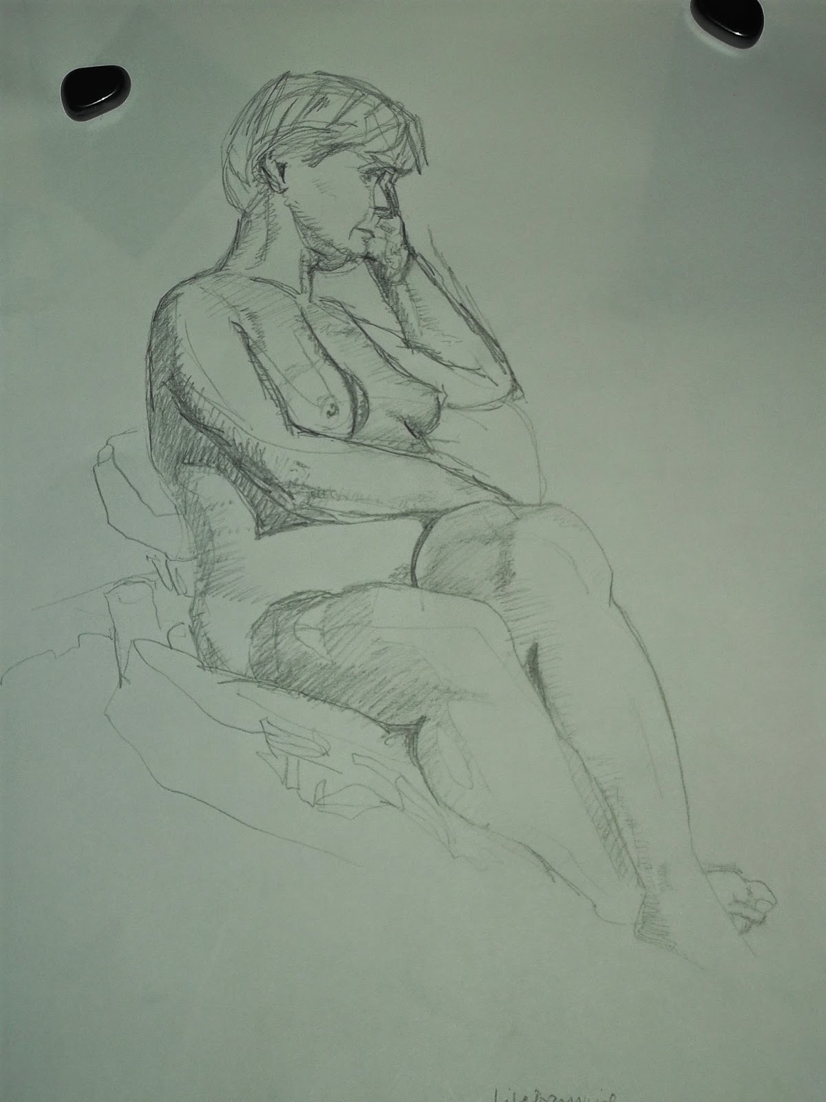
First life drawing class
It was set up so there were some brief poses at the beginning, followed by longer (15 minute) ones.

I was pleased with the line of the arm in this one, but the shape of the head was wrong (although quite pretty!)

The whole thing is flat, as well.


This second one (left) has a bit more solidity to it, partly because I tried shading ,and also the different pressure on the pencil in parts, but the proportions are all wrong.

I decided to try using conte crayon to make myself shade a bit more, and this worked better (right) (although the head and proportion of the right arm...)


For the last and longest pose I used a 4B pencil. It needed a few revisions to get the proportions approximately right, and if I had been doing it at home I would have given up much earlier because it really wasn't going well. But perseverance paid off and here she is, looking not unlike the real thing, with an intent quietness about her that reflects what it felt like to be there.

When the end came, I couldn't believe it had been 2 hours. I had been focussing so much on the drawing that I hadn't felt the time pass.

Second Life Drawing Class
The model turned up in Santa hat, and for the longer poses, beard and boots.
I hadn't done any life sketches since the first class, and it took me a few brief poses to get into the swing of it. During this time I decided that I want to jump forward to this section of the course, to get the most out of these classes.

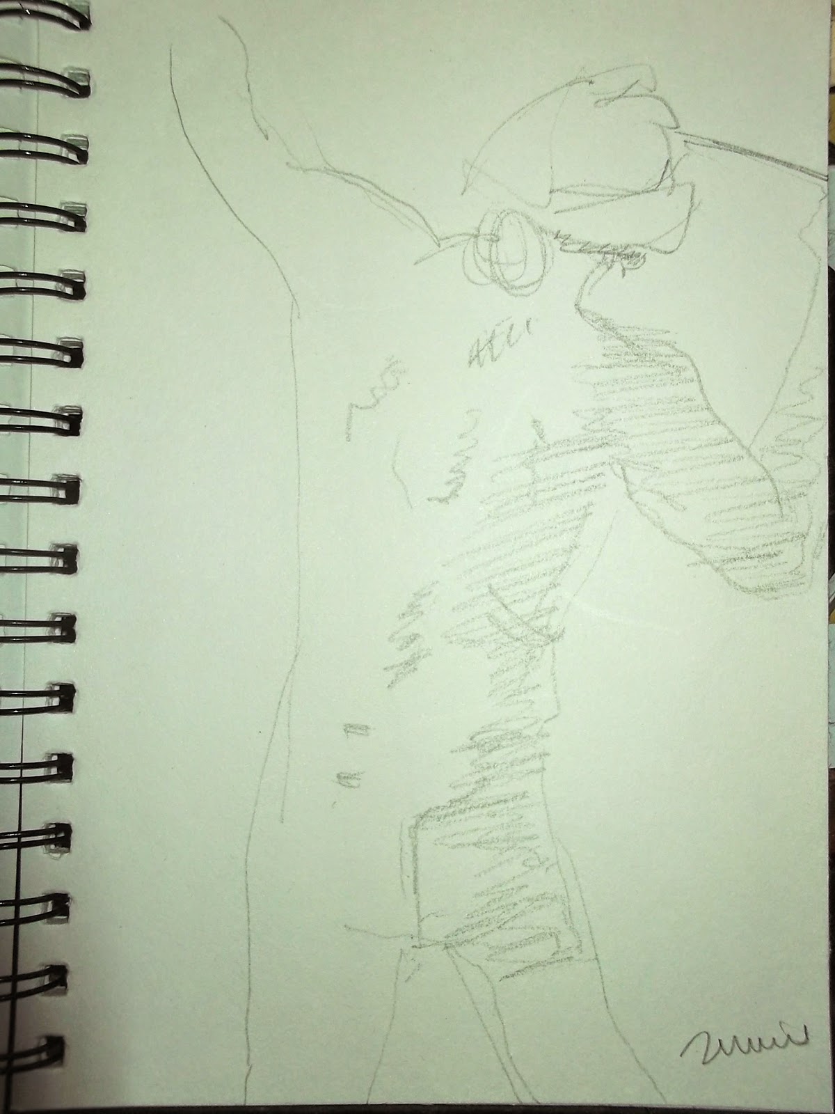
Two minute poses:
When I got there I first sat at a table with no light, not realising how much I need to be able to see what I am drawing!

There's something about trying to capture what I see in 2 minutes that makes a different part of me take over, which actually proves to be remarkably good at deciding what's important.

Here is a strong relationship between the elbows and shoulders...


Here is the movement of throwing...


Here is the twist of the arm behind the back and thigh...
None of which I could have done easily if I'd consciously known that was what I was trying to do.


Three minute poses:


Charcoal sketch which I think has a certain amount going for it. Apart from the fact that I started in the middle so had no space on the paper for the feet!


This is my embarrassing second try, which has crazy proportions, odd shapes, looks like Santa is wearing snow goggles, and no solidity.

At this point I moved to a lighter place, took a deep breath, and started again.

Five minute poses:
These two 5 minute sketches show how I was trying to use shadow to define the shapes, as well as line,
which was working a lot better than just lines.
I really don't get how to draw faces yet!
I'm pleased with the arms and legs in the top drawing, though, and whatever it is about it that suggests his age - something to do with the shapes of the shadows on his chest?
Ten minute poses:


This conte crayon drawing was done almost entirely with shading, and gives a good idea of how weary this model seemed to be. Again, I didn't plan it properly and the edge of the paper cut off his leg and the top of his hat, but in a way I think that adds to the feeling that he would rather have been leaning against something.

I am surprised, looking at it now, about how sharp the edges of the shadows are, because of the way I was doing it with the edge of the crayon, but that this works to define his shape in the strong light.

I felt I needed to sketch some of the chair in to show how he was sitting.


This was another one where I thought the shadows worked well to show the shape of his back, The leg and arms were badly proportioned from the start, (as usual arms to small) and I need to work on getting this right more often.

But I actually rather like this one for the feeling of presence of the torso.


Naked santa.

This looks more like I think life drawings 'ought' to look, with realistic proportions and lined shading. By this time I had overcome my discomfort at having to draw his dangly bits.

The left arm needed reworking to get it this big, but it's still a bit too small.

One day I will think for long enough before starting, so that the whole body gets on the page!


Fifteen minute poses:


Sleeping naked santa
Again, these two sketches show that I need to work on proportions, especially in the arms, and on drawing faces.

My 1 minute sofa's not bad though.

Ho ho ho.

Research Point: Odilon Redon's expressive use of tone

Odilon Redon Le Buddha 1895
from www.artunlimited.com/catalog
This image seems mysterious and somehow ominous with occult meaning, mostly because of the use of shadow. Unfortunately I could not really tell from the image or information online what was used to make the marks.

I found another image, stronger if anything, of an etching called 'In teh shadow people are weeping and praying surrounded by others who were exhorting them'. This seems to have been an illustration from a book about the Tempatation of St Anthony. I cannot reproduce it here, but here is a link to a clear image of it.

It is possible to see from this image that the deep atmosphere and ominous feeling are created by cross-hatching lines. The light only lightens the shadow in one area of the prison, the rest of the people being left in darkness so their features are not distinguishable. The cross-hatching not only gives the tones, but the impression of something texturing the darkness. This is particularly effective on the floor, which not only has a graduation of light and dark within the shadow, but also the variations due to the texture of the floor. And in the background, more figures, who are so dark that we cannot be sure whether they are people or something else. 

Wednesday, 10 December 2014

Assignment 5 Tutor feedback


Tutor report
Overall Comments
Christina this is a well-executed assignment following a strong structure of drawing, research and sample making.  You have used these three elements to successfully explore your ideas and ambitions for this final part of the course.  It was interesting to read your feelings on receiving feedback, these emotions are all too common and I know them well.  Feedback is a balancing act of showing you what you have done well and guiding you to further improve your work.  I think what we make comes from a very personal place that finds criticism hard therefore creative people like you (and me) who put their work out in the world have to be brave.  

Feedback on assignment 
Demonstration of technical and Visual Skills, Quality of Outcome, Demonstration of Creativity 
For this final assignment you developed ideas from the previous work that stood out for you in this course.  This is an important way of working and I encourage you to continue to reflect on earlier outcomes and ideas to move your creativity forward.   It was an interesting review of your work so far showing you to be honest with a deep understanding of what you are interested in and what stimulates your creative ideas.  This thoughtfulness and freedom to think broadmindedly has led to some interesting outcomes.  I believe it is good that you have found the course material restrictive.  This suggests you have a strong idea of how your own design process works which if you follow will come up with the best outcomes for you.  The course material become more of a guide as you move through the levels and even at this level it is not necessary to follow it exactly.

Through research and drawing you created some interesting samples to work through your design idea on revealing light through a hole or slit.  This idea of the ‘slit’ is strong both visually and as a concept.  You used drawing and sample making to explore its value and to understand how to take it into a final piece.  The samples you have sent are constructed with skill yet remain experimental.  You have communicated through them what this ‘slit’ might be.  The samples have been made in a range of fabrics in vibrant colours.  I particularly like the sample where you have used fabric and stitch to create the space of the ‘slit’.  The colours are feminine and sumptuous with the potential to frame a view or scene in the gap they have made.  It would have been interesting to see what you could have come up with if you had made a whole series of these samples, constructed from fabrics and other materials like plastics and metals.  It would also be interesting to explore how the size and shape of the ‘slit’ affects the impact of the sample.  Would a narrow gap give a different feel to a wide one?  Does the gap need to be vertical, if so why?

I find your final piece rather eerie and provokes an emotional response in me.  This is partly because you have displayed it on a mannequin’s hand but I think it is also something to do with the textures and colours you have chosen.  The ribs on the surface of the fabric remind me of the raised veins on the backs of hands.  Your cutting through is as you intended very like the surgical cuts seen in your research.  These reveal the bright delicate structures below.  The piece has been well constructed and looks like it would function well as a glove if that is your intention.  

Sketchbooks 
Demonstration of technical and Visual Skills, Demonstration of Creativity 
For this assignment you have continued to use drawing to generate ideas and work out design problems.  This includes using collage and mixed media to explore texture and colour.  You have used your drawing effectively often by repeatedly drawing the same idea until you come up with something that seemed right to you.  This is an excellent way of working out ideas and planning any sampling you intent to do.   

Learning Logs or Blogs/Critical essays 
Context 
Your assignment contains an interesting and broad range of research.  You used contemporary fashion imagery and your own photography of surfaces and textures to stimulate ideas for this assignment.  Some of the research, particularly the images you collected on Pinterest are very vibrant and exciting.  To make the research more useful I suggest you write about what it is that appeals to about the work and how you can use this in your own work.

Throughout this assignment you continue to reflect effectively and show yourself to be self-critical.  You write articulately about the thoughts and feelings that relate to your creativity.  Your learning log contains technical information, exploring decisions you needed to make and reflecting on previous feedback.  I am particularly impressed that you are able to embrace the idea that concepts and artistic ideas are of value when producing a piece of work.  This is evident in your notes on what using a glove might mean in this assignment. 

Pointers for assessment
  • Refer to the assessment guidelines on the oca website, Research ▷ By Course Area ▷ Textiles ▷ scroll down to page 2 ▷ Assessment Guidelines: Textiles
  • Aim to organize your work so that it tells the story of how you went about achieving the outcomes.  You did this by conducting research, doing drawing and making samples.  You may wish to display this on a board.  For example, for this assignment an A2 board with some of the most relevant imagery from your research along with a number of your drawings and samples would explain to the assessor how you went about developing the glove piece.

Well done Christina and congratulations on completing Exploring Ideas. 


Tutor name
Rebecca Fairley
Date 
10th December 2014
Next assignment due
Course complete
gn

Sunday, 7 December 2014

Talking to my tutor

I spoke to Deborah on the phone yesterday. It was very reassuring to hear her voice and make some kind of connection with her. I haven't really had that with my previous tutor, and felt as if I was learning a bit in a void. I had noticed that other people at the life drawing class had been a lot freer in their drawing, and of course had seen that in the Egon Schiele and contemporary artists as well. I asked her about this, and we talked about it a bit. My notes were:

Use charcoal or watercolour - something you can't control so much
Re textile person - go the way you want to go eg wire drawing, stitched drawings, draw on collage etc
Free to experiment

Today my first sketch was lines:

Bean pods
The colours are an artefact of using a flash


My second sketch like this:
Dried bean pods I'm saving to grow next year
Charcoal in sketchbook
Trying to use tone rather than line to show the shapes and shadows
Much happier drawing natural objects 

And my third one like this:

Dead bean pod and live beans
Conte crayon on brown paper
Using harder and softer pressure on the crayon
I like the free feeling this gives the sketch very much
Colour might help differentiate object from background a bit better for this one, particularly as the beans pop with purple.

Thursday, 4 December 2014

Project 2 Basic Shapes and Fundamental Form

Exercise 1: Groups of Objects

I chose to draw a pile of books with a soft pencil case on top of them. It was in a dark room with a lamp to the right.  I liked the idea of drawing them with charcoal on a piece of crumpled old brown paper, so I did that.

I think using these materials gives a good idea of how neglected the pile of books feels to me. The books were my daughter's school books from last year and had not been touched since then, so looked neglected and dusty.  The crumples and folds on the brown paper are very interesting in themselves, but may detract from the understanding of the image. On the other hand, it makes it look monumental, like a huge pile of ancient stones.

Using charcoal makes it easy to reflect the big difference between the light and shadowed sides of the books. I am pleased with the way this worked, and with the thin lines which were all I could see of the pages. The effect was slightly marred by me smudging the dark side with my hand while I was trying to draw the pencil case on top. I didn't really manage to convey the relative softness, or even the actual shape of it here. Also the light behind the books was quite complicated which I think confuses this image a bit. 
The day after drawing that, I decided to try another arrangement of stiff and soft shapes in my sketchbook. I took more care to set it up so that the final picture would show the contrast of stiff shapes and soft ones more. As I was drawing it, it took a long time of working on it before it began to look like what I was seeing (about half an hour). The important things seemed to be the relationships between the different degrees of shadow. Once I had those about right, the whole thing started looking three dimensional. So better, in the sense of more understandable, but not so good from the atmosphere/ expressive point of view.


Exercise 2 Observing shadow using blocks of tone

Bowl and jug
Conte crayon
As I drew these shadows and reflections, it became more and more interesting and complex, and by the end of it I could see things that I didn't/ couldn't see at the beginning of the sketch. It was only in the middle that I thought a blue crayon might have been better for white china.


Exercise 3 Creating shadow using lines and marks

In this part of the exercise I made four different grades of tone for each one, using different materials - pencil, ink, felt tip and graphite pencil. I found it a little difficult to get them in the right place without drawing an outline first, at times, especially around the lid of the box. The most difficult one to get predictable variations in tone with was the felt pen. I was surprised at how the dots of ink turned out, and think I will try that again in future.

Quick loose line drawing using pencil to try creating shadows with line.
I was initally using quite long lines to define the shapes, but quickly realised that shorter ones are more effective sometimes, and allow more variation in tone, The most difficult parts were the handles of the cups, because the shadows are complicated there and any variation changes the shape the handle appears to be. Whereas less accuracy on the larger shapes seems to be less of a problem.


How difficult did you find it to distinguish between light from the primary light source and secondary reflected light?
I am having trouble with this question, seeing it written down like that in words. Looking at what I've drawn, I can remember deciding that the large white area on the inside of the bowl was the brightest, and should therefore be left mainly as the white paper. This, of course, and a small area of the lip of the bowl, are the areas most completely lit by the light source. Other, reflected areas are all shaded to one extent or another. Sometime reflections are very bright, though, and in those cases it may be necessary to rub out areas in order to show this.

How has awareness of tone affected your depiction of form?
I have become aware that using tone removes the need for outlines in most cases, and that this has the potential to completely change the way I approach drawing objects. However, it is going to take a while to get my head out of the habit of telling me that I have to draw lines. This is a sketch I did at the Imperial War Museum. I started out using outlines, and then reminded myself to use tone, and that made the image a bit more three-dimensional- looking. Better...but lots of practice required!

Flat tyre of an army truck
Imperial War Museum London


Another example of the difference using tone is making for me:


Because I signed up for this drawing course I have finally braved a life drawing class at my local pub, that has been on my to do list for 6 months.


On the left, my first 2 minute sketch using only line, and on the right, something a bit more tone-based. While I am quite pleased with both (I am at the stage where getting the proportions approximately right is a bit of a triumph), there is no question which woman looks more real and interesting.

Exercise 4: Shadows and reflected light 

For this exercise I used a large silver Christmas bauble on a white plate. As well as the light from the large window to my right, there were reflections of the room, and of me drawing, in the bauble.

After my conversation with my tutor, and because I wanted to make this one really big, I thought this might be a good exercise to try out drawing on fabric rather than paper, so I used some viscose lining fabric in a cream colour.

This is how it turned out:
Bauble on a plate
Charcoal and white conte crayon on viscose
When I got to the part where I wanted to erase the brightest areas, I couldn't because the cream was already a mid tone. So I used white crayon instead for the parts where the window was brightly reflected. I think that the part on the plate with the same sort of pattern of white was actually where the reflected light from the bauble hit the plate. Again, the detail seemed to develop over time, like a photograph.

There were some technical problems with using fabric. The first was that it needed to be pinned down, and even then it pulled sometimes when I tried to draw firmly. Also, the strokes of the charcoal show a bit more than they do on paper. And the folds and creases of course, add to the complexity in a way which is not so great in this instance. Despite all this, I was pleased with the the way the bauble looks clearly spherical, and the reflection strips on the neck and loop of it turned out very well. It kind of appeals to me that I can see myself in the bauble, too. The plate was not so successful, in part because the charcoal came off in lumps in parts of it, rather than the rather delicate even shading I was hoping for. Spray set seems to work on viscose too, without discolouring it or changing the 'handle' noticeably.


Monday, 1 December 2014

Egon Schiele: The Radical Nude, at the Courtauld Gallery

I went to this exhibition because I had been looking at Tracey Emin's loose and expressive drawings and she rated him as her favourite artist. And then I signed up for this drawing course and saw a poster for the exhibition in the same week. I think of the Courtauld Gallery in a certain way which made it seem a bit of a departure to show drawings like this but once I was there it was obviously in keeping, with the traditions of life drawing being taken off somewhere idiosyncratic by a rebellious spirit.

The building is of course very impressive on the Strand, with huge portico and curved elegant staircase and big solid wood doors. Inside the galleries the rooms are relatively small and enclosing. Lots of people, but I was able to see what I wanted. Two rooms seemed to have a lot in them, but somehow hung so that this did not cause problems. Most fairly small drawings on paper. Enough about the artist's life to be interesting but not too much.

Standing male nude
link to image
Art school drop-out and joined Kandinski's Der Blaue Reiter. Died young 28? and didn't draw much during national service in the first world war. Friend of a mime artist (possibly where some of the odd poses come from).

Egon Schiele 1912
Self-portrait with raised bare shoulder
Leopold Museum
Link to image
My notes, go like this:


Egon Schiele
Self-portrait from the back
Link to image


'deliberately awkward & expressive poses'


'Contraversial at the time, and still debated' - (some of my family looked askance when I said I was going to this exhibition, referring to the pornographic nature of some of his work.)

Colours - watercolour/gouache
Yellow ribs, red buttocks, green shadows
On brown paper
'the death beneath the skin'

Nude baby
'wriggling off the paper'
Drawn at the maternity ward
Link to image


Covering/ cropped face so form is detail of body and pose.


Diluted black gouache and pencil gives a ghastly air, vs. image of young girl with pigtails, shows the corruption of prostitution.

Seated nude girl with pigtails 1910
Link to image


'Sneering nude' Hat/skirt and facial expression give her character. Surrounding white chalk odd.


Sneering woman - Gertrude Schiele
Link to image


'I paint the light that emanates from all bodies' Schiele 1911 - in the context of one this means very much more blank than line.

Egon Schiele 1910
Self-portrait
Chalk and watercolour
Leopold Museum
Link to image


Nude self-portraits -e xpressive of anguish - grey, thin, emaciated, unnaturally twisted, referring to saints/ martyrs?

Some of these self-portraits suggest that he didn't like himself very much. More about the ugliness, or the posture.


Crouching nude in a green kerchief 1914 Gouache and pencil.
Drawn as if inevitable
Link to image
Unfortunately all the images of this piece that I can find online are cropped in one way or another, which doesn't show the unusual andn striking composition of this image of a woman sandwiched between blue and green. 
Standing nude in red jacket 1913
Focus drawn by red areas
Link to image

'Economy of line & colour' means that impact is focussed.

Nothing in the background. Rules go hang.


What I have learned from seeing this exhibition:
Something about how it doesn't have to look exactly how it looks - it's more important to give the feeling of what it's like to be me looking at it. I think I have been trying too hard to get the details right.

Colour can be important in lots of different ways - focus (right),  composition (crouching nude above) , detail or texture (self-portraits above).

Don't have to have any background!

People have lots of hang-ups attached to seeing naked bodies displayed in particular ways, me included.

Sunday, 30 November 2014

Research Point: Contemporary art works with feeling


Julie Brixley-Williams
Untitled drawing from a daily series
from http://www.juliebrixley-williams.co.uk

Tracey Emin
Untitled 2008 White cube

Tracey Emin's drawings often have so much feeling associated with them. This one is sad and heavy somehow.


Unfortunately the example suggested on www.saatchiart.com was no longer there. 
I looked at the artists website and found this drawing which looks as though it was made with wire. This artist describes herself as a sculptor.

This image looks as if it might be a person bowed down through struggling - perhaps with tied feet?! 

Michael Lentz 2012
Nude no 3716
from www.saatchiart.com


I suspect that the expression referred to in the course work would be clearer when the drawing is not apparently representational

Nevertheless, the next drawing I found which was clearly expressing feeling was this one. I thought the way the black area was done gave it a bouncy, playful feel, that didn't seem to be due to the subject matter, or her facial expression on their own.


Presence and Absence X
Henri Kalama Akulez
Link to article


This painting is very well named. When I saw it I got the feeling of lots of jagged feelings irritating, but empty, with no content or purpose. It think this comes from the combination of the sharp strokes in the more focussed area, and the mustard yellow/white/blue colours.

Inner-face
Djochkoun Sami
Ink on paper
from www.saatchi.com/drawings/abstract/

This ink drawing has a very physical feel to it, of something pushing outwards, pressure, and hairy spikes. But despite this, there is something unthreatening about it. Perhaps because of the softness in the tones.

The drawing below is more menacing, to me anyway, with the sharper swirling lines and shapes in a much deeper perspective.


drawing
Dorota Jedzusik
from www.saatchi.com/drawings/abstract/


How might a drawing act as an emotional conduit between artist and viewer?

I suppose I think a drawing can be a non-verbal communication of an inner state, like the way you hold yourself, or how you move your hands and face while you talk.

It's natural to talk louder, gesticulate more sharply and deeply and use short hard words when you are passionate about what you are saying. The same has to be true of drawing - harder pressure, shorter sharper, or bigger deeper marks.

The drawings on this page show that different media can be used in different ways to express different feelings.

And of course what is drawn is going to have a major effect eg the position of a body has its own non-verbal message.


Is it the image, the medium or that act that brought the art work into being that makes it 'expressive or 'expressionist'?

I am assuming that the skill is being aware of how this works and using the image, medium and the way it is drawn together to express what you feel. I expect that different artists have different degrees of control over this, but that generally it can't be done by controlling all these things consciously. (I may learn otherwise during this course!) I can already say that some materials are easier for me to be expressive in, perhaps because they are the ones that don't allow the judging part of your brain to have too much control.