Thursday, 20 February 2014

More scaffolding

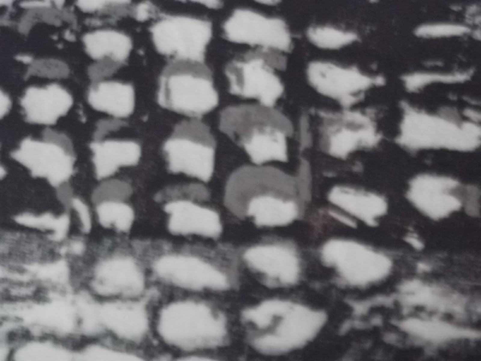
This is what it looked like when I did the 3 layers of scaffolding with the screen I prepared earlier:


The colours were chosen to give the contrast between the eye-popping green and the soft grey of the poles. The green is close, but not quite blue enough here.

I found it difficult to judge where to put the blocks in relation to each other.  You can see that the lines are not quite aligned. and the blocks to not lead on from each other but leave a gap between.

You can just see the last block which only has 2 layers.


This was a more successful print, in that the colour was better, and the joins are less apparent.

I like the way Payne's Grey looks when diluted - a lovely subtle blue grey.


 You can see that I tried graduating the intensity of it for the left hand column, which is interesting and could be useful, but unfortunately turned out a little blotchy initially.

The pink showed through a bit more than I intended here, and I think in fact should be a little darker.


What happened to the screen:

Ah, learning by experience is so much more effective than reading other peoples' advice. 
My screen was ruined by my taking so long over this, and not being careful to add screenprinting medium every time. 
So I used the screen to make some prints:

The screen block for this print was the glue left over after I took the stencil off.
The shadows above were contact prints from the screen afterwards.
I think it looks very attractive, and the grey gives it an antique look which I could use some day.

Finally, I printed some more of the 'shadows' onto reclaimed cotton sheeting, and drew the scaffolding pole lines onto it with a sewing machine, using varied thickness and colour of thread to see which worked best.


Sunday, 19 January 2014

Composition squares from all I've done so far

I don't know what the technical term may be (if there is one), but when I was doing Textiles 1: A creative approach, I found that picking out squares of images I had done for their composition was very useful in taking the process forward.

I have gone through my workbook with a couple of sizes of card squares and found these....


Of these, the ones that appeal most are....


It's the colours and light that work for this one.

Not sure how I would translate this into a screenprint.

I'm used to deciding the technique I'm going to use AFTER deciding on what it should look like, so doing it this way round is different, and I'm not sure it will work so well.

Have to work on it a bit and try some things if I choose this one.


This detail of the hallway photo in the dark appeals to me a lot, and this composition with only part of the rectangle of light at the top is interesting. I'm not at all sure how to get that blurred effect with spots of different colours using screenprinting - perhaps with literally spots of primary colours, greyed out, on different layers. Sounds a bit daunting but would be amazing if I managed it.


Rather blurry photo doesn't do it justice, but this appeals for the same reasons as the original scaffolding photo, but with the additional interest of the lines at either edge of the poles and the diagonals.

There's potential for interesting pattern repeats from rotating this around the four sides.

I'm wondering about trying out something like this in tapestry weaving. A bit like the woven pattern in the El Dorado exhibition at the British Museum.


As above, better as edging than a whole image.

This one would need less time to develop, which is a consideration now that I'm nearly at my allotted deadline.

It is dawning on me that I'm going to have to extend it. Again.

What made me think that any new job would be less demanding that the old one?! (It is, once I'm used to it, but that takes time).


 I think this could look very interesting if I used different colours as well as different tones.

Again needs sketchbook work to develop it further before using it.

Could look interesting as a repeat pattern or border.


This one gives me a good feeling that it could turn into something great.

I like the layered look like peeling paint. But it is probably more suitable for applique or something else.


The extra random bits of pattern and variations in the paint and texture that turn up with screenprinting (at least the way I do it!) are interesting and these lines seem to accentuate these effects.

This square has lots of interest and contrast and some texture. I could enjoy working with it.


This last one is appealing, but actually rather simple and therefore not so itneresting to work with.

Thursday, 9 January 2014

Constructivism

Alexander Rochencko (1891-1950) Cover for El Lissitsky's book 'The isms of Art' 1921


Doing this sketchbook exploration of scaffolding has been reminding me of constructivist images I have seen, like the one above, so I thought it was worth looking into the movement in a bit more detail than I have before.

Constructivism was an artistic movement in Russia which started just before the Revolution, but flourished after it with the full support of the Bolsheviks. It followed artistic experiments in other countries such as cubism, futurism, and suprematism in Russia. It contributed to many important subsequent movements in European art in the 20th Century including Kandinski and the Bauhaus in Germany.

The principle of the constructivists was that art was to have a social role. 'Tatlin's dream...is that the spiritual revolution of his creativity should act as directly and powerfully on actual everyday life as does the political revolution.' This quote, and much of my understanding of the constructivists, is from a PhD thesis by Wendy Bark (1995) Constructivist costume, textile and theatre design 1917-1934; a study of contructivism set in the social, cultural, political and historical context of post-revolutionary Russia' http://etheses.dur.ac.uk/5130/. 


Model of Tatlin's 'Monument to the Third International 1920
This building, which was intended to be larger than the Eiffel Tower, and contain 3 blocks inside to house a political centre, was never built. It was not designed with engineering principles in mind, but a much more artistic vision with the spiral being a visual representation of the 'revolution'.
The model of this tower exhibited in the courtyard of the Royal Academy of Arts in London in 2011 was my introduction to Constructivism, and the accompanying exhibition of architecture inspired me with the excitement of the architects starting afresh. It reminded me of the way dress designers in the 1960s starting making very geometric designs and bright strong colours (and for some of the same reasons), and led to the exploration outlined in this blog.


Many sources quote Tatlin's idea as "Not the old, not the new, but the necessary", which to modern Western ears sounds as if he were trying to make the purely functional, a sort of anti-Art. Whereas in fact, he argued against the 'tyranny of forms born by technology without the participation of artists.'. According to the website Cabinet//Tatlin, or, Ruinophilia, his own slogans, 'Art into Life' and 'Art into Technology!', are not only about putting art in the service of life, but about 'opening the horizons of the imagination' to making art itself the medium of social revolution. He is quoted as having believed that his artistic movement was in some way a necessary precursor of the Bolshevic revolution.


A corner detail of a residential block in the Narkomfin development, 1931.
An experiment in communal housing. Photo by MA Ilyin/ Schusev State Museum of Architecture
www.theguardian.com

Marxism encompasses the idea that 'the environment determines consciousness'. It isn't surprising, therefore, that many of Tatlin's followers happily became propagandists for the new regime with their 'contempt for literary and artistic idols and passion for formal innovation'.

This movement followed a period of revitalising of the folk crafts and an increase in prestige for the applied arts in Russia, for example through the journal Mir Iskusstva. And this background can be traced through into Tatlin's respect for the qualities of the materials he used, and the introduction of unusual materials into art works, the legacy of which can be traced through 20th century sculpture.
Self portrait of Alexander Rodchenko 1933 showing his wish to show images from all sides at once, as if walking round a sculpture.
taken from www.camilacarril.blogger.com.br

Other committed Constructivists include Alexander Rochenko; his wife Varvara Stepanova (1989-1924), and Liupov Popova (1889-1924).
Varvara Stepanova 1923 in sports clothes she designed to be functional yet attractive, deliberately moving away from fashions
designed in Paris in a bourgeois capitalist culture.
Textile design was thought to be a particularly good way to communicate socialist principles to the masses, who might otherwise have little exposure to them. The design process was effectively restricted to 5 centres after the revolution. Designs were expected to avoid over luxuriousness or bourgeois   sentimentality, and this can be seen in the use of flat colour, and the lack of embroidery or rich fabrics. 


Popova's Painterly Architechtonics 1918-19
Photo: State museum of contemporary art copied from Guardian website, which comments: 'It is a strange idea, both arrogant and naive, that compositions in oil paint might shape cities.'

Rodchenko collage 1919
From max.mmlc.northwestern.educ/


Rodchenko cover for Marietta Shaginan's 'Novyi byt and Art' 1923


How I respond to these images and ideas:

While I am not a communist, I can definitely relate to the idea that design of environment can have an important effect on the ideas you have. And while it is naive to think that you could teach socialism to the masses by the design of textiles, or by making a play, its scenery and its costumes in one coherent whole, it is an idealistic hope that appeals to me.

I am enough of a socialist to want everyone to feel able to be part of the same human race, and not excluded from the hub of things by distribution of wealth or accident of birth. I have some sympathy for the idea that pastel colours and prettiness is middle-class sentimentality, which can make being a crafty middle-aged white woman rather an uncomfortable place for me at times. 

What do I see in this style of art? It's all very flat - even the architecture! With very little in the way of textural variation, except where the photographs bring it in. The colours are clear and strong and simple. The lines are strong and their interest is in their relationship to each other. The mood is positive, forward-looking, hopeful and excited about the possibilities.

And rightly so, at least in artistic terms, in view of the huge influence these ideas have had on art and architecture in the following century. 

I think that is what I like most about this style - that feeling that creativity is being given its freedom and art might even lead to a better society for everyone.


Paper dress, Dispo (Meyersohn & Silverstein Ltd), 1967, London.
From Victoria and Albert Museum no. T.181-1986
An example of a 1960s dress design which gave me a similar feeling of hope and creative freedom.

Sunday, 5 January 2014

Scaffolding

When I first started doing textile art with OCA I went around taking lots of photos of things, and this was one of them, enlarged and printed out.

What I liked about it was the combination of curves and straight lines, regular irregularity,
and the amazing shapes the shadows make on the netting.
Which is a strange colour - I don't know why I  say that - perhaps it will come to me.
And the edge, with its pattern of parallel lines.

I worked on it in my 'coursework' sketchbook, looking at the different parts of the design separately.


This pink tissue is cut to reflect the darker parts of the shadowing. I found it difficult to cut this pattern accurately with scissors and I think in future I might try with a craft-knife. It turned out rather less repetitive and geometrical and sharp than I hoped.

It's pink because I found that if I then covered it with blue tissue it would make a dark grey like the actual colour of the shadows.


Here it is with the blue on top.
The edge is scalloped like it is in the photo.


And here are both layers covered in tracing paper, on which I have traced the pattern of the poles.

The planks are reinforced by black strips of paper under the tracing paper.

I like the way the tracing paper changes the colour  underneath just as if it were adding some white to it. I particularly like the poles sticking out at the edge and how the eye is drawn to it because of the greater contrast of the detail there against the paler background.

I was very pleased with this try, and decided to use it prepare a print of all 3 layers, so I could experiment with different ways of making a pattern with screen printing.


So, this is my much more accurate tracing of the shadows and light areas than I managed with the pink tissue.

Doing this made me more aware of the repeats and alignments than I had been, and it became more interesting to me as a result.

Sometimes I think there's no point in doing things over again in a different way, and then something like this happens.


This one us of the two tracings superimposed, which I did to make sense of the placement of the shapes before cutting them out of sticky backed vinyl. (Below)

The idea of this is to add paler sections to allow the background colour to show through, leaving 'shadows' elsewhere.


This one shows the vinyl stencil and tracing taped to the screen. As you can see I decided to give the multiple screen a try despite some misgivings, partly because of just wanting to make something!

Trying out different pressures and papers:


Since I didn't have a teacher handy, I started by trying out different pressures on the squeedgee when printing.

This shows what happens when I didn't press hard enough - not enough paint got onto the paper.

The one that was the most even and therefore gave the clearest edges was the one that I pressed hardest on.

These were done on rougher, more absorbent paper.

The light pressure one came out more textured. Again the higher pressure gave a better result.

I tried setting them next to each other to see how making use of the negative space would work out - it looks interesting, and I could use it.

However the bottom right one shows what happens when there isn't enough paint - again interesting but not very reproduceable! Instructions with the acrylic paint indicate that as well as being mixed with other colours (eg white in this case), it could be diluted with water. This is me trying this out, and printing on cardboard from a cereal packet as one step more rough and absorbent than the last paper. 

Watering it down was successful only up to a point. After that it got bubbly, which looks interesting but again not very controllable.

The printing worked OK on this cardboard, but not as well as the previous paper.

On the left is my try at printing on brown parcel paper. The paint didn't 'take' as well, and you can see places where it leaked through under the tape I used to make the stencil. (Also above).

Not sure what to do about this as the glue was loosened during washing of previous paint off the screen.


Experimenting with the shadows stencil:


This is what it looks like when I overlap the shadow stencil so that it repeats.

Again, I learn the importance of marking where the repeat comes on the frame. This one worked reasonably well, not perfect.

It could work as a border.

I'm not sure about the sqare tops to those triangles and the right edge looks messy and unintentional.  The printing itself worked well. The colour of this photo is not correct. Printing this, I realised that I had got the colours the wrong way round for these experiments, if I was going to use them all the way through the process until the final 3 layered print. But I carried on with this colour for these bits of the experimenting.


This is where I tried repeating on a diagonal.

Keeping it aligned was much more difficult for this one. I think I'm going to have to work out how to do this better.

Overall, the pattern isn't so appealing. The rows of triangle and leaf patterns would work better if they were more evenly spaced, I think.

On the right is the effect of using just two rows of the leaf pattern.
 It turned out pretty. And reminded me of the regular floral patterns in February 2014 Vogue. Another possibility for a border, or for an all-over pattern.

This red one is a sample I made of the basic 'shadows' stencil on red background, not least to see if there is any effect of the background colour on the surface paint (which it does, but perhaps not enough to use like tissue paper).

The high contrast makes it pop which I find attractive and reflects that aspect of the scaffolding netting.


At this point I printed out some repeats on cotton fabric that I could work on with the sewing machine (which I'll talk about in another post).


Experimenting with the scaffolding lines stencil:


I mucked around with the scaffolding parallel lines stencil on various papers and combinations.

This one appeals because of the way the clay came through onto the paper in places (perhaps because it was still slightly damp), giving the lines some definition, and how some of the broader lines have only printed in some places leaving white spaces in parts.

I also like the collection of dots in the middle which are there I think because of the way the clay dried.

This one on grey packing paper, which is very soft and perhaps more able to take the paint, gives more detail and complexity. I tried aligning the parallels in some places and not in others to get an idea of how both would look.

Below is what it looks like on top of the background colour. I am a little disappointed about the lines coming off the edge as I particularly like the way that looks in the photo and it hasn't worked so well with the stencil. Perhaps because the lines are broken?


So, after all this I haven't yet produced a 3 layered print as planned. The trying things out took over. I still want to do that, and also to do some machine sewing experiments using these patterns. And the next thing after that will be sampling bits of all these images to work further on them.


Saturday, 14 December 2013

Louise Baldwin and colour in textiles

Louise Baldwin page of 62 group website

Looking at these examples of pieces by Louise Baldwin, my immediate impression is of bright pretty colours in blocks of prints next to each other, both on fabric and on paper or card. It makes me want to try blocks of colour next to each other, but for me they would be different colours, I think with a bit more obvious drama between them.

The second impression is of unfinishedness, and that the stitched parts are not clear all at once. A bit messy even. You can only see parts of faces until you look harder for the rest, and the differentiation between the background print and the background stitched pattern is at first glance difficult to disentangle. If I try some of this stitching on patterned fabrics, how would I do it differently? I suspect I would start with some sort of extension or distortion of the pattern that is already there, and see where it took me.

I can see that she did it differently from this. I'm not sure how. There seem to have been layers built up which have different emphasis of texture, pattern and colour.

I have a large collection of patterned and textured fabrics rescued from disdain and neglect which I would like to use one day. My husband would like me to use them one day, so they don't just keep taking up more and more storage space in the house. In general the idea of reusing materials and yarns appeals greatly, and can of course add to the meaning of made objects, while reducing the cost of making them. It can make them less robust though, and in some cases they have been moth-eaten, torn or frayed in the past. Embroidering on them could improve their robustness. And could perhaps emphasis the fragility, history, or meaning.

I think part of my sketchbook work should be about looking through my collection and seeing whether I can enhance the meaning in some way by what I do with the fabric.

After writing these ideas I have had a look at this:
Crafts council maker CV for Louise Baldwin

It says that she is interested in the way people live on different levels at the same time. I guess from this I can say that she has expressed this well in the pieces I've seen, as that was very similar to the message I got from them!

Feedback from assignment one


Open College of the Arts
Tutor report 

Student name
Christina Rogers
Student number 
510830
Course/Module
Textiles 1: Exploring Ideas
Assignment number 
1


Overall Comments

Well done Christina, you have made a really competent and solid start to Exploring Ideas.  It is pleasing to have a contents list along with your work and your reflections on Assignment 1.  The work is clearly laid out within the sketchbook and supported by your annotation.  I can easily see how your ideas are linked to the visual research and then how you have taken these ideas forward into your own work.  The reflection work demonstrates you are articulate and self-aware. You are thinking through your own creative process with a critical eye looking for where things went well and how the creative process could be improved.   

Assessment potential 

You may want to get credit for your hard work and achievements with the OCA by formally submitting your work for assessment at the end of the module. More and more people are taking the idea of lifelong learning seriously by submitting their work for assessment but it is entirely up to you. We are just as keen to support you whether you study for pleasure or to gain qualifications. Please consider whether you want to put your work forward for assessment and let me know your decision when you submit Assignment 2. I can then give you feedback on how well your work meets the assessment requirements."


Feedback on assignment 

Conceptual piece: Reliquary for a soft heart.
A good range of visual research has been explored.  I can see how you have used this imagery as a springboard into the project.  However the research would have been stronger if you had looked at a wider range of contemporary designers who are influenced by medieval artwork.  You could have looked at the Grayson Perry Tapestries.  Though personally I think Grayson Perry’s work and the D&G pieces are too obvious and there are probably better examples.  I would like to know what you thought about the D&G outfit using such religious imagery.  Did it work for you that sacred images were used for the purposes of fashion, possibly signifying capitalism and the free market?  
I like the concept of the heart piece it is both shocking and intriguing.  You are right to mention in your reflection that you did not need to make a complete piece.  A set of samples on your storyboard is fine at this stage.  I am pleased to see in your reflection how you thought through how you were going to create the textures of the heart’s structure using a variety of yarns and fabrics.  I would suggest that you made many more samples showing all the different ways that the surface of the heart could be created.  And instead of making an actual heart could you have produced the same reaction in the viewer through an abstract form?  This would have released you to explore scale and texture more broadly.   

Product piece: Cowrie shell scarf 
Your research for this part of the project is of a satisfactory depth and breadth.  Because your idea for the product was related to the fashion industry you looked more fully at contemporary design.  The drawing for this part appeared more thorough.  There are many drawing of the shells in different mediums as you explore the surface and shape of the shell.  There are a good number of structured stitched samples as you explore which way to create the texture of the piece.  This shows how you have developed your ideas by exploring possibilities.  I don’t think you need to worry that the final sample is too stiff.  You have recognized this in your refection, adding what you could have done to improve the sample.

Sketchbooks 
You have shown you can produce nicely detailed drawings from your research material.  There are a number of painted sketches experimenting with colour.  The quality of your painting could be improved, possibly in a separate sketchbook.  
  • Look at using a wider range of brush sizes with a variety of brush textures.  
  • Try using an ink nib to draw with in a range of colours. 
  • Explore effects using chalks, charcoal and pastels.
  • Sketch from objects around the home or museum and exhibition spaces.
  • Keep using lots of colour.
You created a nice collage of the cowrie shell using corrugated card.  This method could have been developed to investigate other possibilities in surface texture.  I suggest you make a larger number of samples with a range of materials.  For example add in your printed fabrics to a collage using hand stitch to create the detail.    
There is evidence of a number of technical skills including weave, print, stitch to create structure, pencil drawing and painting.  As well as expanding your drawing skills described above I would suggest you expand your range of techniques and materials. 
  • Use stitch to draw, either with hand or machine embroidery.
  • Print onto different coloured and textured fabrics.
  • Weave with found objects and more unusual yarns, for example plastics, wires and paper.
  • Continue to develop creating structures with fabric and stitch by bringing in fabrics, papers and plastics with curious properties.
  • Experiment by combining techniques.
  • Take your ideas through a number of processes, for example 
Draw print draw stitch draw weave
Don’t be afraid to leave you original image.  When starting with a cowrie shell the final piece doesn’t need to resemble the shell.

Learning Logs or Blogs  
Your online learning log is clear and easy to use; it would be useful if you added a category list.  Your Blog along with the reflective work you sent with the assignment shows you to be articulate and self-aware.  I note how you are able to make links to your practice from your research, keep this up.  

Suggested viewing/reading 

Pointers for the next assignment
I suggest you separate your sketchbook from the course project work.  Use your sketchbook to develop ideas related to and unrelated to the course material.  Create a larger number of samples using a wider variety of materials.  Mix up the mediums, stitch, draw, paint, collage and print freely.  Continue to work with a range of colours exploring ways to express mood.  Maintain your good working practices.

Well done. I look forward to your next assignment.


Tutor name: 
Rebecca Fairley
Date 
10th December 2013
Next assignment due
3rd February 2014


Reading this I am very pleased that my new tutor has taken the trouble to give me pointers about where to go. It's made me keen to get on with that sketchbook/colour work!

I'm not sure about a larger number of samples - I thought I'd done a lot for this one. And I have had trouble working out what should go in a 'sketchbook' and what in a 'course material' book, because of course they feed each other. I will try separating them for this one and see how it goes.

And this feedback made me think about how I would like to have a look at both historical and contemporary textile artists again - to see what's going on, but that it's difficult to know where to start, and how to know who's considered particularly good or interesting. I particularly like the fiberart greats section, and will certainly be exploring there again soon.

My biggest difficulty with this one is going to be finding good stretches of time to really get into exploring, because I'm just starting a new job. My 'good working practices' are going to have to keep me on the straight and narrow.


First try at screen printing

I can see already that there are lots if ideas I would like to explore more, and I've started on the first in my sketchbook today.


This advertisement from Elle was interesting to me mainly because of the background. It is made up of light coming through a screen (relevant for a screen-printing module), and has something of the quality of houndstooth check, but with odd pattern-ground repeating shapes.

I wanted to try different ways to capture something about this. First I tried coloured pencil,  and rapidly found that it worked best to use three colours rather than just two.

Then I tried using paper with holes punched in it. It was obvious that part of the impact is because of the regularity of the holes.


The ideas I tried the worked best were the two with regular patterns of holes in more than one colour, with varying sizes of hole.


I can see that during his part of the course I'm going to have to focus on working out how to screen print as well as I can, and that this will involve doing a lot of practice with various different materials and dyes/ inks. It makes sense to try it out early at least once, so I know what kind of things can be varied while using this technique.

I have a simple acrylic screen printing kit at home, which I tried (without a lot of success) to use last year. So after reading the instructions carefully this time, I decided to do a quick screen print just to give me an idea of where I'm going to have to concentrate my attention.

This was the pattern I decided to go with to start with - texture from the first page of my new sketchbook, aimed at putting a design onto a t-shirt. I wanted to do two colours, to give it a feeling of depth like in the sketchbook piece. I drew it freehand, liking the way the shapes were in lines in two directions, but that the spacing was not so regular or predictable as if I'd measured it out. I think the G is the important part of this design in the context of a t-shirt and that the increasing distance between the lines in both directions, and the corner without texture, would emphasise this. I hope.


I went by the instructions for the acrylic screen-printing kit, rather than the ones in the course work, mostly because they were clearly using different mediums and different kinds of paints/inks.

The first thing was to prepare myself for messy work, cover the outer part of the screen in duct tape, and then trace the part of the design which would be printed, onto the screen using a blue sticky liquid.


When this dried, I spread a clay-like substance as evenly as I could over the top of it, and then let that dry. 


Once dried, I sprayed it on both sides with a water bottle, until the blue stuff was gone. All these different steps were to allow the clay to block the paint from going through to the paper underneath. It was quite confusing as to whether I was getting it the right way round or not. 


You can see that I had previously used this screen once and had left it unwashed for too long so it was a bit stained before I started.


These are the first two imprints I did of this screen, using purple as in the original cut paper 'sketch'. 


And this is the first try on a t-shirt. From this I learned that you have to protect the area around the print from transfer from the frame. Which was in the course instructions but didn't make much of impression when I read it. Now I know!


This is the same screen at the next stage, where I painted in the parts I wanted to be the greyer paler purple, and then spread on the 'clay'. This is it drying.

The next step was to overprint the grey on top of the purple. At this point I learned the importance of marking the position of the screen on the fabric, to ensure it goes in the right place!


T-shirt 1 - two colours screen printed onto t-shirt

This looked interesting, but didn't show up the letters in the way I had hoped.
And the texture was quite stiff - at which point I realised i had used the wrong medium.

I was washing out the screen and thought the way it washed out unevenly was interesting, so I printed another second layer using the half-washed screen.

T-shirt 2 Printed with half-washed screen, giving a more intense textured finish to the bottom half. The second colour did not allow the first to show through. So the texture is because of the extra layer of paint under some parts of it.


Texture after printing t-shirt 2

This is a detail from t-shirt 1 showing that I did manage to capture some
of the repeating irregular holes with shadows that I intended.
What didn't work was the contrasting sections of lettering.
Oh, and I took a photo of the paints I used for this, just to show I'm working on improving my colour skills deliberately every time I make something.

The colours for these screenprinted t-shirts were mixed
from primary colours and white


What I learned from this first try (in no particular order)
1. Two screens are better than one. I'm also wondering about splitting a screen into 2 sections, as my screen is quite large. But that is probably asking for mess. 
2. Don't forget the textile medium.
3. Mark the position of the screen on the fabric/ paper the first time.
4. Protect the background
5. Wash the screen as soon as possible. 
6. Try out small repeating images and find out how they work printed in various ways. In layers, rotated, different colours, on different kinds of fabric and patterns. 
7. Look up what artists have done with screen printing. 
8. This try made interesting texture, but the image didn't come through like it would have done with stencils, or block printing. I need to do a simpler image until I'm better at it. Or try stencils.