Saturday, 5 December 2015

Composition Research

I started learning about composition for this topic by reading the section in 'Contemporary Drawing: Key concepts and techniques' by Margaret Davidson (2011, Watson-Gupthill Publications NY), and in my sketchbook thinking about how each idea related to my reworking of my assignment 2 piece.

Universal Fundamentals of Composition
FORMAT
LANDSCAPE
Using a flat rectangle automatically suggests to the viewer a deep and wide image with depth to it.
Hence the feeling that if there is a lot of water around the duckings, that the intention is to emphasise the size of that.
I hadn't actually thought of it in this way before - that there is a message in the shape itself. Duh!


LANDSCAPE
Even if you try to bring the viewer focus to the object itself by making the object enormous, all it does is make you look past it to the depth and breadth of the image again, just because of the landscape format!


PORTRAIT FORMAT
Using a rectangle in this orientation automatically conveys a feeling of
an enclosed, more intimate space, with less depth to it, with the focus
more on the object itself.
PORTRAIT FORMAT
This relative flatness and focus on the object rather than the
space holds true even when the object is relatively small, if the
format is vertical.

Other formats, according to this book, are imbued with this kind of meaning to the extent that they refer to the oblong shapes above. I thought I would visually think about this in reference to clothing eg a hoody being nearly but not quite portrait format would suggest relative flatness. Unless you make it into a landscape rectangle deliberately.

MODIFIED PORTRAIT SHAPE
Oh so flat- looking - decorative rather than representational
MODIFIED PORTRAIT hoody
Even referring to the actual three dimensions of the body doesn't make it
stop looking flat.

LANDSCAPE HOODY
But magically, putting in a horizontal format creates the illusion of space where
you know there isn't any.

UNIVERSAL FUNDAMENTALS OF COMPOSITION
EYE LEVEL

LOOKING DOWN ON THE IMAGE - Landscape
The landscape format still makes you see space.
Looking down on it makes the viewer feel powerful, and the object look small, contained, restricted, powerless
These ducks are obviously on a pond, rather than free, simply because I am looking at them from above.
LOOKING STRAIGHT ON - landscape
This makes the image more personal and familiar
Perhaps this duck even has a name. I found myself sketching in a domestic scene, with depth suggested by the landscape format, the intimacy prompted by the eye level.

LOOKING UP AT THE OBJECT - landscape
This makes the image more imposing/ huge/ possibly dangerous
Am I going to get kicked/ eaten?!
After these revelations, I tried looking at portrait format from above, level and below to see whether the effect was altered with the format.

FROM ABOVE - Portrait
The words that come to mind are squashed,
inferior, rejected, dejected, cramped
disrespected, dismissed, forgotten
EYE LEVEL - portrait
This gives a very straightforward what you see is the plain truth
rather flat image with little in the way of subtlety or nuance.
Like a childrens' book or a scientific illustration - factual.
FROM BELOW - portrait
On a pedestal, looking down it's nose at me,
puffed up, grand, out of my reach,
The Duck God

EYE PATHWAYS
Thinking about balance in a drawing, and the path the eye takes across and within the picture, it helps to think about the things we are naturally drawn to:
1. Faces
2. Vectors (arrows, pointing things, or directional marks)
3. High contrast points
4. Power centers (either side of the middle of a horizontal rectangle, or just above the middle of a vertical one)
5. Focal points created by the artist for the viewer to return to repeatedly (or deliberately have no focal point)
This list was condensed directly from Margaret Davidson's book.

I did some sketches thinking about how to make a composition for my duck drawing that would draw the eye round the picture to come back to the eye of the mother duck.

USING COMPOSITION TO DIRECT EYE PATHWAYS
First, the format is landscape as I want to give a feeling of space.
The images are larger than in my original assignment drawing so that the space is the one between the duck and her duckling. I think the power centre of the image is the part of the skeleton duck wing which has the markings on it (because of the parallel lines perhaps?) But the viewer most likely enters the picture through the eye/head of the mother duck, just to the right of the centre (1). This would lead either to the vector of the beak, or down to the power point. Following the vector (2) the eye reaches the high contrast duckling (3), and from there through the other beak/ vector back to the power centre. There may be some movement along the ducks back, which would give some balance to the image, but I think there may be room for some use of background contrast or vectors to balance it vertically a bit more.

SYMMETRICAL BALANCE
Attractive but static
Re: meaning, there is a formality to this that brings its own meaning
that trumps anything else you might want to say, unless you use it deliberately.
Eg to contrast something wild (or out of the pattern) against the formal arrangement.
I could I suppose have one skeleton in a formal balanced arrangement of rubber ducks.
ASYMMETRICAL BALANCE
This is the elaboration of the image of the mother and baby ducks above,
but using detail and contrast in the background to keep the viewer looking.
More complex, subtle and engaging - I think this is something that
would make me continue to look at an image after I'd had it for a while.
Not so much about meaning, but about viewer satisfaction!
THE GOLDEN SECTION

The Golden Section or Golden ratio - proportion of 5 to 8 which is thought to be
a frequent ratio in nature and therefore intrinsically satisfying for human brains to look at.
Has been used by classical and contemporary artists, architects etc to guide composition.
There is also a rule of thirds which is that it looks interesting
to have images on the lines between thirds of the paper.
I didn't explore these ideas today.
OVERALLNESS
Deliberately creating an image with no focal point or eye pathway, giving a different kind of unity and balance. This can either be by having a uniform texture over a symmetrical format (eg a square), or a different format with marks with equal emphasis so the eye moves across the surface evenly with the same level of interest in everything there.

Skin close up
An example of overall composition (well, almost, as the difference in focus in some areas does produce a slight focal point)
Thinking about what ideas this brings into the mind of the viewer, I'd say it makes us more aware of the detail, and lose some of our perspective on skin as a familiar useful thing that doesn't need our attention.
Could I make the great patterns and colour variations of the bones of the duck skeleton 'become' the overall composition
 in a way that would not produce vectors and focal points? I don't know, but I could try!

Reworking Assignment 2

I was advised to rework the assignment - trying out a larger range of compositions
- thinking about the effect of the relative size of the image within the background
- trying out different ways of drawing water

What was I thinking the drawing should be about?
'what I kept coming back to was the lovely photo of a duck with her ducklings on a , and the difference between what a duck looks like and the strange distortion that I see in my mind's eye.'

How could changing the composition make this contrast clearer?


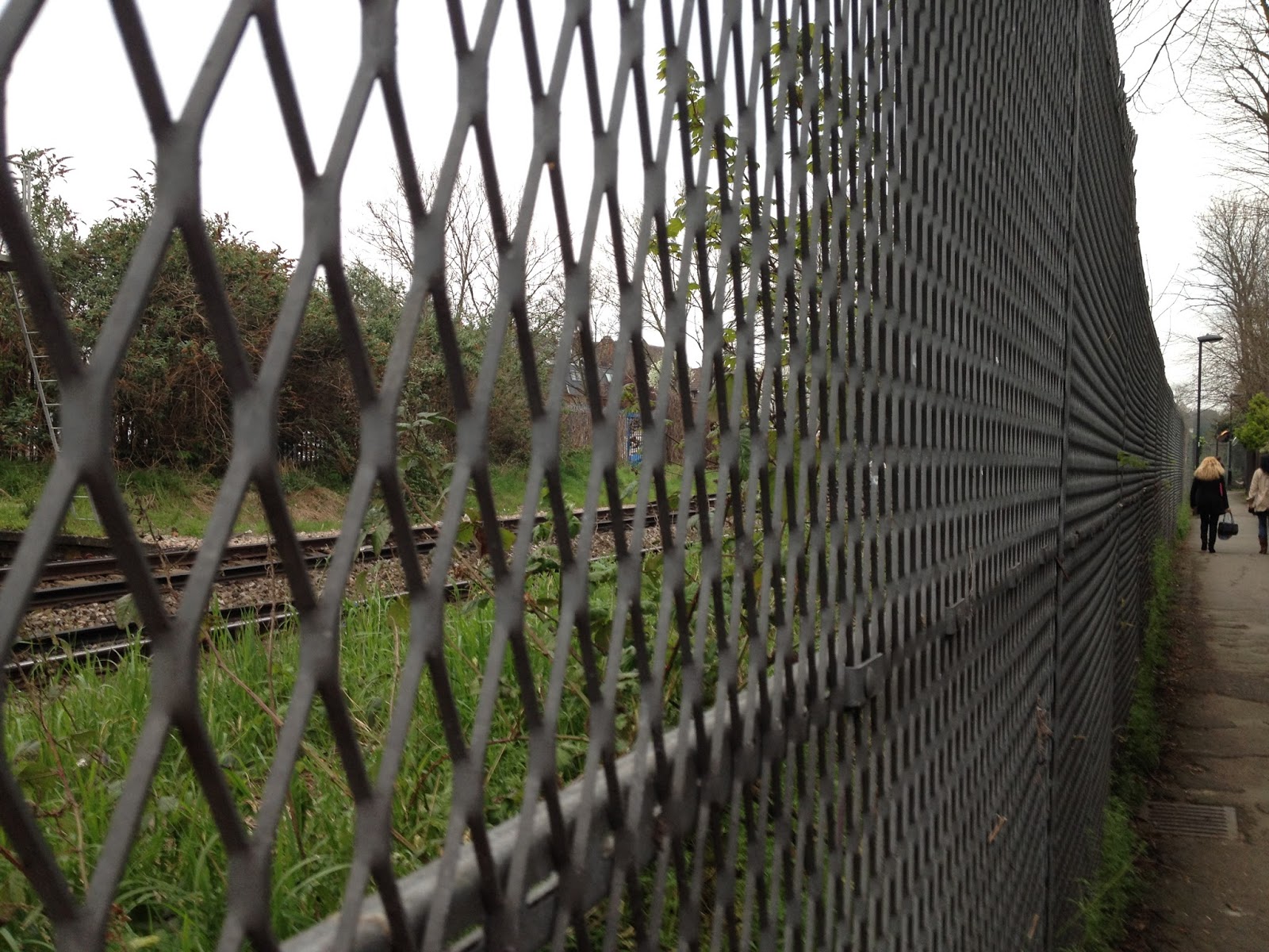
Perspective

than this one with a person receding in to the background.
And a bit more of the train tracks behind.
How different the effect of this photo........
Putney Bridge, boat race day 2015
- straightforward vanishing point on the horizon

Photo taken Summer 2014
Dramatic river valley in South Africa,
with references in the foreground to show scale.
Reminds me of Japanese prints
The same valley without foreground references shows how
the distances and sizes are much less obvious


Blue pipes shrinking into the distance. Foreground wires
and tiny curving buildings give another reference
to the positioning of the viewer.
Photo taken for first textile art module

Thursday, 29 October 2015

Landscape Research Point continued...

Some landscapes from early 20th Century which explore very different ways of painting landscape.


Paul Klee Landscape with sunset 1923

Flat, shapes and colours


Klee Station L112

What would happen if I tried simplifying all into shapes and colours like this?


Georgia O'Keefe Lake George - Autumn 1922
Vilcek collection

The trees are very strongly rounded - sensual.
Try overdoing it like this

Greyed colours show the low light


Oscar Bluemner No. 6 Valley 
Simplified shapes again, this time curved.
Oscar Bluemner No.3 Port beacon from Vilcek collection


Oscar Bluemner Port Amboy West (Tottenville)

Emphasis on the geometric, with the tones and colours secondary. Try it!


Stanley Spencer Landscape in North Wales

Detail definitely secondary to 3D shapes provided by tone contrasts.


Stanley Spencer Cookham Flowers in a Window

Detail is important but hasn't overcome the shapes of the roofs and hedges.

Landscape in contemporary textile art

Looking at how some textile artists work with landscape. With help from www.textileartist.com

Heather Collins
Forest floor
Heather Collins
handmade fabric, free machine embroidery

Detail of leaves from Forest Floor
Both images from heathercollins.co.uk
This sculpture gave me a wow moment when I saw it. I really enjoy the intricacy of the detail and the realism. From her website it is obvious that she is inspired by the textures and details, like me. I need to work on seeing the bigger picture as well.

Fiona Robertson is good at this. Her embroidered pictures of the Hampshire countryside show the whole view seen by a walker (rather than just a small part of the forest floor!) It's also interesting to see how her sketches translate into final pieces.
http://www.fionarobertsonartworks.co.uk/landscape-embroidery.html
Looking at these landscapes with 'range of tone' specs on, I can see that the ones with the widest range from dark to light are the most successful in showing depth (eg the red and orange leaves one she used for the header of the page, and the dark path through the yellow flowers are much more direct and atmospheric than 'first signs' or 'autumn view' - although they both use colour beautifully.

Looking at this I think I should have a try doing a single sketch in different degrees of tonal contrast, to see what happens to it.

Carol Naylor's landscapes are more expressive than realistic, and use colour in interesting ways.
She also deliberately uses the distorting effect of the machine embroidery on duck canvas.
http://www.carolnaylor.co.uk/gallery/gallery10.html

Carol Naylor Diamonds and Rust
from a Spanish landscape

Sea of Lavender
Carol Naylor
That image, of a field full of lavender flowers, is one which you never forget.
I notice that she has not put in the flower stalk detail in the foreground, and in fact that would distract from the movement towards the ridge of pale yellow in the middleground.
I could do that sketch in different combinations of colours too, to find out what that does to the image. 

Heather Dubreuil makes art quilts out of fabric she has dyed and then fused and stitched. They seem to be mainly of urban landscapes. They are of a size to be displayed on the wall like a painting. Here are a few examples:

Rooftop terrasse
abstract in some ways
makes you think

Santa Cruz de Tenerife
reminiscent of Klee
partly because of the flatness I think
and the limited range of colours

Villagio Toscano
The texture and colour intensity
contrast between the foreground and
background are very effective.

These are much more blocky than the other landscapes which reflects what urban landscapes are like. It is more difficult to see a metaphorical or other meaning in these.

Caroline Dunn
http://carolinedunn.weebly.com/landscapes.html
Through this link, 'A walk around the block' a piece created from a sketchbook walk much like the one we've been doing in the course. She has left the sky, except in the places where the birds are flying.

Winter Landscape in the Dales
Caroline Dunn
This has a very strong sky threatening the landscape with the darkest and lightest tones, and the freest marks.
I could try using different degrees of freedom /control in drawing style to contrast natural and man-made.

Laura Breitman
Another detail person, but this time with an eye on the whole image.
http://laurabreitman.net/collage/landscape/
These have a very accomplished feel to them. Attention to detail, composition, colour and tone. Very impressive and beautiful too. There is no need for meaning when it is so well done.


Laura Breitman Looking up
Collage in fabric

Detail of 'looking up' showing that
it is made of fabric collage
Laura Breitman Sunset


Laura Breitman Under the EI

Note to self - all those composition sketches and emphasis on range of tone etc are worth it!

Thinking about the ideas in Contemporary Drawing, what does the use of textiles as medium bring to these pieces? 

Heather Collins' forest floor - it focusses my mind on the impressive feat of producing something like that out of textiles. IE it stops being about the wonderful colours and textures of nature and becomes about the skill of the artist in duplicating it. More so than a painter? Perhaps. Because we are less used to seeing this kind of technical skill in this medium, maybe?

Laura Breitman's pieces, though, I had that awed feeling, but it was much less important than the experience of looking at something beautiful and evocative. I suppose that the use of the printed fabrics (some printed herself for the purpose) in collage add to the depth and resonance of the image.

Fiona Robertsons farm landscapes - I think that using textiles makes one aware of the stillness of them - the contemplative pace of both the sewing and the walking through the landscape. The colours are very intense in places - is that easier to do with dyed fabric and yarns than with paints?

Carol Naylors machine embroideries - definitely brings a distortion to the ground that drawing would not necessarily bring (or bring in a different way with the water effect on paper). The stitches distort the canvas in a way that makes you aware that the plants change the shape of the ground they grow in. Also machine stitching is intrinsically linear, reflecting the lines made by linear ploughing and planting of the lavender.

Heather Dubreil's art quilts - Not sure what it brings - would the same images made of coloured paper or painted in oil have less impact or interest? I don't think so necessarily, which suggests that the use of textiles is not adding any particularity to this piece of work. (But I could well be missing something).

Caroline Dunn's landscapes feel more personal, the walk round her home, and are made in traditional quotidian manner by sewing. To me this adds warmth and homeliness to her images.

Sunday, 25 October 2015

Landscape - drawings

A walk in the park

Charcoal and pale grey conte crayon in sketchbook.
Looking at it now I can see that there needs to be more of a middle tone behind the trees and sign.
Also that there should be at least one person or dog!
A little house hidden behind huge bushes. I am drawn to these kind of scenes,
where you are pulled in to something half hidden.
The difficulty with this one was differentiating the highly textured bushes from the house,
which was quite well hidden behind and between them. Also that the tone of the bushes was had to get right.
Someone I know was jogging and spotted me and I didn't manage to keep going for much longer with an audience.

I enjoy looking at this view because of the feeling of space. It's difficult to believe it's in the middle of London.
The paths across the grass cut it almost geometrically, taking into account the undulating shape of the ground.
In the distance, the detail isn't obvious, and I made a note that I don't have to know what's actually there, just what the tone changes are.Aware that there is more detail in the foreground because of the grass and dead leaves at the edge of the path I'm sitting on, but I didn't think of drawing them in at the time.


This one was done as it got dark, in a little courtyard between two buildings.
There was a lot of contrast between the darkness of the tree and the light coming
from the windows. I used a charcoal pencil and a B pencil, and a rubber.
I'm pleased with the way the leaves on the ground came out,
and that the perspective is not too far off.

Sketchbook variations exploring tone and colour
Lake with ducks - tone only, using black and silver pencils on white paper

Lake with ducks using temperature of colour only
The green was a little darker than the blue which complicated matters.
Putting in the yellow showed the highlights which were not in my 'tone' sketch above.
Lake with ducks using tone and mark as suggested by tutor.
Lost a bit of tone with the detail again, especially at the edge of the water.
Enjoyed doing the water this way. Could try doing clouds like this too.

Monday, 19 October 2015

Landscape 360 degree sketches

The idea was to sit in one place, and do 4 sketches, turning a quarter of the way round a circle each 15 minutes so as to have a completely different view. This also has the advantage of showing you, as it did me, that you don't have to deliberately pick a view in order to be able to get a reasonable composition - because you get to chose where the edges of the picture are.

I was in Cheltenham and found a bench on the footpath between the station and the town centre which had reasonably open views on all sides.

This one of tree and railings took me a bit more than 15 minutes
because I got caught up with the detail of the tree.
I used charcoal, graphite, and grey conte crayon, and the white of the paper.
The way natural things appear between railings is appealing, and
I wonder if I could use that as a pattern for something.


This one of a streetlight looks now as if there is snow on the ground, but it was grass. I didn't quite know how to show the grass and the leaves fallen onto it other than with small shadows like I did over to the left under the bushes there. I can see now that I got the perspective wrong in the right half, and that I forgot about some of the tree trunks. And the man walking is far too large! 


The third 15 minute sketch was of an interesting curve in the path,
but was brought to a sudden end by a downpour.