Thursday, 15 October 2015

Landscape - research point

Landscape is such a huge subject for artists. It's natural to want to depict the parts of the world that we live and move in. The exercise is to research artists from different eras who use landscape as their main subject, and some suggestions ahve been made - Albrecht Durer, Claude Lorrain, LS Lowry, George Shaw, and Sarah Woodfine. I'm going to have a look at those, and follow my preferences to see what else I can find.

Albrecht Durer 15th century
Albrecht Durer, Landscape with Cannon
I know and admire his drawing and woodcut work for its detail. Feeling awed at the time and focus it must have taken him to just sit and get it all down.

This one, of landscape with canon, gives me this feeling. There's a quality of messiness in the landscape which reflects what it is like to try to take in all the detail, and makes the viewer feel all business. Theres a feeling of space in the valley, probably due to the contrast of it being much less detailed, and then the detailed village cutting across in the middle background. The size and detail of the tree and the stones on the foreground ground give something of a frame to it, and emphasise the perspective. The presence of a cannon and soldiers in this rural scene must have some meaning, but not sure what 600 years later.

However, what I found on further exploration of his landscapes, was that many of them are obviously sketches, and that he was probably the first artist to use watercolour for landscapes.

Landscape near Segonzano in the Cembra Valley
Albrecht Durer

This one is an example - I was in doubt as to whether it was by Durer until I spotted the detail on the furthest hill, which is very much like the other works I am familiar with. (And the signature!) What I see here is:
Composition - that furthest, most detailed and dark hill at a sweet spot in the composition;
Colour - subtle variations in the watercolour across it, with the most colour contrast at the horizon
Tone - sketched in to suggest shapes in the foreground, detailed and more intense on the hill to focus attention
Unfinished - some filling in of intermediate levels of tone and detail on the hill to the right, suggesting that this was a sketch he never finished. This and the use of watercolour makes it feel remarkably contemporary.


Albrecht Durer Landscape with a Woodland Pool
From British Museum online collection

This is another of his watercolour landscapes - BM says 'This is one of his most sensitive and atmospheric portrayals of nature'  - thought to be outside Nuremberg.

Again, it has the look of a sketch done on site, with no particular meaning other than to show what he sees. There is an apparently unfinished part in the bottom right. I find this one a little unsettling, presumably this being what 'atmospheric' means.

Tone: There seems to be more light in the background than the foreground, with the areas of lightest tone being just underneath the strong clouds, and in the untouched white paper on the 'beach' on the right, and the strongest tone being in the nearest parts of the pool and the detail of the clouds and pine tree tops across the painting 2/5 or a third down.

Composition: The most intense parts are the foreground of the pool, and the clouds above at the golden mean reflecting this and intensifying the heaviness of it close to us. There are green pines in top right and green grass bottom and bottom left giving a sort of diagonal band of detail. Opposite this are two areas of bleakness in the truncated trees middle left and empty ground bottom right.

Detail of poolside grasses from Landscape with a Woodland Pool (britishmuseum)
Colour: The colours are apparently natural colours, with not much in the way of blueing or greying due to distance. One of the things that make it look like a sketch is that it looks like he was using a limited palate of colours and not mixing much. The grasses in the foreground are suggested by the brushstrokes and addition of a bit of blue.


Albrecht Durer Quarry
copied from hannahmaydegree.blogspot.com

 This one is more comfortable to look at, with the familiar awed feeling regarding the detail and accuracy of his drawing. Obviously a sketch as it stops completely outside the areas of interest to him.
Composition is therefore less of an issue, but there is lots of interest here which keeps your eyes moving round. This is provided by the areas of deeper tone (middle, top left and bottom left), and one of greater  tonal contrast at the 2/5 line vertically; by the areas of detail which correspond broadly to the tone areas; and by the colour contrasts at bottom left, and the higher horizontal lines of bluegrey in the orange.

There is a feeling of hugeness which can only be because of the tiny spindly trees.
And of the warmth of the orange/ sepia colour, again presumably because of the contrasting grey-blue colour. This one has a lot more evidence of mixing colours to get them right.

Durer The Trefileria on Peignitz
again copied from hannahmaydegree.blogspot.com

Looking it up online, trefileria appears to mean wire factory. Can this be right? Is this the 15th century equivalent of that? With a millstone in the middle! Not sure. The composition, with the buildings so close they crowd into the space, makes this landscape more of a study of the angles of the buildings and their relationships to each other. Durer has used tone to make them three dimensional, and this and colour to show that the landscape behind is receding into the distance. The detail is in the bottom left building, and the more intensely dark doorway in the front mid-right, and there is again a contrasting diagonal from left back to front right. There is an obvious area of vagueness in the middle ground. I'm not sure I understand the message or meaning of this painting. And there is something a bit blocky about it that I don't 'get'.

Durer Antwerp Harbour
This ink line drawing is refreshingly 'simple' after the watercolour paintings. No tone, other than that given by greater concentration of detail. There are large blank areas and a dramatic diagonal line in the composition which is satisfying as well as illuminating the perspective. Again the detail is in the further parts of the harbour rather than, as one might expect, the nearer boats, drawing the eye into it.


Claude Lorrain 17th Century

'Designed landscapes based on classical proportions'.

Claude: Landscape with Country Dance 1640-1
from Liber Veritas at British Museum
This detailed sketch in ink and wash in 2 colours is part of his liber veritas (book of truth) which he used as a sketchbook and also to record his paintings so people couldn't copy them. It is of an actual country dance at Malvern Castle, but the composition is carefully contructed according to classical rules. The zigzag of the cows, dancers and castle is pleasing, and the looming trees frame it off centre in a typical way. The two colours of wash (brown and grey) are used to provide a range of tone, with the deepest tone being at bottom left and in the trees to provide the classical framing. The lightest tone in the sky next to the darkest tree, and in reflection at a classical section point in the middle of the dance. It is very romanticised rather than realistic, suggesting that it is intended to be taken as a rural ideal to entertain and delight rather than a document of record.

A Spectator article by Michael Proger (22 October 2011) says:

'despite turning his attentions from pies and patisserie to painting he never lost his love for confection'

Claude: View of Tivoli
Taken from hoocher.com, at the 

This is a more natural looking landscape - a sketch done during Claude Lorrain's visit to Rome. Again composition is very important, and indicated by tone, but in this one it is simpler and less mannered, giving the drawing a more spontaneous look to it. Done in ink, wash and chalk.

Here are some of his more familiar 'ideal' landscapes, which he did for aristocratic patrons - apparently he was shrewd and died wealthy. He was friends with Poussin, also known for ideal landscapes.


Claude - View of La Crescenza - oil on canvas
metmuseum.org

Claude: The Ford
oil on canvas
from metmuseum. org


Claude: Queen Esther approaching the palace of Ahasuerus
pen and brown ink, brown wash over black chalk, heightened with white 
from metmuseum.org


Meaning: These landscapes are deliberately constructed for entertainment and to allow his patrons to show off. Claude landscape paintings were important to my mother and therefore part of my fine art education and development. To me they represent elitism and the appropriation of art by the aristocracy (and the plutocracy) deliberately separating themselves from the other people of the world. We are so rich/ educated/ refined, that you couldn't possibly appreciate fully/ deserve what we have. Perhaps this is envy speaking, but I like to think it's because I enjoy my more visceral response to nature, and to landscapes which capture the combination of unpredictability and complex repetitiveness in nature. Even his trees look as though they were made by skilled craftsmen rather than by the tree tapping the sunlight. I obviously feel strongly about this but don't quite know where to go with it. Perhaps I will work this out a bit more while I'm doing this module!

L.S.Lowry and the others will have to wait for another day.


Monday, 12 October 2015

Landscape - cloud drawings

Exercise 1: Cloud formations and tone

Ok, so I took a long time to get round to this one, because I was daunted at the very thought of trying to draw clouds. And some days there didn't seem to be any. Or the whole sky was grey and flat! But that was of course just an excuse and in the end I went out to Brockwell Park and found some good ones.


 This was looking down a hill at some looming grey clouds in a pile on top of each other.

I tried using a combination of charcoal, graphite and eraser. I didn't make the shapes distinct enough.


For this one, I noticed that the colours were not just grey and white, but that there was a more creamy colour in the mix, and I used chalk to put those parts in.

Again, it's a bit vague-looking, but more like the real thing.


 I noticed this cloud that looked as if it had lacy edges. I think my shaping of the cloud was a bit more successful on this one. I tried putting the lacy edging on but it came out very much larger than it was in real life. The lines of pale grey cloud around it were there, but there was more graduation of tone.

This sketch is of the clouds as well, but shows a bit of the horizon too as it had some interesting shapes. It was a little hazy, as it is in the sketch, but yet again I have not managed to employ a wide enough range of tone.


This one was done on a different day, from the window of a train on a very wet grey day. You can see the blue right at the bottom in the only place where the sky was visible.

I was quite pleased with the way this one feels heavy and grey, and the diagonal shapes in the cloud.

Sunday, 4 October 2015

Drawing 1: Assignment 2 feedback


Tutor report


Student name
Christina Rogers
Student number
510830
Course/Module
Drawing 1
Assignment number
2


Overall Comments

Assessment potential


I understand your aim is to go for the Textiles Degree and that you plan to submit your work for assessment at the end of this course. From the work you have shown in this assignment, providing you commit yourself to the course, I believe you have the potential to succeed at assessment.  In order to meet all the assessment criteria, there are certain areas you will need to focus on, which I will outline in my feedback.    


You have submitted a good quantity of work for the second assignment. You have attempted to use some colour throughout the projects and experimented with a variety of surfaces.


I can see that you have attempted to work with thumbnail sketches for your composition, you should continue to develop this further and aim to really experiment with the arrangement of objects. Keep your pencil sharpened to assist you in clearer lines to contrast with softer marks and tones. For example, when drawing the snail shells it would have helped you to describe the three-dimensional form if you had used a range of grades of pencil to give you a range of tones to work with from the lightest to darkest grey. Using directional marks, which follow the form of the object, will also help you to have more success at creating the illusion of a three-dimensional form as the examples below:


You mention in your Learning Log that the texture/surface detail of the object makes it more difficult to suggest the form with shading. Alongside the use of a range of tones you often have to simplify the detail in order to emphasise the form. As you have discovered using shadow and highlights can help to define the form so create a strong directional light source when setting up your still life compositions to help promote this.

When experimenting with texture as well as varying the mark, think about varying the pressure and angle of the media, this will help to extend your vocabulary of marks.

You have experimented with the use of colour for your Project 3 work and you have considered the texture of the objects to some degree. The issue you need to work on is keeping the form whilst you do this. Unfortunately this has become a little lost and the objects are beginning to merge together, creating more pattern than form. It may well be that this starts to inform your textile work, certainly that is what is hoped for. However, at this stage it is also important to develop the skills to capture the form. Remember that there is a difference in how we perceive colour so that it is possible to use this to create the illusion of form:


As you have indicated throughout your Learning Log, some work needs to be done to ensure that the backgrounds within your drawings are as considered as the foregrounds. Much of this can be resolved at the thumbnail stage, by trying out different placement of the objects in relation also to what appears in the background. Whilst you have tried different arrangements and viewpoints you could develop this further by zooming in close to the objects and focusing purely on their relationship to each other or zooming out and including something of the environment they are sited in. It is possible to use a textured and toned background rather than drawing the environment. However, this needs to be really distinct from the objects otherwise, as you have discovered, they begin to merge.

Although you haven’t sent them through, the mixed media drawings have real interest to them. It would be worth bringing some of the elements you have used into your other work: newsprint, strong tones etc. The contrast that you are achieving in the photographic images of your work needs to be brought into the actual drawings: ‘monochrome musical instruments’ for example. The strong contrasting tones of yellow and red work well to describe the form and add interest to the drawing, which is not apparent in the original. Use this to select the colour and tones you are going to work with.

Feedback on assignment
Demonstration of technical and Visual Skills, Quality of Outcome, Demonstration of Creativity

The thoughts behind your selection for the assignment are interesting and evidence an ability to think things through conceptually and be creative in your response to the tasks. The combining of reality, impression, death, life etc. are concepts which you could easily develop throughout your projects.

There are some issues with the final piece, which are related to some of the things I have addressed in the overall feedback. The composition needed much more experimentation before you embarked on the final work. You don’t have to stay true to the original photograph you used. As it is there is a large amount of background without much going on in it. This could have worked if the ducks and skeleton had sufficient detail to provide focal interest and contrast. If you were trying to make reference to the endless cycle of life through the vastness of the water, it would have been better to work on a portrait format with the ducks occupying a small section at the bottom of the composition. The positioning of the objects, as much as the objects themselves, can give rise to a range of narratives so it is important to consider this if you are going to work in this way, i.e. more conceptually.

You also need to be careful of the order in which you apply the media. The background appears to be drawn over the top of the ducks, distorting their shape and making them merge into the background. As with comments previously, you needed to use a range of tones in order to describe the form of the ducks. The course is designed to develop your observational skills alongside your creativity so it is important to demonstrate this within your work. I don’t want you to lose your lively, free approach to drawing. However, there needs to be a balance between, lively mark-making and accurately observed more controlled line and form. Concentrate on trying to develop this in the next part of the course.

I would suggest that you attempt to develop this assignment piece. Create several compositional drawings and see how this changes the narrative the work is creating. If you decide to work with vast expanses of water, observe how water appears and try to capture this. Reflect on how you would approach the texture of the water and ducks if you were creating a textile and try this approach to your drawings.

I know you have stepped out of your ‘comfort zone’ whilst undertaking the course and that necessitates pushing yourself to experiment and holding your nerve until the work starts to come together – it will if you continue to work and reflect on what you have produced.

Sketchbooks
Demonstration of technical and Visual Skills, Demonstration of Creativity
It is good to hear that you are beginning to use your sketchbook in a manner that is more appropriate to you specifically. As you have suggested the course should help you to develop skills that will allow you to work in your own particular way. It is not enough to be skillful; your work needs to be distinctive if you are to develop as a practitioner. It is important that your drawing and textile practice begins to come together so that each is feeding the other. However, it is early days in the course so it is something to be aware of and work towards.

Learning Logs or Blogs/Critical essays
Context
There is some evidence of reflection on the work you are producing in regards to the process and techniques you are developing. Think about the context of the images you are researching and referencing. The mallard duck illustrations for example: how might the context in which this was intended for viewing affect the choice of media and composition compared to the context you are working in? Good selection of artists referred to in your still life section. Remember to include critical reflection on the work as well as biographical details. Reflect on how the work of others is helping you to develop your thinking as well as comparing and contrasting the work of the artists you are researching. This will help you to develop your critical thinking.

Suggested reading/viewing
Context

Look at Vija Celman’s drawings of water:

David Hockney’s landscapes:


John Virtue’s cityscapes:


Pointers for the next assignment
Action points from feedback:
  • Experiment further with the composition before embarking on the final piece
  • Keep your pencils sharp and use a range of grades of pencil, which you can use to vary the mark, pressure and direction in order to successfully describe the form
  • Use a strong directional light source and colour perception in order to emphasise the tones and assist your development of the form
  • Rework your assignment after you have experimented further with composition
  • Reflect on the context in which artists make work and how this affects the reading of their work
  • Compare and contrast the work of others and reflect on how this influences your own work

Tutor name
Deborah Harty
Date
4/10/15
Next assignment due
tbc

So, to get it straight in my head, what I need to do during this part of the course is:
For finished pieces: More composition sketches to prepare for piece - do this for assignment piece and draw it again.
For each sketch: Use more than one or two pencils, and sharpen them frequently  
and try out different pressures and directions with my marks to make the form.
For each sketch, and practice in sketchbook: Form needs to be more obvious than detail - directional light and colour changes (including cool and warm).
For research and reflecting on what I am doing: Reflect on how seeing artists work affects how I do mine.


Thursday, 1 October 2015

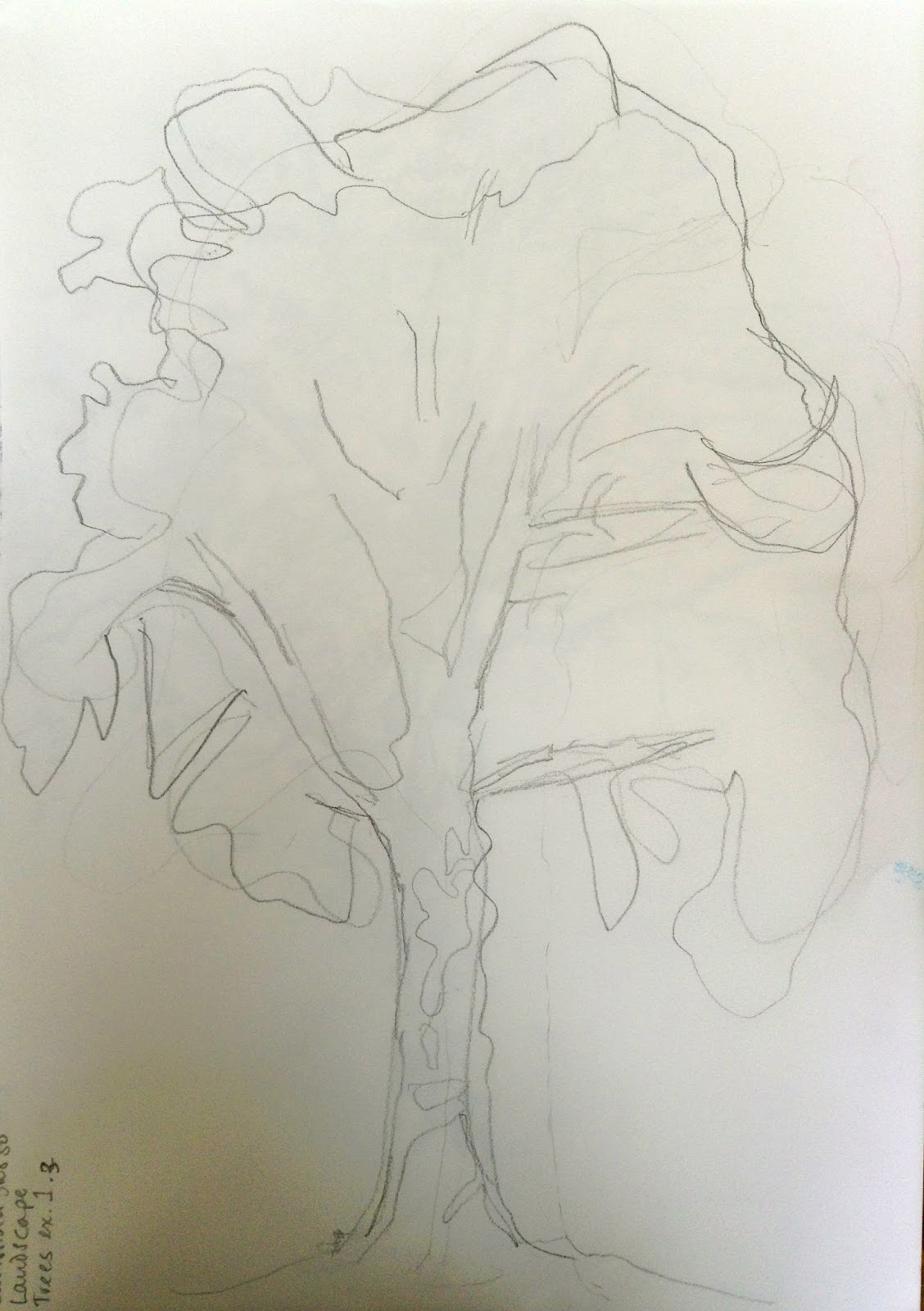
Trees

I was lucky enough to have a beautiful sunny autumn day for my first session of outdoor sketching. I went to my local park which has lots of beautiful old trees. I enjoyed slinging a bag on my shoulder and wandering round it looking properly at the trees. I have passed them so many times but never really focussed on them.


Basic shapes in outline or
shaded areas of foliage
 Exercise 1 Sketching individual trees

I picked a tree which was a little separate from the others, and that I could sit far enough away to see the whole thing (and be in the sun!). I was mindful of needing to sketch in a freer way after the exercises and effects in the previous stage, and in the later stages of using several pencils or other utensils to get a wider range of tone.


Simple outline with main branches
added
Simple outline

Shaded areas and texture of foliage

These exercises were simple and worked wonderfully to help me grasp the structure of the tree.

I learned that breaking it up into simple parts really works. I was pleased with how easy it seemed to draw the tree approaching it in this way.


Exercise 2 Larger observational study of an individual tree

I picked a small tree which was still next to the support it had when it was a sapling. I picked this one because I love oak trees, it had an acorn despite being so young and because the contrast of the trunk and the post was interesting. I wanted to show this contrast, and the shapes of the oak leaves in the sun in some detail so I picked a fine pen to draw it.

I started well but as has happened before I got caught up in the tiny details at the expense of the whole image. The result was that again I lost the full degree of contrast in the shapes and the final image is less defined than I would like. Also I'm thinking that I should have done the whole little tree rather than a chunk of its trunk. I often avoid doing the whole of something, perhaps because of worry about what I will do in the rest of the paper - how to sketch in the background?


Observational study of an individual tree


I had taken a rug and initially enjoyed sitting there in the open air on a warm day. I got up and stretched every now and then. After an hour and a half of this one drawing, my back was hurting too much from sitting on the ground and I had to give up. Time to admit that I need to take an easel with me, however cumbersome that might be.


Exercise 3 Study of several trees

I went to the woods near me intending to climb to the top of the hill in the hope that there would be a view down onto trees, like the Greenwich Park view in the course file for this exercise.

As I walked towards it I saw a view I thought might work, and did some composition sketches.

Sketches of some groups of trees to work out what to draw for this exercise


I decided I wanted a view with more interest for me, so carried on to the high ground.

When I got there what drew me was the tunnel of trees bending over the path, with light at the top and lovely enclosed darkness at the bottom, with pale leaves providing detail. I searched around for a while for the right place to put myself where I would be able to see these, and settled down to sketch it.

I did a couple of composition sketches to work out which parts to include and what to leave out. I used a viewfinder to help with this, and the tall thin shape worked best to include both the path and the lightness of the sky while making the tunnel effect over the path the emphasis of the drawing. Having some branches in the foreground would frame it nicely.

Abandoned first attempt


My first try was not working too well. I had got bogged down in the detail again, and forgotten the tone, which is supposed to be the main point of this sketch, so I started again.

Study of several trees in pencil on white paper


Well, I'm not so pleased with this. It took me a lot of tries to get the tone approximately right. I found it very hard to do approximate large tonal areas. It was as if I couldn't believe that I could leave out the detail and it would still look like trees. But there you are, it looks better now I've got closer to what I was aiming for. I think I might go back at some point and try again.

I definitely need to work out how to look at something and see the tones 'independently' of the details.


Monday, 31 August 2015

Assignment Two


For this assignment I want to carry on exploring the possibilities of using the mallard skeleton. What is interesting to me is:
- the contrast between the idea of a duck that I have in my head vs. the actual complexity of a real duck.
- explore further how to use a darker background and lighter tones to bring out the structure of the object (and this difficulty I seem to have getting the whole range of tones into my drawings)
- I don't want it to be completely naturalistic - perhaps exploring the funny side of skeletons doing things?

But what I kept coming back to was the lovely photo of a duck with her ducklings on a , and the difference between what a duck looks like and the strange distortion that I see in my mind's eye.

I had a go at drawing one of the more extreme versions of 'mental duck':


Rubber duckie in a more accurate range of colours


Rubber ducky in Sharpie
Clearly far too naive, glossy, and
yellow to be an actual duckling.

Photograph by Charles J Sharp (see earlier in blog for website link)
It has great composition - are those ducklings on the golden section? - and the warm feelings you get when you see a mother and children. The water looks as though I could manage something like it in a drawing.


I tried it out using crayon, which was too scrappy and low intensity.


Using watercolour was more effective. This was a bit too deep and green, so would need more white and less yellow.

The marks I did initially underneath the watercolour to show the movement of the water did not work as wel as the ones I did afterwards (with crayon). My attempts to scratch the surface were not so effective in this case.


So, by this time I was wondering if I could use ducklings and skeleton together in this composition to illuminate my point about mental images and reality?


Sketch of my idea for final piece
Various titles came to mind, but as the point is about the differences,
my preferred title is Generation Gap
Planning:
I have decided on cream paper that can take watercolour and have a bit of texture but not too much. My intention at first was to use narrow masking tape round the outside to make it look like those Audobon type paintings, but on reflection that plan was in fact for one option of the previous exercise, and would not add to the meaning or appearance of this one.

I have already worked out which media I will to use - colour pencils for the skeleton; felt tip pens for the ducklings; watercolours and pencils for the water background.

The blue flash on the mallard would not be necessary as the water will be showing through between the bones.

My intention is that the yellow and red ducklings on the blue background are quite intense and attractive colour combination, and the skeleton bones and delicate tone detail only dawn on you later.

I haven't done anything with watercolour background like this before, but I'm hoping it will work OK.

First stage
It was helpful to have the phrase 'Spend time gradually building the drawing' to calm
my nerves at this point. I tried to emphasise the boniness of this, and the amount of empty
space, with the marks I used. I really like the way that, because it comes from a standing rather
than swimming duck, it seems to be craning forward a little in a slightly anxious way,
which will go well with the role of it as mother of rather too many little ones.
At this point I realised that where it touched the water would be different from in the photograph
I was adapting for this drawing. The colours and material I picked were intended to
give a feeling of age and dryness. You can just see where I lightly sketched in the ducklings
to make sure they would be in the right places.
Second Stage (sorry about the wire across the photo)
Drawing in the rubber ducklings. I tried to put the shadows where I thought they would be.
Doing this it seemed wrong to give them black felt pen eyes (they would stand out too much), so I went for brown instead. I tried to make some of them look in other directions so they would look more characterful. In retrospect I think having them all looking exactly the same might have been better. Anyway, After this I put in some of the reflection marks and looked at it as a whole in terms of composition. I found that I had put the ducklings too high up after all, so I would need to remove some of the bottom of the paper to compensate, and perhaps some from the sides too. 
Stage 3
It took me some practice to be able to make the right marks with the watercolour and brush (cobalt blue). This is ok but I'm sure it could be a lot better. And I made the heads of some of the ducklings green and/or different shapes where they overlapped. Anyway, it does give the impression of wavelets and the water going off into the distance, as I wanted. The shadows were a bit more difficult and I think not so effective, especially under the mother duck, and in the top righthand corner. I think, having looked at this photo, I will do a bit more work on them before sending my assignment to my tutor.
Assignment 2
Generation Gap
Coloured pencil, felt pen and watercolour

Reflection:
1. Development of technical and visual skills
Well, I don't think there can be any doubt that my skills in these areas have improved, but they're still in the adequate or limited boxes. Lots of work to be done, but I feel that I have made a good start on this.
I've just been reading lots of emails from other Drawing 1 students and there seems to be a groundswell of feeling that this assignment is a long and difficult one for many. I certainly found it a challenge at the beginning, but in retrospect I can see how much I have learned, and have perhaps an idea of some of the areas I could explore to learn more.
2. Quality of outcome
I think the quality of outcome varies a lot for me - partly due to ignorance of the effect of particular techniques before I do them, and partly because I'm still learning what is needed in preparation for a drawing (as opposed to a piece of textile work). I think I have presented the work for this part two quite coherently despite doing the exercises the wrong way round, and understand conceptual/ visual ideas ok.
3. Demonstration of Creativity
Well, I haven't always been so creative during this part of the course as I would normally expect myself to be. I find it much easier to be free and experiment visually when I am working out how to make a particular thing eg in my preparations for the assignment piece, for example, rather than in the exercise trying out different materials for its own sake (although of course that has been useful). As for a personal voice it seems a bit soon, considering how much I still have to learn and try out.
4.  Context
I guess I think I have done some research, some of which has informed what I have done myself. eg I found the research about animal drawings enlightening - that they are not always realistic (or even real animals), and often used metaphorically. Which freed me up to make a lighthearted but serious point with my duck skeleton.

Sunday, 23 August 2015

Colour and darkness update

It has slowly dawned on me (in part through my largely ineffective efforts to reproduce the effect I am looking for) that it's not just the level of darkness that appeals to me, but the level of contrast. This, of course is what my tutor was suggesting at the very beginning!

Of course this is not always true, because it depends on what I am drawing, but a bit of focus on contrast could get me a long way with my drawing I suspect. Looking back, at the drawings I have done during this part of the course...

Dark -low contrast


Higher contrast
Low contrast
Higher contrast


Dark - low contrast
Higher contrast

The lighter spikes give it more shape
and add to the compositional interest
Perhaps this one is an exception to this idea -
the lower contrast gives it an atmosphere and make me wonder
what the story is behind the picture.


Noticing contrast around me more. For example, the dishwasher - how does it look in monochrome, compared with one contrasting item?