Thursday, 21 November 2013

Cowrie entrances

I did some sketchbook work thinking about emphasising the patterns round  the entrance of cowrie shells. There are bright shiny hard 'teeth' that sometimes look like white lumps in a semi-regular row, and sometimes more like horizontal lines in a range of coral colours. They are more prominent on one side of the entrance than the other. They are closer to the edge of it on that side, and on the other there is a 'lip' of shinier, sometimes pink, smoothness between it and the entrance itself.

Here are some of my sketches exploring these things...


This one is of the knobbles only, on prepared sketch book paper.

It looks kind of interesting, but shows that there isn't enough context.


Collage on textured paper prepared by rubbing wax crayons against sisal rug.

The contrast was rather strong but it did get the 3D quality I was looking for.


This one was done with gouache, aiming to get the colours in the interesting colour palette from Georgio Armani A/W 2013. The mauve isn't quite lilac enugh, and the dark blue is just off too. The whole image doesn't really suit these colours!


I decided that I wanted to see if I could print a repeat pattern of these shapes, emphasising the white lumps around the entrances.


I used this photo tumblr_m7bldjN2x81ra81xco1_500.jpg
as a starting point...


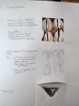
Collage & tracings for printing
I traced a pattern and transferred it onto lino, cut it out and printed it onto white cotton:


This did emphasise the white lumps, but only by concentrating the printing paint around them. This wasn't really my intention, but I decided to go ahead and do the rest of the print to see what happened.

The image looked very like fruit with seeds in it - partly because of the more regular oval shape of the linocut. Something to consider if I go for this idea.


The grey patches were printed on using a compressed foam stamp cut according to the tracing.

The colour turned out quite a lot bluer than I expected. I used Paynes grey acrylic paint lightened with white.

The stamp was difficult to cut cleanly in detail.


This picture shows what happened when I used a different grey that I made up from combining indigo, velvet brown and white.

It does give more of an idea of the 'lips'.

Finally, I did another print using the same stamps but with more paint, to capture the regularity and linkedness in the original photo.


Cowrie Curves

I wanted to look a bit more at the curviness of the cowrie images, as there is something about that that particularly appeals to me. I found some images on the internet which seemed to me to relate to this....
Maryrose Watson | winner of Peter Collingwood trust fund award, 2011
from www.rugwweaver.com

This has something of the straight lines/ curved ovals contrast that appeals, as well as a subtle asymmetry and amazing innovation. 

By Ixchel Suarez from ixchel-tapestry weaver

This shows a visually interesting subversion of the usual parallel lines behind the pattern of a tapestry weave. The two of these together have certainly made me think about how I could express something of the cowrie feel in tapestry weaving. 

This is one of the ideas that came of it.
Barnacles, from pinterest Amy Thomas STW

I kept coming back to this amazing photo. It has the same quality of emphasising both the entrance to the shells and the curviness of the rest of them, but intensified by the colouring, directionality, and randomness.  This made me think that I should explore a bit more of the entrance patterns of cowries.

Starting the second sample - exploring cowries

After a work-enforced break, I am coming back to my blog to catch up with what I have been doing. My last entry was about the first sample for for assignment 1 of Textiles: Exploring Ideas, inspired by 13th and 14th century medieval images. The first sample was more of a conceptual piece, and the second one is supposed to be different. While I was doing the work on the first one, I kept coming back to, and noticing, images which are related to the cowrie shell ideas. I decided that I would go along with this for the second sample, especially as, since I had already extended my deadline, a bit of extra time from changing themes would be ok.

Arab cowrie
What appeals to me about them is:

The oval/ not oval shape - curved

The way the pattern emphasises the entrance, drawing the eye and curiosity inwards.

The contrast between the soft, curved, blurred shapes and the hard shininess

The fantastic pattern on the back of the arab cowrie

The slightly uncomfortable feeling that there might be something a bit too female about  the shape.
Tiger cowrieseashellsbymillhill.com

The colour palate - bluish white, coral/copper, palest pink, mahogony. I noticed when I first started collecting images of cowries that theres something rather stylishly 1950s about this colour palate, that asks for clean shapes and geometric patterns.

I wanted to try out some more repeat patterns this time, as I like the look of repeats often, but haven't done much work on them myself. Also because of the sketchbook work I did initially with cowries that led me into squares because of the calabash shaker image.


Sketchbook work:


I printed out some repeats of one of the cowrie photos I found online. I like the way this reflects the 1950s idea somehow, and the wood background is a good colour for this. Repeating it emphasises the spots and the entrance even more, and the 'teeth' shapes, which are also suprisingly regular and hard.

But the unchanging regularity of it is less appealing, rather deadening.


Earlier, I had found an appealing picture of lizard skin on pinterest. It had some of the same qualities as cowrie shells - the irregular oval shape, 3 dimensions, and lines in the middle of each oval. But each one was a slightly different shape with different proportions. This led to an emphasis on the similarities between them, and was more appealing.


I printed out some more of the original cowrie images, and played around with different arrangements of them.

The top one with alternate shells upside down, gave an attractive regular curvy line, and the whole thing lost the feminine feel, and the emphasis on the  pattern round the entrance to the shell.

I played around with various star shapes, but again, these didn't add anything.

I tried regular rows again, but this time against a background of straight lines. I used strips of gold tissue because it was the coppery colour which I thought could reflect the highlights in the spots. I like the way the contrast hightened the blue in the white shell, and the curvy 3D nature of the shells.


Monday, 4 November 2013

Couture A/W 2013

I've been looking at the designer shows online and in magazines to get an idea of colours, textures, shapes, etc.
All the images here are from style.com.

Last season was all about black and white, with a lot of geometric patterns and contrasting strong warmred,  or rich mid-blue. What I see now are these themes:

Chloe Spring 2014
Ready to wear

Black, white and flesh pink:
Bouchrer Jarrar
Fall 2013 couture

There's a reason why this Bouchrer Jarrar design is first on the list -
the contrasts of colour, flow, and twisted shape
are all great ideas for a cowrie shell.

The DKNY colours include a bluish pale grey. I find this combination of strong and pastel interesting and different. And relevant.

It makes me want to try out some unusual combinations myself.

Phoebe English
Spring 2014
Ready to wear

DKNY pre-Fall 2014
The textures are a combination of cotton/ heavy, and chiffon/light.
Shapes are clean, still quite geometrical.


Black, white and bright orangey red

Akris collection

Christian Dior
Fall 2013
This one has an oddly more blue red in the hat. The dress itself is dark coral with lacy texture making it look even more coral like.

The Dior dress looks like a pumpkin witch for halloween it's so orange.

That seems to be the thing these all have in common - the strength of the red.

Miu Miu emphasised it even more by making it shiny.
Giambattista Valli
Fall 2013 couture
Miu Miu Spring 2013
Ulyanka Sergeenko
Fall 2013 couture


Rich pastels:


Electric Feathers
Spring 2014
Ready to wear
Giambattista Valli
Fall 2013 couture

Suddenly the flower colours are back - pretty and flowing.
Georgio Armani
Spring 2014
Image from fashionista.com


Soft-textured grey (and fleshpink):


Chanel Fall 2013
couture
I would like to try to
keep something of the
natural variation look
in the texture
Chanel Fall 2013
couture
This one has obvious
shell-like textures
Ulyana Seergeenko
Fall 2013 couture
Here is severe, dry, but
curved
Valentino Fall 2013
couture
The slits for sleeves have
something of the 'hidden/ revealed' quality of the cowrie


 Some relevant shapes which could be useful or inspiring:

Zuhair Murad
Ready to wear Spring 2014
Zuhair Marad
Spring 2014
Black embroidery on white

Atelier Versace
Fall 2013 couture
Attractive curve to the slit
Atelier Versace
Fall 2013 couture
Emphasised edges
draw the eye
Jean Paul Gaultier
Fall 2013 couture
False coat look
Maison Martin Margiela
Spring 2012
Shapes on the bodice
made with beads/
buttons
Maison Martin Margiela
Spring 2012
Printed shapes and coral
emphasis
Moncler Gamme Rouge
Spring 2014
Zip as hide/reveal


Monday, 16 September 2013

Enclosing the relic

Putting the soft heart into a container has taken me around a variety of ideas and back again to the original idea of a box.

I tried to enclose it in a net of squares made from gold ribbon. The ribbon I found was great for the purpose - a light gold, and rough, so not like most of the satin gold ribbons you find. I thought it turned out well when I fixed the rightangles with bright red thread, and I was thinking about putting gold coloured glass beads at the joins to make it even more 'catholic kitsch'.


Unfortunately when I was constructing the whole thing around the heart, it not only hid the 'realistic' aspects of the heart, but the idea of a reliquary was less strong. I was kicking myself for not painting it out in my sketchbook before starting.


The hoped for contrast between the organic soft heart
and the cold hard gold squares just wasn't working.


While I was finding this, I came across a box which had once contained chess pieces, and this set me thinking that perhaps the original idea of a box reliquary would work better.

The box is plain, a bit roughly made, and undecorated, with a simple gold coloured clasp. Seeing it I was reminded of some of the reliquaries in the Vatican Museum that looked well travelled - as if they had been carried around on long journeys. This related to what I had read in 'A Distant Mirror' by Barbara Tuchmann, about how people in the 13th century did travel a lot more than we think they did, and in fact some noblemen rarely went home  because they were going from one battle to  the next during the 100 years war. They were strongly religious, donated money to invest monasteries etc, and woud hvae had relics with them when they travelled. Meaning that a delicate container would never have done.  

So the next step was to think about how to enhance the contrast between workaday outside and Glorying in God inside, in keeping with medieval styles and colours.

I decided to go with the attractive gold squares on blue which appealed from many of
those medieval images I saw during my researching. It was nice to be able to use a
couching technique in my piece - cf. anglicanum embroidery

I thickened some of the Rioja wire to make it stand out more, and couched that in the shape of a halo/ cross-shapes inside the lid. I wanted it to be irregular, partly to make it catch the eye, and partly to give the idea of a well-used relic. Once I had done that I put pearl beads around the inside to make it more kitsch and relate the imagery to the Virgin Mary's personal imagery of purity and blue.   

This is what it looks like when you open the plain wooden box with the heart inside.

Sunday, 8 September 2013

Constructing a heart 2

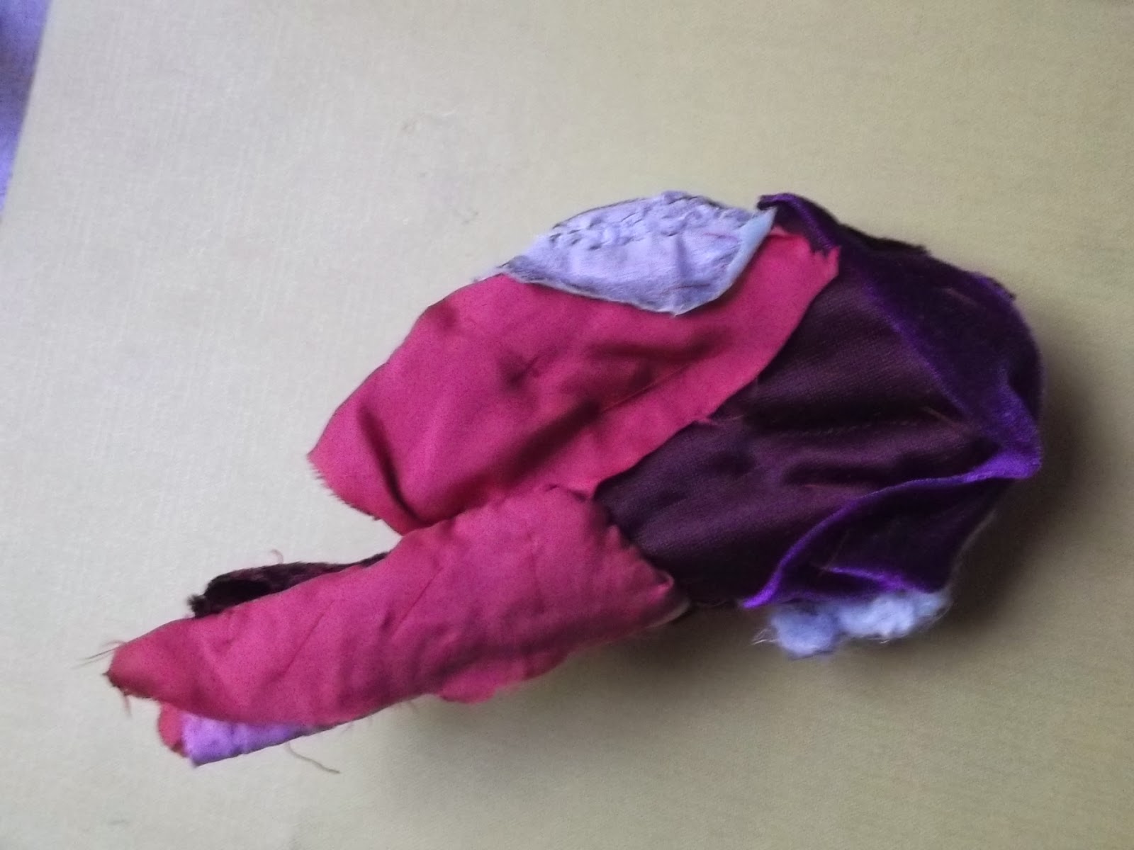
What I did was to attach the four pieces of heart to each other as if they were the chambers of the heart, remembering that it's not at all obvious from outside which bit is which. Then I embroidered some additional stitches onto the outside, for example some lilac fluffy wool to make the marks I had noticed when painting the lamb's heart. These photos look rather bluer than they did in reality but give an idea of the intermediate stages.