Fashion Colours SS 2019
 |
| From the marvellous https://fashionvignette.blogspot.com/ Pantene colour of the year living coral The more intense versions of this are 75% colours for me |
 |
| Add caption |
 |
| Too intense for me |
What would work for me?
Princess blue 100% only if muted
Fiesta 75%
Pink Peacock 75% only if muted
Living Coral 75%
Toffee 25%
Pressed rose 25%
Sweet lilac 25%
Jester red 25%
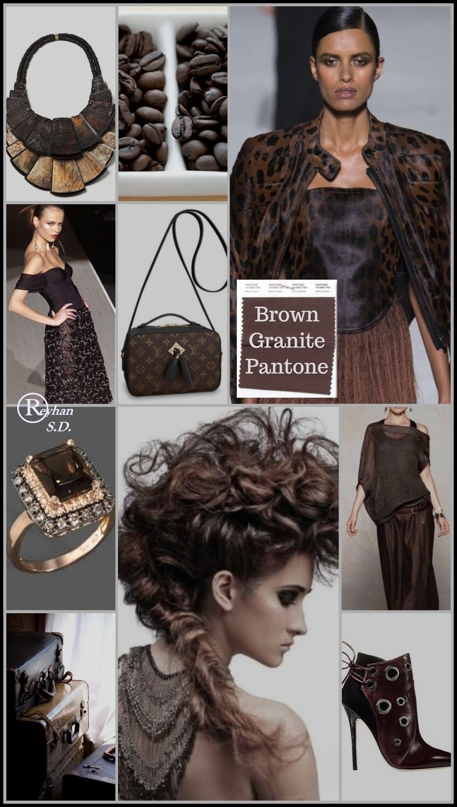 |
| https://i.pinimg.com/originals/ 64/24/82/642482b002f889d33fdcd6058bc7aae9.jpg Brown granite is a 25% colour for me |
Hm, they're all variations on pink with no other blue or green than the rather too pure princess blue...
 |
| Too strong for me |
 |
| Another prediction range |
OK, looking at this one, I can add
Peacock blue 100%
Aqua 75%
Sticking to the principle that the colours I like
are the ones that go with my natural colouring,
then I am going to go for:
Peacock blue or blue-grey all over
Fiesta & Living coral & aqua with neutrals
Blue grey or brown granite neutrals (and may have to use a light neutral eg pinky beige or soft white)
Accessories in sweet lilac, muted pink peacock, jester red
Mmmm nice.
Fashion Patterns SS 2019
 |
| I see grid checks, Prada regular geometrics (with straight and ovals), and fun prints eg D&G lollipops in very un-beachy colours, and Stella Jean vintage look, all of which work for me. |
 |
| https://fashionvignette.blogspot.com/ These large blocks of strong pastel colour always appeal. I could wear the lavender 25%, jade (100% pastel), sky blue 25%, pink 25% and princess blue 100% I like the abstractness though, and can imagine them influencing something. |
 |
| Aha! I can work with this. Variations on calm tweed/checks |
 |
| https://fashionvignette.blogspot.com/ This appeals to me, goes somewhat with 30s style, and is in some of my colours mint green, cherry red 100%, neutral grey 100%, bluegrey100%, pink, sky blue It would be an influence rather than the whole idea. (Except perhaps for the lovely dress in the middle!) |
So next time sketchbook to work through some of these ideas.
Colour palette:
 |
| Neutral brown granite |
 |
| neutral blue-grey |
 |
| Contrasting colour |
 |
| For all over colour |
 |
| Contrasting colour living coral |
 |
| Contrasting colour |
 |
| Jester red accessories/ in patterns |
 |
| sweet lilac accessories/ in patterns |
 |
| This fiesta red is too intense and orange so cancel that |


