Saturday, 27 April 2013

Harry Potter Studio visit

I went to the Warners Studios north of London with my fan children this week.
I was not really expecting to enjoy it, thinking it was likely to be a marketing exercise.
It turned out to be a celebration of the creative arts that had gone into the making of all the Harry Potter films, and a demonstration of the creative process in some detail. I have included some photos in this learning log because they reflect a lot of what I have learned on this course about how it's done, and I want to keep many of them as inspiration for sketchbook work in the future.


This is the original artwork for the Whomping Willow, and a model of it, showing something of the creative process that went into making it come to life.


This book, one of many created especially for the film, was a text book of magical plants. The whole shape of the book has been altered to give the appearance of being made of moving water plants, and there are 'bubbles' somehow made of light rising from the word 'Magical'. The rest of the book has been treated to make it look as if it has spent some time under water.

I think this is a beautiful and resonant bit of thinking outside the box. I love it. And it makes me want to be as free as I possibly can in my creative thinking.


This architect-style model of the imaginary village of Hogsmeade (I think) has the meticulousness and teeming detail that particularly awes me when it's done well.

Making models or samples allows problems to overcome and new ideas to be incorporated as they make you think in a different way about the same thing, and also to find out how the materials used affect the outcome.

Prior to starting this course I had not used this part of the creative process at all, and often ended up stopping halfway through making something because of this.

I do like the irregular repetitiveness of this model, and the extra-tall chimneys sticking up. This is getting to be a bit of a theme for me - hairiness in one form or another.


These two pictures are examples of workmanship and design that struck me when I was watching the film, and are even more impressive in real life.

The tapestry family tree (with some of the faces burned out) looks as authentically tapestry-woven as you could hope for, and has a lovely rhythm to the shapes of the branches. The colours are subdued as if faded through the years, and the detail keeps you looking without distracting from the overall appearance of it.

The metalwork pattern on the right is an intricate magic lock for a vault door. It's a masterwork of intricacy and repetition. It reminds me that repetitive patterns have the capacity to be beautiful and makes me want to try out a few in my sketchbook.

The next few photos are of things which demonstrate different sorts of fabric treatment or manipulation as explored in this course.


This phoenix's bright feathers are made of satin cut into shapes and layered on each other.


Fabric printing, painting and treatments:

The rather unfocussed photo below shows a combination of printing and painting (I think - it looks singed in fact) to give the look of a well used skirt.


Fabric Manipulation:

The sleeves of the same dress are decorated with slit rolls over scrunched pieces of the same colour, and the front of the bodice with fabric scrunched into 3D patterns, and stuffed twists.


Surface stitching:

This bag for a ball is embroidered relatively crudely, as if the student might have made it herself.


The sleeve of this dress has a lovely lattice pattern made by manipulating the fabric itself that looks like a feminine version of armour by virtue of the silvery colour and slight sheen, and the robustness of the lattice. This suits the combative female character it was made for.


Colour:

I have included this photo of the cover of Ron Weasley's bed, because it is an example where the lack of harmony in the colours gives it meaning.

It lets you know that it was made by someone who didn't have enough wool to make the colours harmonious, but loved him enough to spend the time and effort to keep him warm when he was away from home.


Finally, here are two other images that I find interesting and want to explore a bit in my sketchbook.


I find myself looking at the contrast between the irregularly regular horizontal
fluffy stripes, and the rounded stiff metal verticals in this photo of a post owl.


This is from the set for the wand shop. There were four walls all filled with wand boxes
on shelves like this up to well above eye level. The colours seem to come from the around the
turn of the 20th Century. Each box has a slightly different coloured label and a different
actor's name written on it by hand in ink. What appeals about this is the repetitiveness,
kept interesting by the quality of meticulous attention to tiny differences.

Tuesday, 23 April 2013

A moth's eye

After the review of my work so far, and because of a feeling I have recently been having that I need to explore repetitive patterns more for this project, I found myself wanting to try out some ways of expressing an image of a moth's eye.

Link to page where I found this image


First, seeing how well shiny embroidery looks on a black coat dress, I used some metallic paint on plain black cotton, using metallic white for the highlights, and to suggest the wonderful patterns around the edges of the eye.


Then I sewed together 2 layers of fabric in a simplified version of the pattern here, and stuffed the resulting shapes. The fabric is some that I found in the remnants box of a fabric shop and looks as if it had been hand dyed.


Finally, I tried out layering a darker sheer fabric over the top, and cutting out crescents to make highlights out of the dyed fabric underneath. The horizontal wiggly lines are there because I thought these shapes are a bit like the heads of the cicada, which has a black line down the middle of it.


This worked better than I expected it to, although it gives a rather flatter impression than the original eye photo. Without the horizontal lines I could have stuffed it as well.


Monday, 22 April 2013

August Macke 1887-1914 and Der Blaue Reiter

I picked the name of August Macke from the list of 20th Century artists suggested in the course file.
I had not heard of him before and knew nothing about him, so I decided to find out what he did. My sources were all internet pages, including Wikipaedia, and www.august.macke.org which has  his complete works online.

Self-Portrait of August Macke


He was born in Germany, son of a builder, and brought up largely in the cities of Cologne, and then Bonn. Influences were his father's amateur paintings, Japanese prints, and a romantic painter of dramatic characters, Arnold Bocklin.


He studied at the Dusseldorf Art School, travelled in Europe, and did some stage design and costume work in the theatre in Dusseldorf.


He visited Paris in 1907 so saw some impressionists, and then joined Lovis Corinth studio in Berlin for a few months. Although Corinth later became more expressionist, at the time he was against the movement, and his work was naturalistic. Macke's art at this time was more post-impressionist, and he later did some more Fauve work.

Wikipaedia tells me that Fauve artists 'emphasised painterly qualities and strong colour over representational or realistic values retained by impressionists.'
Andre Durain - Self-portrait in the studio
Fauvism

Henri Matisse - Woman with a Hat
Fauvism


Der Blaue Reiter
This was a movement in Germany from 1911-1914 of some Russian imigrant painters including Kandinski, and some native Germans including Franz Marc, and August Macke. This movement was 'fundamental to' German Expressionism, and formed in response to rejection of one of Kandinski's paintings for an exhibition. 

Wassily Kandinski - The Last Judgement
From wikipaintings
The painting that started Der Blaue Reiter movement 
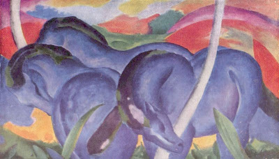
Wikipaedia quotes Kandinski as saying that the name of the movement (meaning the Blue Rider) derived from Marc's love of horses, his love of riders, and both of their love of the blue. Kandinski saw blue as a spiritual colour. 

Franz Marc - Die Grossen Blauen Pferde
The group promoted primitive and children's art as well as the expression of the spiritual and music with the use of colour, by creating touring exhibitions, and almanacs. They were influenced by cubism and fauvism. 

August Macke's Art:

As you might expect from an interested developing artist in rapidly changing artistic scene, there is a wide variety of styles in his work from the traditional naturalistic portraiture to much more abstract cubism-influenced styles. 

He died fighting in the First World War in 1915, and it's tempting to wonder where his work might have gone as he got older if he had survived.


A Walk
One of the more naturalistic
of his paintings, with a lovely
light to it reminiscent of
the shimmering air of summer.


Sunny Garden
Which shoes the influence of the impressionists on his work


Lady in a Green Jacket 1913
Which owes a lot in its colours and composition to
Parisian post-impressionists
The composition of this painting is what stands out for me - the main character in the foreground, but looking away in a thoughtful pose. The other people in triangular perspective with the trees, but with a very flat horizon, all in couples except for her.


Girl in the yellow jacket
This one has both expressive colours and unnatural shapes -almost abstract.


Colour blocks II

Kairouan
Macke visited Tunisia with Paul Klee

What appeals to me in this painting is the way he has used blocks of colour to describe the scene, which are not realistic but are strangely evocative of the experience. I have found when I have tried to use colour in blocks like this, that I am constrained whether I like it or not by what I 'know' to be the 'real' colour of the scene. 

In my sketchbook I have drawn my foot in its constituent shapes in order to start exploring other ways of representing it on paper, and I can see that there's a lot of interesting directions I could go with it. Perhaps the next step would be to try out which colours work best to express my foot in this style!


Sunday, 21 April 2013

Textiles 1 Part 5 A piece of your own


Stage 1 Reviewing my work so far

Colour: 
Looking at the exercises and samples I have done for this course I am reminded of all the things I enjoyed exploring and wanted to do more of.

These two are from the colour section, and remind me that I didn't have time to do as much exploration of how adjacent colours influence each other as I wanted to at the time.


I have been thinking, while exploring colours in my sketchbook, and my theme, that in natural things there is almost always an unexpected colour or two in the mix, and that this gives things a richness and interest that they don't have when I just use the 'harmonious' colours.

Also the idea that colours can be mixed on the fabric as well as in the palette.
The embroidery on this coat dress from the S/S Collection Chanel Paris  shows the use of shiny coloured embroidery
to mix colours on the fabric very effectively. Something like this reminds me of the iridescence of some insects and may be useful for my theme.


Stitch and Line:
Seeing this sampler again after so many months reminded of me of the pleasure I got from embroidering it in a tent during a 3 day rainstorm. It was just about the only thing that could have stopped me minding the wet.

The cicada's wings have veins on them which are in an attractive pattern, and parallel (or roughly parallel) embroidered lines could be useful for this.

I became particularly interested in the attractive qualities, and the technical difficulties, of embroidering a pattern onto translucent fabrics. This may well be something I could benefit from exploring more for this project.

It may be possible to use this to represent sound waves.
This square of a sampler was made using upholstery twine, and the hard dryness of the result appeals to me still. Again, this could be adapted to reflect qualities of the exosketelon of cicadas, especially over their legs I think.


Painting and Printing:
Looking at the painting and printing exercises and samples, I think I could use them to explore images and patterns in my sketchbook, and use the techniques to add interest or colour to fabric, but I am not sure if there's any particular technique that I have an urge to do more of for its own sake at the moment.


Except the linocut which I loved doing and loved the detailed result.


Fabric Manipulation
The fabric manipulation exercises were full of things I wanted to try more of. This one - pin tucks in more than one direction - made me think of insect wings at the time, and can be used to make a variety of different shapes between the tucks. It has something of the curved quality of joins between bubbles which I noticed in the wings of the cicada.


I'm not sure whether this one can be useful for developing this piece, but the lumpy, irregular quality of it really appealed to me at the time, and made me want to try variations of it with different fabrics.
These sewn pleats use the striped pattern of the fabric to create a different pattern, not unlike the pattern on the abdomen of the cicada.

When I made this stuffed applique folded square, I thought it looked like a cricket.

Stuffing shapes could be useful as a technique for making insect body shapes. (Although it is not a technique that I find particularly inspiring).


These swags are something I drew in my sketchbook during the fabric manipulation section of the course, and I still want to develop them further.

These little pleats are very appealing, and the cut outs on the skirt interesting -
worth another explore I think.


Applique and fabric alteration:
I did want to do more of was this layer and cut idea. It could be used for shading a pattern, or adding an interesting texture. Since translucent fabrics are often shiny to some extent, this could be used for the insect to give some of that shininess which characterises them.

I am wondering also about weaving threads within the structure of a loose fabric to represent the sound waves.


The way stitching makes shadows has always appealed and intrigued me. I am already looking forward to a session trying this as a way to represent images and feelings associated with cicadas and the sound they make.

White seems to give the most effective contrast between the fabric and the shadow, but perhaps there is some other way to get a similar or waay different effect? Worth a look.
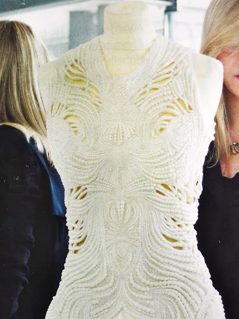
This Alexander McQueen dress is covered in pearls and embroidered and then cut out in places.
It's been in my sketchbook beckoning to me for months.
I haven't dared try this at home yet, but wow would I like to give it a go.


Making textile structures:
Most of my textile structures images and samplers are with my tutor for assignment 4.
This S/S 2013 collection Balmain jacket is woven from strips of white in the same pattern as a cane chair.
It makes me want to try more and different woven patterns, to see what happens. 

This piece of antique silver lace was something I put in my sketchbook in response to the sound that cicadas make.
I wonder if I could weave something like this from wire. And if so what I would want the pattern to be like.
This is made of metal! It gives the appearance of being so very fine and light, just like petals.
Or for my purposes like high pitched sounds and insect wings.
I also really enjoy the colours and the way they graduate despite being due to the metal content of the wire.
I'm including it because I find it inspires me to try to make something so fine and light myself.

OK, way too many options!


Wednesday, 17 April 2013

Reflective commentary for Assignment 4


Reflective commentary
Textiles: A Creative Approach - Assignment 4


This assignment was learning about creating textile structures, as opposed to decorating or manipulating them. 

Exploring the qualities of yarns by sorting through and thinking about them for stage 1 was both educational and inspiring. It made the knowledge I have already acquired about this explicit to me, and also corrected some misapprehensions eg that wool feels a bit different than I had thought because of most knitting yarn being mixed or pre-treated; and that man-made fibres have more interesting and attractive qualities than I had thought. 

Stage 2 explored different possibilities of structure. I found the ways different colours and types of paper interact interesting. And the effect of different techniques of rope making and different materials also seems like a fertile ground for more work. Like Anne Sutton, I found that the restrictions of these exercises channelled my exploration into areas I may not have otherwise tried.

Learning tapestry weaving was made very simple by the combination of the coursework instructions and Nancy Harvey’s book (although I didn’t have time to work my way all through it). At first I was delighted to find I could do it neatly, and then worried that this might translate into a lack of opportunity for creativity. However, what transpired is that the creative opportunities were somewhere else - in the textures and colour combinations within the structure. The regularity of the stripes and holes and lumps that are made with different techniques and different yarns particularly appeal to me. And the counterintuitive idea that you can see more than one colour in one row because they are compressed together.

I spent a lot of time and thought on planning the tapestry weaving sample, using what I learned in the previous sections of this course. Even so there were of course things that I didn’t know until I started making it, so I had to adapt the design a little and start again. I think the final result is good in that it gives the feeling I wanted it to, and I think it has the subtle colour changes, narrow repeated vertical lines, shadows and perspective that I was hoping for.

My use of weaving in my theme book reminded me that exploring things that intrigue me and looking at them in detail my sketchbook leads to new visual understanding and new ideas. I have been doing lots of drawing and finding how much taking that bit longer over it can take it to a new level - the more I look the more I see. And the more I do in my theme book, the more I want to start making my final piece.

Looking for contemporary artists for the research point was inspiring. I had lots of new visual ideas, and conceptual ideas too, which I have started to explore in my sketch book and theme book. The set question about textile art, design and craft was one which I have read around a lot during this course. I found that having to write about it again focussed me on thinking about what other aspects of the context of textile art I am interested in, and I worked on that in my sketchbook too. 

Monday, 15 April 2013

Research Point: Textile Artist Rozanne Hawksley


My second textile artist for this research point is Rozanne Hawksley. Images and information are from the V&A website (page now removed), Inspired to stitch: 21 textile artists by Diana Springall 2005, and www.rozannehawksley.com/.

I have chosen her for this project because I relate to much of her imagery viscerally in my own person and because of my own personal imagery history;
because her work refers to, and presents powerfully, issues of importance and relevance to everyone ie death, bereavement, war, being a woman;
and despite their disturbing nature, I think that drawing our attention to difficult issues is part of what Art is 'for'.

'Rozanne Hawksley combines textiles, found objects and embroideries to create small-scale textile installations. They all pack an emotional punch, many dealing with themes of loss, isolation and the effects of war (Hawksley herself was a war-time evacuee). One of her most famous pieces on this theme is now in London's Imperial War Museum. Called Pale Armistice, it's in the form of a funeral wreath, but tucked among the flowers are bleached bones and white kid gloves, poignantly recalling the many brides who were left husband-less during the war. ' Crafts Magazine May 2009
Pale Armistice 1991
Photograph by Dewi Tennat Lloyd
"This state of war seems un-ending and only in death are we united in an enviable peace".

Background:
'Hawksley trained at the Royal College of Art in the 1950s, when she became part of the group that included Lucien Freud, Francis Bacon and John Minton. She was told to study fashion as her main subject but admits she hated it."I said I wasn't going to go, I wanted to do sculpture", admits Hawksley, who now lives in Newport, Pembrokeshire.She went on to teach at art colleges and work as a freelance designer before taking a three-week course in textile art."I thought, 'This is it. This is what I've been looking for all my life. It was a wonderful feeling," she says. She went on to study a postgraduate course at Goldsmiths College in the 1970s and began using textiles and needlework as an art form.' Karen Price Western Mail Apr 3 2009 

Bye Bye Experimentum Crucis 2008 Rozanne Hawksley
This piece, like many others of hers, is intensely powerful
even without knowing that it relates to the
birth and death of her daughter, a victim of thalidomide.

She has survived evacuation during the second world war, the death of two husbands, and two children, and psychiatric illness.

Veterans 1978
This glove is ornate, beautifully made, and creepily contrasts the finery of
the keepers of the Church with the inevitability of death for us all.

More painful Catholic woman imagery 


Maiden's Garland Rozanne Hawksley

Imagery:
Gloves - 'Her interest in them predates the 'empty dress phenomenon' and she finds them far more personal, "because each takes on the shape of the person's hand - loving, protecting, signalling 'go away', aggression, friendship, everything. They also become used as symbols, as trophies, so they can tell a complex story." Selvage May 2009

Catholic imagery and associated images of women - 'Other pieces here have more overt religious themes; Our Lady of Seven Sorrows shows a naked female torso pierced by seven gilt arrows, the serene face draped in a delicate wimple seemingly blissfully unaware of the bloody mess below. ' Crafts magazine May 2009

Bones - Again often in a catholic context, arranged like a reliquary for a saint, or to remind us of the presence of death in life.

Blood against white - the visible signs of terrible acts.

Imagery relevant to and strengthening the message eg.

Stitches: means and methods of stitching of wounds
drawing on paper  from 'The Seamstress and the Sea' 2003
The imagery here reflects instructional posters for seamen, illuminating
the likelihood of, (and lack of attention to the pain from) wounding.


Installation ....a treaty will be signed sometime today. 1997
'around, the sound of time passing.'
Materials:

The artist has made it clear that she chooses materials for their relevance to the subject matter. Again, like Amundsen, she uses non-traditional materials, but intermixes them with the very basis of embroidery traditions, because they refer to cultural norms, expectations and reverences which are otherwise unstated eg the pomp and expense of Bishop's lives, or the extreme value given to a wedding day/ deflowering day.

When interviewed for her one woman show at the Ruthin Craft Centre, she said "I'm quite nervous as I don't work in any particular fashion. I really work on what I believe". it seems to me that this is a clear statement of an artist (rather than a craftsman or designer). At the same time, her pieces often contain objects which she has made or decorated with meticulous skill in embroidery, and have tactile contrasts which have a physical effect on the viewer - a craft aspect.

Scale:
From a whole room to a tiny boxed collection of objects. The treaty installation being large is appropriate for the large subject, and to imagine men in uniforms sitting round the table of bones, while the smallness of Veterans seems to intensify the helplessness and bitter waste of its grief.

Colour:
It is only at this point that I realise that she uses a very restricted range of colours. Perhaps because these art works are highly symbolic, so use strongly symbolic colours - innocent or winding-sheet white, blood red, inhuman black, and grandeur gold. 

Techniques:
The embroidery technique is immaculate. Each aspect of each piece has meaning that adds to the rest. She uses found objects, bones and artificial flowers to communicate an emotional message. 

Artist/Designer/ Craftsman issues
Rozanne Hawksley trained in fine art, and the obvious conceptual driver for her pieces indicates that she works predomnantly as an artist. There is clear craftsmanship in the embroidery.