Tuesday, 26 March 2013

Sktechbook and theme book

An update of some of the things I've been exploring in my sketchbook for the last few weeks...


Looking into Anniken Amundsen as part of the research point for this course, I have found myself looking up pictures of cells under the microscope.

There's something really amazing about them, not least because although they are so tiny, they are still all different from each other.

I am drawn to this kind of image - lots of similar but different things in ranks. Don't know why!


Here is another photo of cells, this time packed more solidly together - I think they must be plant cells.

Again, the repeating pattern and the variations within appealed to me, and drawing them in bright colours seemed appropriate.

I starting finding myself wanting to make something like it, with empty spaces, but in 3D.

Or as pattern on the flat, with embroidery and buttons or something punchy for the nuclei.

Lots of potential here for developing it into something I could make.


Another weird and wonderful organic image - this one was a sketch I made at the Natural History Museum.

'Sea lilies' were actually animals rather than plants, and there is a large fossilised bed of them off the front hall of the museum.

What appeals to me? The complexity and the visible movement of it in the water (which my sketch doesn't do justice to).

More drawing practice needed. And more time.


This picture from Marie Claire magazine appealed to me because of the textures and light on the skirt.

I think it looks like waves in the ocean during a storm.

This attempt to capture the feeling was made with cut paper and chalk.


This is a flight of fancy that took me after I made one of the weaving samples. I was thinking that one of them looked like the nest of a weaver bird, and that the eggs and chicks would be safe inside it.

Weaver birds often nest with a whole flock of them on the same tree, and I thought I'd try to draw lots of them in one clump like a bunch of grapes or something.

Hanging there they look like slippers or primitive boats hanging up to dry.


This one started out as a painting of a rose, and ended up as an improving poster!

Made with drawing inks.


From my theme book: 


Cicada and colour exercise.
Acrylic paints, some of them metallic because of the iridescence.


I tried out repeated patterns from the cicada picture.


I liked the repeating heads, so tried them the other way up,
with different coloured eyes.

The rest of the page is and exploration of different ideas to represent
the sound that cicadas make.

And this page is an exploration of sound from the
other direction - the scientific representation of it.

The top image is the fully strung loom photographed
from an angle so it looks like sound interference.
This was a row of trees against the sky that made me think I want something of the same curve and featheryness if I end up making a collar.


The more I do in my sketchbooks the more ideas pop into my head. I keep remembering the tutor's comment that I shouldn't decide too soon. Great advice.


Sunday, 24 March 2013

Tapestry Weaving - preparing for the final sample


After looking at the ideas I had at the beginning of this part of the course, I have decided to use this image for my last weaving sample. Because I keep being drawn back to it, and because I am interested in trying to make those vertical stripes with the alternate rows/ alternate colours technique.  The burnt matches are going to be more troublesome but I am thinking I can use knotting as long as I find the right yarn to do it with.

I spent most of a day planning a design for the tapestry weaving in coloured pencil in my sketchbook, and then transferring it onto graph paper to make the 'cartoon'. This is it, with the wound yarn down the side of it showing which yarns I intend to use for which section.  After I had done this wrapping, using black fabric for the lines of matches, it was obvious that this was way too black. I will have to use something different for the matches. I can see that the most important thing about them will be the stiffness of the yarn, as it needs to stick up and more or less hold it's shape against gravity.   
I do like the way the loom looks when it's just been set up. You can't really see if there's anything behind the loom, so I've photographed it against a very red wall.
In this case I've made the warps very close together (5 per inch) as I am intending to make the yarn thin, and I want it to look rather fine, to reflect the ethereal feel of the image. I am rather proud of getting them so even.

Ah well. This is what it looks like after I've done a few rows.

There are 3 beginners mistakes (and that's only counting the ones I've noticed) as follows:

1. I forgot to do the few rows of rug wool to fold over at the end as planned.
2. I made the stripes 3 wefts apart, thereby making it impossible to avoid visible wefts
3. I started it from the bottom, which would usually be fine, but for this one I want
the knotted yarns to stay sticking upwards so I have to start at the top.

And as well as that I think I need to make the purple thinner
so as to be the same thickness as the blue for this stripey section.  So......start again!

Wednesday, 13 March 2013

Using weaving in my theme book

During these exercises I have been working on my theme of The Sound of Cicadas, exploring images and designs for my final piece.


This is my copy of a cicada photo I found on the internet, using acrylics to explore the shapes and colours.

I was particularly interested in the patterns of veins on the wings, the spots, and the folding abdomen.

I found from reading about them that the males who make the cicada sound to attract females, do so by making the layers of their abdomen go in and out and scrape against each other.

I am intrigued by the way the wings are made. How are they grown like that - filmy with the lines joining like the lines between soap bubbles, and yet strong and stiff enough to fly with?

Although I have been telling myself to move on to other images and ideas, I have found myself drawn back to these wings repeatedly.


This is another page of my sketchbook showing a more detailed drawing of the wing veins, and the patches. When you look at them more closely you can see that they don't reach the edge of the wing. That the patches are inserted within the lines rather than between them. That the relative proportions of vein to wing fabric is smaller than you would have thought necessary to keep it stiff against the wind resistance. So the fabric of the wing itself must be stronger than it looks.

The angle of curve of the wing at the top where it attaches, and on the inside edge are very distinctively wing-like - recognisable from lots of different sorts of flying creatures. I wonder if those angles are necesary for aerodynamic reasons.

Doing this drawing, and the weaving exercise at the same time made me think about the possibility of weaving the wing out of something strong but translucent.


This is my attempt to do so, using wire, tracing paper, and strips of plastic from a milk carton.

Making the wire shapes was easier than I expected. I didn't quite get the angle right at the bottom edge.

In order to fill the irregular triangle space between the wires/ veins, I cut the strips of plastic as long thin triangles, and wove them through the wire 'weft'.

At the angle of the wing, it seemed important to curve the strips upwards. I put coloured tracing paper (from a newspaper advertisement) into the spaces where the spots were on the wing.


Looking at the result, I can now see that the horizontal lines of the warp are wrong for the wing - the stripes of weave need to be in the other direction from wing tip to attachment, in order to reflect the movement of the image more accurately. The degree of translucency is good, but the colour needs to be graduated from grey to yellow. And the lack of flexibility of the plastic is a problem here, because it means I cannot really curve it without distorting the wing shape. And because it leaves irregular gaps in the fabric of the wing.


I have been interested to find how working in different ways on these wings has helped me to sort out their complexity into an understandable model in my head. Initially the design of the wing looked almost like random lines with spots randomly on it. Now I can see much better how it is constructed, and what I would need to do to make something like it.

This reminds me of seeing anatomical drawings from 500 or 600 years ago, next to similar drawings from 100 years later, and how without a hypothesis as to how the body worked, the detail was simply not visible to the artist/ scientist before a certain date. (At an exhibition at the Wellcome Institute a couple of years ago).

It reminds me that following my intrigueometer is a good way to work in my sketchbook, and I shouldn't resist it.


Saturday, 9 March 2013

Tapestry Weaving - first 2 exercises

I have been lucky enough to find a second hand copy of the recommended book Tapestry Weaving a comprehensive study guide by Nancy Harvey 1991 Interweave Press Colorado ISBN 0 934026 64 5.

It is absolutely what it says it is - a practical guide to everything you need to know to do tapestry weaving, starting by making your own loom. I decided that, since you can make a smaller piece than the loom, but not a larger one, I would make a slightly larger frame than the size given.

Tapestry Weaving Sample 1

The first tapestry weaving sampler I made.
Starting at the bottom, you can see several rows of plain rug wool; then a section of alternate coloured rows giving vertical stripes; then spots. On top of those is a section where I made waves/ mounds of blue and cream. There are 2 ridges of cream using 2 different forms of Soumak, topped with patches of knotting in a variety of different materials. I finished it off with some more plain rug wool weaving, and knotted the weft stands together.   

 I found out from experience that it really does matter if you weave two adjacent strands through in the same direction. You can see the vertical strings showing through in this part of it for that reason.

The knotting above it was made using ropes I had twisted from various different colours of thread, with the intention of having a gradation of colour from left to right. The changes were a bit too subtle to show I think.

I like the way the vertical lines came out both at the bottom and the top of this piece.

 This section again shows some visible verticals, for the same reason. It was most difficult to keep to the correct pattern when I had altered the number of rows along only a part of the width ie where I had made humps.

I thought it was interesting to see the subtle difference between the soumak ridges - one was from behind over 2 wefts, and the other from the front over only one at a time.

You can't really see here, because it is overlapped by other knots, but there is an interesting coral effect from using lacy fabric to do rug knotting.
The pale blue plain cotton just ended up looking like bows.

Overall I was pleasantly surprised that I could produce something so neat and even on the first real try. I can see there is a lot of potential for making visually interesting pieces. I was wondering, however, whether there was going to be enough leeway for me to be really creative using this technique.

Tapestry Weaving Sample 2

This was my opportunity to try out some other types of yarn in the weaving. I could see that I would be using wider yarns so set the wefts twice as far apart for this one.

Even so the first rows for which I used white cotton sheet torn into strips revealed a lot more of the weft strings than I anticipated. It came out knobbly like the wool on a sheep.

The bright orange is thin strips of felt in a soumak weave. The paler orange was the same weave in the opposite direction in a thicker cotton fabric. This thickness and the different colour at the torn edges give it a rougher quality than the sheet strip.


At the top of this section is a grand combination of dark red cotton strips interlacing with yellow polychiffon. Under this, I used bright white vest fabric cut into strips, using a soumak technique to produce columns.

I tried using some yarn made of strips of orange plastic bags. This gave the shiny knobbly appearance in between the two brighter layers.
Beneath it you can see what happened when I tried winding copper wire round itself - of course it only showed on alternate wefts and the shininess of it was overwhelmed by the surrounding white cotton. 

At the top of this section I used string to contrast with first more of the white vest fabric, and then bright red manmade fabric with a lot of elasticity in it. I like the way this changes the final shapes of the spots and lines produced with this technique. 

The next 6 rows were made by alternating strips of milk carton (translucent) and plastic from overshoes. I think this might be a useful way to produce stiff but transparent sheets (eg for insect wings). There needs to be something between the rows of milk carton plastic because the edges don't sit well against each other. And attention needs to be paid to what to use for the weft as it is so visible. 

The lower rows were me experimenting with soumak diagonals in more than one yarn. This leaves nice regular holes in the fabric which could be useful, and again completely covers the weft. 

This section shows the top of the sample, with a return to the lumpy effect of white cotton.

I used a more pleasing way of knotting the weft together for this sample than the last. It's a bit more fiddly but worth it.

Next time I want to try weaving a few rows of plain and folding them over at the end.


Tuesday, 5 March 2013

One more try

After making the orange sample, I felt as if I had somehow missed the point. I had also had something brewing in the back of my head and in my sketchbook in response to doing this section, and I think reading the book about multimedia sculpture, so when the instructions indicated making a frame and filling some of the sections, I decided to give it a try and see what happened.

Weaving experiment/ sample.
toilet roll tubes, brown paper, packing paper, crepe paper, ribbon, yarn pulled from hessian, wool and silk, carpet.
Some of the individual circles appeal to me very much - the woven nest, the gold shimmering cross and the spiral particularly. The colour of the crepe paper is too much of a contrast, I think, and doesn't really work with the rest of the more toned down colours. The movement is too confused. I think the whole thing would work better if the circles were all the same size and not squashed out of the square in the way they unfortunately are. And it is lacking an overall message. I am thinking that the nest one could be tidied up and used in a repetitive way - perhaps a lot of them papier mache'd together like the nests of martins under the eaves. The string and grey soft paper go well together for this purpose.

Saturday, 2 March 2013

Stage 2 Exercises 2 & 3 Hand-twisted ropes

Exercise 2: The aim of this exercise was to try out different ways of making braids and ropes to express different qualities, but without considering how they could be incorporated into larger structures.

 I started off using conventional yarns like knitting wool and embroidery cottons, working with different thicknesses of yarn. This helped me to learn some different techniques for making braids etc.

It soon became clear that restricting myself to these materials would severely restrict the qualities I could expect to produce in the braid.

In particular I would find it difficult to get very shiny or hard qualities.


I tried adding a shiny ribbon.

This looked familiar as it is a decorative touch which is used frequently.


Then I tried a combination of strips of plastic bag and bubble wrap, which is shiny in a particularly wet kind of way.


This blurred photo is an attempt to show the combination of copper florist's wire and picture wire that I braided to make a shiny and hard braid.

I like the effect, and the surprising colourfulness of it. It is of course very strong and flexible and could be useful structurally.


This was my next attempt at making something hard. It is from strips cut from a 2 litre milk bottle.

It was more difficult to braid than the other materials tried so far, because it was not so flexible, and was already fixed in a shape. I didn't really have a choice about which kind of braid I did with it, because it didn't have the flexibility for the more rounded ones.

I am pleased with the stiffness and flatness of it  - it looks a bit like a shed snake skin.


Most of the rest of my braids were experiments in softness of various qualities.

This was made from very thick wool of the kind that is sold to make into 'a scarf in an hour'. It is soft to the touch but when made up with this technique it looks like rope, which I think detracts from the softness quality.


This was made with the pale pink mohair/silk blend wool, and twisted strips of undyed packing paper.

It certainly has a softness in its appearance, although when you get closer and can see it's made of paper it has a rather neglected fragile look to it. I think the wool was wasted in this combination because its soft qualities don't show up against the paper at all.


This was made from the very soft cotton string that came with the tags I was using to label these braids.

The softness is surprising in such a utititarian product.


This braid is the softest yet - made from strips cut from old tights. The plumpness of the curves adds to the feeling of softness.


Finally, a braid made from strips of the white fake leather fabric. It looks solid but is in fact a tube surrounded completely by interwoven strips of the fabric. It looks lie a riding crop or something ornamental from a 19th century sodier's dress costume.  I was surprised how neatly it turned out just from having a one-sided fabric and cutting the strips quite wide so I had to turn them very carefully each time.


Exercise 3: Hand-twisted ropes
The aim was to attach braids to a frame, paying particular attention to the way it worked with light.


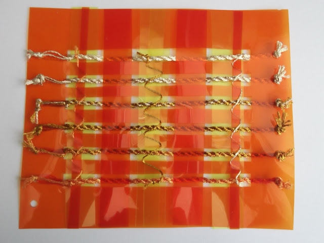
The frame is made of orange acetate, with strips of the same colour and yellow across it to make it firmer. I chose these colours to capture the warm glowing quality of light.

Because of the translucency of the acetate I did not want to attach the ropes with glue or sewing, so decided to use knots through holes made with a hole punch.  The thinnest strips of acetate are attached to the braids by winding thinner ropes around them.

The ropes were hand-twisted from shiny man-made yarns, and are graduated in colour by combining four different colours of the same shiny yarn together in various proportions.