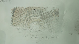
Monday, 30 July 2012

More about Part 3 Sample

I have had quite a few visitors to this blog but no comments yet. I would be happy to get (constructive) comments. Please feel free.


Some thoughts about working on translucent fabric.

- The threads at the back show through so I have had to tie off each separate one. This has actually led to something rather attractive - the cut threads at the back become a fuzzy part of the pattern. I think I will use that to give some shape to one side of the flower by leaving the connecting strands for the ones that are closest together. Or at least I'll see how that looks.
- It looks lovely and light as I had hoped - like a dandelion clock about to be blown off.
- There's a limit to how heavy and rough the yarn can reasonably be before it looks odd, like it's holding the whole thing up on that one stitch.
- Thin shiny threads look particularly good on it for some reason.
- I'm thinking that there may be a lot of other ways to use the fact that the fabric is see-through, and that I can't be the first person to think this. I should try it again, and I should see if I can find a textile artist who uses this in their work. Perhaps ask my tutor.

This is my sample so far.
I haven't worked out how to get the translucence to show up in a photo yet.
Something else to work on.
Well, I've been having a struggle with myself about whether my sample is going to be acceptable. The trouble is that when I am making it I keep wondering if I am doing what is intended by the exercise. Should it be more abstract and free? Should it be more like an actual 'sampler' like the ancient ones with pictures and rows of regular stitching on them. Am I actually making myself veer from the whole reason for the exercise in the course file / missing the point? And wishing that the instructions included some examples of other people's samples, to give me an idea of what I should be aiming for. Or if there were some way I could get reassurance that I am doing it 'right'.

Now today, I realised that what I am struggling with is the difference between a creative course and the kind of academic study I am more used to. For this course the instructions will be deliberately much more open to allow creativity in the response. I did not expect to find myself responding to instructions by wanting more direction! I will keep thinking about this issue, and keep trying to use the instructions as a stepping stone into opening my creative self rather than as step by step invariable laws.

I think I have managed to be open and creative in my own way with this piece. But just to be sure I want to spend a little time doing another one for this same exercise. This may mean I will need a bit more time to finish this part of the course, but I think it is important for me to get a bit more understanding about this relationship between a brief and my ability to do my own thing.

My experience of working with the flowerhead picture has made me think I might do better with something even more linear, and have picked a very small sketch of the lines on a tabby cat that I did as part of a page about great artists' mark-making in my visual workbook/ sketchbook.

For some reason I think quite bright greens express the feeling these give me. Initially I was thinking about a green background as well, but the new, clean feeling of the lines will go better with plain white I think.


Friday, 27 July 2012

Paolo Uccello


Paolo Uccello, who I was reminded of at the Royal Academy Summer Exhibition, is on the list of suggested artists to investigate in the course folder. I have spent some time today doing that on the internet.

I looked in various places but found a good summary of his life and work at www.arexperswebsite.com/pages/artists/uccello.php

The italicised parts of the following is a series of quotes directly from there:
Paolo Uccello 1397-1475
He would stay up all night in his study trying to grasp the exact vanishing point. He used perspective in order to create a feeling of depth in his paintings, and no, as his contemporaries, to narrate different or succeeding stories. (More like modern painters)
His best known works are the three paintings representing the battle of San Romano (The other two are in the Louvre and the Uffizi. The Medici family of Florence commissioned them).
He worked in the Late Gothic tradition, and emphasised colour and pageantry rather than the classical realism that other artists were working on. His style is best described as idiosyncratic...He had some influence on twentieth century art and literary criticism.


uccello-battle-san-romano-NG583-fm.jpg


Paolo Uccello The Battle of San Romano


Georgio Vasari - The man on a horse in the middle of the painting was called Nicola di Tolentino. He is wearing a mazzocchi or hat, constructed from wooden hoops covered with cloth. 
According to Vasari in his Lives of the Artists,
"He used to show Donatello...the mazocchi that he had drawn with their points and surfaces shown from various angles in perspective.' (Here's another artist trying to paint things from all sides.)


Vasari also implied that Uccello was more turned on by perspective than by his wife. Vasari's book is full of naughty or personal jokes like that, as if he knew them, but in fact his book was written 75 years after Uccello's death so he couldn't have.


The National Gallery website says 'Uccello was much preoccupied with one point linear perspective, seen here in the foreshortening of shapes and arrangement of broken lances... The best known system of linear perspective is that described by Alberti in his treatise 'On Painting' ('De Pictura', 1435), in which receding parallel lines appear to converge on a single point on the horizon....If an object or person is foreshortened it is depicted as though receding from the viewer into the picture space.' It gives the fallen knight in this picture as a good example of this.


I say - The lances on the ground look very artificial in their lines showing the perspective, but only when you look directly at them! There's something stylised about the whole painting, but it does have a lot more depth to it than a lot of those very early renaissance paintings. The horses and armour look rounder.  The hat, as well as being three dimensional, has some good details of the brocade it is made of.  I am attracted to the stylised orange tree behind the action. The whole style is rather solidly 3 dimensional, like a children's cartoon on t.v., and that along with the bright colours and action makes it initially seem more decorative than serious to me. I think that was what drew me to it as a child. But the whole scene is sophisticated, and about a historical event, and there is the underlying development of a technique that was very new at the time. 


He was known as Uccello because of his fondness for painting birds. He kept a large number of pictures of animals and birds at his home.
At the age of 10 he was apprenticed to Ghiberti...whose late-Gothic, narratie style and sculptural composition greatly influenced Paolo. Lifelong friendship with Donatello. (Who is famous for having made some figures for the front of a church which were in excessive perspective so that they would look grand from below).


What follows is some of the things I have thought about when I was looking at some of his other paintings.

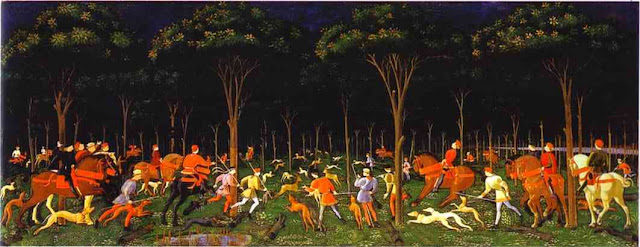
This is the Hunt, which was his last known work, painted 5 years before he died. 
The perspective is clearly there in the trees, the lines of the branches, dogs, and lance, and the shapes of the horses. It's a very attractive painting, with bright colours, and lots of excitement. I particularly like the stylised (as opposed to realistic) trees, which remind me of some trees in Arts and Crafts art. Like these trees on a Voysey clock at the Victoria and Albert Museum. http://collections.vam.ac.uk/item/O9685/clock-voysey-charles-francis/

St George and the Dragon 1456

This one is also at the National Gallery, and I remember thinking it was like something from a story book, except for the gory lance in the eye. And that the posture of the dragon was very good at showing how an animal would cower and roar at the same time. Now I look at it again, I see the linear perspective in the strange blocks of grass, in the inside of the cave and the lines on the ground, in the foreshortening of the horse, and the posture of the dragon. I also see a spiral cloud on the right, which is so unexpected in such an old painting. Perhaps God is in the cloud or something. But it has a fluffy texture and the colour intensifies inside the spiral. And underneath are trees that look more like giant moss. It's all very unusual. 


La Tebaide (Episodes in the lives of hermits) 1460

This painting does use perspective to separate different hermits' lives. The stairs turn a corner to mark out a separate cave for one story, and a running monk in another. I am happy to see here some more albeit different species of stylised trees. There are lines of dots in the background, and on the roof of the church, again showing lines of perpective.

I want to try out some of this linear perspective, perhaps with lines of stitching, or lines of dots, and also some of these trees, in my sketchbook. I am also drawn to the spiral cloud, and I might have a go at making something like it. 


Thursday, 26 July 2012

Part 3 A Sampler

Yesterday I read some more of the sketchbook book, spent some time with my textiles workbook (which is what I think I will be calling mine from now on), and picked my fabric and yarns for the sampler exercise.

I have been reading the chapters about three dimensional work and artists whose focus is the pleasure of the fabrics themselves, and also the following chapter about conceptual work. I can really relate to the people whose work is an expression of something they are working on internally, and that sometimes it isn't clear what that is, or even that it would be a good idea to try to work that out.

My stuff so far has been three dimensional, organic-looking, very tactile, and pretty opaque when it comes to meaning. Conventionally attractive vs. disgust or twistedness has been a recurrent one. The hidden complexity in apparent simple lines another. And I so haven't been interested in making them all neat and tidy in a conventional embroidery way. I laughed out loud when I read the suggestion in the instructions that I might be used to sewing tidily.

Which is why it's a bit strange to find myself being so neat and confining myself to small areas and straight lines! I don't know if it is the way the exercises are directed, or if there is something tidy inside that has been waiting for the opportunity to come out. I have been surprised to find that these initial sewing exercises have resulted in my making neat regular patterns and focussing to an unaccustomed degree on a pleasant final overall look of the piece.

I suspect that this is the difference between starting with an idea and narrowing down how to make it look like it does inside my head, as opposed to doing a simple stitch and seeing where it takes me. I rather like this way. And I am glad to be led by the needle into new and pretty pathways. I just hope that it is not a sign that I am after all too hidebound by convention and prettiness, and is taking me in approximately the direction intended by the course-writers!

In my textiles workbook I reviewed the notes and very quick sketches I had made at the Royal Academy Summer Exhibition at the weekend. Most of the exhibits were not textiles at all of course, which I found a little disappointing. I always like the Summer Exhibition because there is such a huge range of styles and tastes and there's always a selection of things that move me or intrigue me in some way. And always some few which are really masterfully made.

They are all packed together like those classical paintings of artists' studios and it can be difficult to cut out the 'noise' of all the other exhibits to properly look at one. In addition I had my family with me, which is not ideal because it cuts down on the time I can spend on what I'm interested in, as well as having to deal with their comments, questions and opinions about everything. And their wish to leave before we'd seen the artists' books and sculpture. I think in future I will try to go to at least some exhibitions on my own to allow myself to truly follow and wallow in my own interests.

One of the pieces that stood out for me this time was a painting of a landscape and sky with a strangely pointed man and a bird. It was the way that the low hills in the distance were bleached out by the brightness of the sun. I have often seen this in real life, but I think never so effectively in a work of art.

And I enjoyed some really awesomely skillful oil paintings by Frank Cuming RA.

And in a completely different, more amused way by a piece made entirely out of painted clothes pegs. I enjoyed it at first because of the regularity and texture. And when I got closer because it made me laugh. And closer still because of the dedication and belief in the idea that it must have taken to make it.

But the Cathy de Monchaux pieces were for me the most interesting things in the show. I know not everyone likes her sculptures exactly, but ever since I saw some of her work at the Turner Prize exhibition I have had a visceral reaction to what she makes. She uses texture in a way which defies categorisation, with textiles or fur often part of it, sometimes contrasted with metal. There's something beautiful and intriguing about them, with underneath something very fundamental which art works cannot usually get close to. I'm guessing that her inspiration is very internal. Her website (which the link comes from) doesn't have an image of anything I saw at the Summer Exhibition.
http://www.sculpture.org.uk/image/602816413255/4/

I particularly liked a piece called Sweetly the air flew overhead - a battle with unicorns. Why? Because it was in deep relief and made me feel I was right in there with the tiny unicorns. Because it was so meticulous and detailed. Because the unicorns horns, and in fact the layout of it reminded me of Uccello's Battle of San Romano, which I have liked looking at at the National Gallery since I was a child. And because it is in part made out of elastoplast, which indicates to me, yet again, that she really works at using the materials, however outlandish, that work for her vision.


Sunday, 22 July 2012

Modern Chinese Ink Paintings at the BM

There is something special about the composition of these Chinese paintings, even the very recent ones.
What? The sinuous line down the long thin scroll, with the main focus off-centre and sometimes not there at all, a kind of perspective where size indicates importance (perhaps) and the greatest detail in the little plants and birds. Decoration is with living things. They are not afraid of lots of blank space in the composition. And that I like - the blank parts illuminate the shape of the overall curve. I could try composing something like that.

And they were more expressive than I expected from their rather formal presentation on scrolls. There's something interesting to me about the contrast between first impressions and gradually dawning realisation that all is not as it seems, that makes it forever impossible to see it the way you did at first. Which artists do that?

Lots of them in different ways I guess. I should make a collection! The first one that springs to mind is dramatic - Let's eat outdoors today by Hirst. But there will be subtler ones.

hirst_02_4d3985cc2db50.jpg
Lets eat outdoors today Damien Hirst 2009
from http://www.glamkiller.com/2011/01/21/glamkiller-art
-lets-eat-outdoors-today-damien-hirst-fait-de-lart-avec-des-mouches/

The Liu Dan ink paintings were the highlight for me. Perhaps because they were accessible without lots of knowledge of the history and conventions of Chinese painting.

There was a series of 6 drawings of a single rock, from all different directions, that took him 6 months to do, and a dissertation about how it linked him spiritually to the rock to do this. Which sounds pretentious but I know for myself that paying attention to one thing for even 15 minutes can get me very attached to it.

And one huge one of a rock. I couldn't see where his strokes had fallen - no lines, just the rugged shapes of light and dark on a rock. Is this what I like - photorealism? Not always. It's the skill of it, the vivid texture, and something about the unimaginable time and attention it must have taken.


poppy_304x384.jpg
Liu Dan (b. 1953), Poppy, Ink on paper, 2007. From a private collection, Beijing.

This picture doesn't do it justice - it looks a bit like folded silk here but in reality there is an intricacy and light fragile look to it, on its sinuous stem, and the detail in the petals is extraordinary. I respond meticulousness like this with something like awe. It's an opium poppy which even I know has historical significance for China.


Want to go to the V& A and start looking at textiles now - think about which part to focus on first.
Also try representing 3D things from all different angles.

Friday, 20 July 2012

Even more Part 2

I don't know if I should still be doing this sewing lines / shading / contrast, but I am. I am finding new things about how it works every time I try something different. I am not sure if I am doing it 'right' but in some ways I think it would be a shame to stop and move on to the next thing when I'm getting so much out of it.

Like what? The different appearance and feeling of different thicknesses - rustic matt or glamorous shiny - delicate straight vs organic curvy - the way chain stitch draws attention to the stitching, or when it's one chain stitch only it makes a pleasant texture, like rice grains.

But then I suspect the whole process of learning this is a spiral one, that I cannot complete without moving on, and then back to doing this exercise with a particular theme in mind when I have done all the other parts of this course.

Wednesday, 18 July 2012

Creating Sketchbooks for Embroiderers and Textile Artists - Katy Greenlees 2005 London

The beautiful required reading book about Sketchbooks arrived today. It truly is an inspirational book, and just flicking through it broadens my understanding of what sketchbooks are for.

The introduction suggests that the word sketchbook may be restricting, which I think it has been a little for me. I have been sticking interesting bits and pieces in elsewhere, and keeping my sketchbook mainly for drawings. This book and suggests some alternatives - I like 'visual diary' and 'workbook'. Visual diary implies it's a record but not necessarily in writing, and that the stuff in it may or may not be useful in future. Workbook emphasises the design work aspect of it, and for me that it has more practical things in it, like measurements as well as experiments.

The first chapter is about the purposes of a sketchbook, and I can see that while I have been doing most of these things I have not put them all in one place in the way they seem to suggest. With the result that it isn't easy to store them all together.

Also that the sketchbook I chose for practicality's sake is way too small for this purpose, but still perfect for leaving in my handbag so I can get at it whenever I want to jot something down. But I think I'm going to have to start taking pages out of it and sticking them into a much bigger paged book eg A3. Which will allow me space around it to expand / compare / explore etc.

The other thing I have done as a result of reading this first chapter, is to write one of the purpose words on each page of my sketchbook to get my head straight as to the creative variety it can be used for.
 

Sunday, 15 July 2012

Sea and sand

This course has me looking at everything differently. Well, perhaps not so much differently as taking note of what I'm seeing more.  And recording it in some way or other when it is interesting.

We were lucky enough to have some sun when we arrived in the Gower. As soon as we put up the tent we ran down to the beach with our bodyboards. The afternoon sun on the shallow water has so much texture I wanted to record it for my skin theme book.


The sea at Rhosilli beach

I noticed for the first time what a sharp angle the water makes with the sand when you look up the beach - about 30 degrees. And that this shows the perspective very clearly.

Working on lines of running stitch, I found out how much the colour of yellow wool pales when you sew it further apart. I think this is the right way to say it, rather than saying it intensifies when it is together, because it looks more intense in the ball.

I particularly liked altering the lengths of stitches to see how that affected the end product. I did one section which ended up with me picking up only one thread of the calico underneath between stitches. It was more like weaving than sewing in a way. And looked interesting and attractive.


Running stitch exercise
The flash shows up the difference in shininess of the threads.
The crumples are because it was done during a camping trip!

I loved the way this section turned out. I wanted to make it circular (dictated by the embroidery hoop) and look nice all together, even though I know that isn't the point of the exercise at all. The proximity of the different sections caught my imagination and I ended up doing some which should really be part of the next exercise.

Once I realised that I reread the exercise instructions, and thought - how can I do ALL the permutations of narrowing patterns, four stitches, thick and thin, textured and smooth, matt and shiny? Can that really be what they mean?

I particularly liked the way the thicker harder yarns made such a different kind of texture. The middle section was done with upholstery twine. And I noticed again how the type of yarn and the closeness of the lines of stitches dictates the length of the stitches I want to make.  I think I should try doing the opposite - long stitches in very fine thread close together, and very short ones in thick thread - just to see what happens.


Saturday, 14 July 2012

Crayfish/ Textiles 1 Part 2 Stage 2


We stayed the night with my sister, who has a huge collection of drawings of fish all over the walls of her corridor. (Mostly by her friends, which makes it very creative-friendly). Because of this course, and the drawing every day, I had the confidence to make a copy of a Japanese drawing of a crayfish (I think), which I coloured in purple because that's her favourite colour. It has some good textures in it, especially the hard sharpness of the carapace over its thorax. I might try that out for one of my sewing exercises.


We went to a Lebanese restaurant in Bristol which, as well as having delicious food and being very child-friendly, had these fantastic lamps.

I particularly like the way it's the negative that gives the pattern, and that you can't see what that pattern is going to be by looking quickly at the lamp. And that it decorates every available surface.

This photo is from this website.

It's a lot of fun doing the first embroidery exercise using my yellow/ neutrals bags of yarns and calico. As suggested, the mind tends to wander during the relatively slow process of doing it, and so there's no difficulty knowing what the next square of stitching is going to be.

I wasn't sure why it was suggested that I have my sketchbook to hand, but now I can see that sitting doing this stimulates the imagination, and more ideas keep popping into my head, and also that looking back over it can bring up some other thoughts about what to try out.

I like the idea that each one doesn't have to be perfect, or even very attractive or interesting, because they are each try outs just to see what happens - like the drawn patterns in the first exercise.

Friday, 13 July 2012

Pintucks/ Textiles 1 Part 2 Preparation

Packing for a week's camping started with a pleasurable hour packing for a week's sewing. Quite a discipline trying to pack enough so I wouldn't be too restricted in my choices of fabric or yarn, but not have so much I couldn't pack it safely away from rain if necessary.


As you can see I couldn't resist packing some of the more exotic fabrics on the list anyway. Perhaps I will get that far in the instructions. Although I know perfectly well it's very unlikely what with the surfing and the castles!


I went last minute shopping with my daughter and drew this part of her muslin dress in a cafe at the shopping centre. I'm not sure if it will be useful to have this in my sketchbook but I do like folded fabric like this.

It doesn't look pretty or clever, but it's what I'm interested in, and might work more on, and I guess that's the point of the sketchbook, isn't it. There's some doubt in my mind a lot of the time about whether I'm doing this right - the sketchbook, this blog, the whole business - how long each part should take etc. Although not so much that I think I need to bother anyone with stupid questions, or anything. Just the usual doubts you get when you're doing something for the first time and you don't know what you're doing!

Monday, 9 July 2012

THE JOY OF THREAD / Part 2 Preparation

Today I started preparing my mess of threads, wools, ribbons and all for the next exercise, by getting out all my bags and sorting them out into similar colours. I don't know if everyone on this course is like this, but I have multiple bags of tangled yarn I have collected from various eras of my sewing/knitting/embroidery life. Some of them were given to me, or left to me.  Sitting in the middle of the floor of the spare bedroom and sorting through them was a journey and could not be done quickly.  Each one of them has a history, but that was not where I went...

I was transported by the colours and textures to a world where time stood still, and the feel and sensation drew me in to atmospheres rich and rare. I have some wonderful things in there. I put in some raffia, ancient metallic ribbons and lace, scraps of tissue paper and transparent sweety wrappings that I love the look and feel of. I have stuck some bits into my scrap book with little sketches of my diversions of delight. If the idea was to inspire, it's working.

I do have some reservations about my sketch book at the moment. I feel rather constrained by it, because of what has gone into it so far being largely pencil drawings. I've been loving the improvement in my drawing ability that's resulting from drawing every day, but - I don't know - it isn't messy enough! I think I have to think of it more as an ideas book than a sketch book and see if that works better. I'm also not so sure how to decide what to put in there as opposed to what goes in the theme books.

Unfortunately my printer is out of ink and is therefore only able to give me black and white, or unpredictable colour.

Having said unfortunately, this has actually produced a couple of interesting textures and I am putting them into my theme books as variations on a theme. I am going to have to remember to switch my camera to high resolution when I'm taking inspiration photos, so that I can enlarge bits of them.

Writing this blog has the unexpected effect of freeing my mind up so I stop being neurotic about little things and let my enthusiasm take me on to the next thing. I guess it's a good thing!

Sunday, 8 July 2012

THEMES

I've been having a think about what themes there are in what I am drawn to, so that I can put the images and thoughts and ideas together as recommended. (Instead of leaving them jumbled in my ideas drawer as they are at the moment.) This is obviously a useful part of the preparation for the next project, because it will inform which bits of fabric, yarn etc I put together in some of the bags.

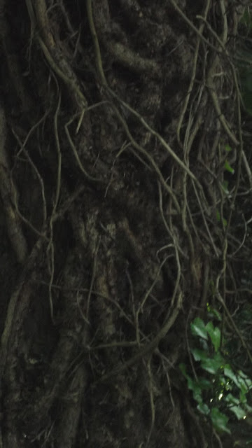
ROOTS/ IVY - It's the tangled fleshy mysterious quality of them that I like. I made a soft toy heart with ivy instead of arteries curling round it.

From udidahan.com
Looking at that heart now, even so early in the course, I see that I could have made it so much better and more rich with meaning if I had taken some time to do some drawn or sewn studies/ try out some different techniques before I got stuck in.


SKIN - I'm thinking I would like to explore blotchiness, and the variations in colour of skin. The contrast between the hairy armpit in all its sensuality vs. plucked skin. Or the fragility and strength of bat wings.

There's so much cultural expectation about what women's skin looks like that it's an effort to actually see it as it is. An effort that I'm not sure I'm quite up to yet. (But can feel myself getting there more each day)

And also it's very complex texturally, which makes it quite ambitious to try.

From Mickey3D.wordpress
I want to try to capture the colouring/ texture of my children's skin/hair somehow.

And I am watching my own skin as I slide towards 50 and want to use it as a metaphor for that process of accepting and fighting the inevitability of physical decline.

HIDDEN: Something that keeps coming into my ideas is a contrast between clean hard plainness on the outside, (or perhaps a shell or spore covering) with something expansive, messy, burgeoning, crusty, colourful, meticulous, intriguing, unpredictable and intensely private on the inside. Someone is hiding their true complexity behind a shell or minimalist cover story. (Not hard to see the metaphor there!)

This one overlaps with AUSTERITY/ ABUNDANCE : This is a relatively new one for me. Not much coming yet, but it feels like a biggie. The visual /textural things that shout austerity for one thing. And the way society says abundance is more technology, but to me it seems so austere vs. natural abundance eg Crystal Palace radio mast hard and skeletal over a mass of fully grown horse chestnut trees along the edge of the park. Both designed to pick up energy from the sky.

DRIVING KILLS: Something about the sleek speed and aggression of cars, made into a visual impact. Almost advertising. Or the opposite, a government health warning. 'Driving kills you and those around you' cf cigarette warning notice. Lots of studies of silver, reflections, and depicting movement and recklessness needed for this. A bit futurist. Impetuous power = danger.

DURHAM QUILTS: Don't know what it is but I can't help being awed by these intricate quilting patterns on white cotton. Wondering if I can't use the technique and take it somewhere else. I want to spend some time trying out some different kinds of swirling intricate lines of white on white to see where it takes me.

OLIGODENDRONS: Mysterious fossil plants which have a very pleasing regular shape to them.


Lepidodendron from personalkent.ac
Obviously rather more themes than I can reasonably spend the time developing. I guess I will work with these while I'm doing the course work and see where I end up.

So lovely to have permission to spend time pursuing these very personal areas of fascination.


Saturday, 7 July 2012

Textiles 1 part 1

Wow.
What a pleasure just to clear the kitchen table and fill it with lovely pencils, paper and piaints for my own pleasure and experimentation.


I loved the list of new and exciting ways to make marks. I could have spent six weeks just exploring each of them to the hilt.
I am particularly impressed with the negatives - bleach painting, rubbing out, and the making rubbings. Although I think I will have to try out a variety of different rubbers as the putty one I have doesn't give me the kind of control I would like for the rubbing out thing.
And the fixative technique - well! I had seen pieces that had transfers on them and wondered how it was done, thinking it woudl be some complicated photographic technique using software, and there it was, simple as a child's tracing paper transfer. Yippee!


All these things are getting me excited, and worried that I don't have enough time in my life to try them all out to the fullest. And that I will spend my energy doing that and not be able to decide which one I like best.

So, to start me off, here are the ones that appeal to me personally the most, and a bit about why I think that is.

Wax resist - I hadn't thought of doing this before, and I like the way it allows you to think one layer at a time without the next layer obliterating what you've done. The spirals let me make the focus move as it where - different shapes on different levels of the picture. I think there's a lot of potential here, and of course it can be applied to dyeing fabrics.


Bleach on coloured tissue - again, something I hadn't tried before that obviously has lots of potential. I like these ones where you can add something but it takes away what's there. It makes the mind boggle as to all the ways it could be used. Another one I want to experiment more with.


Block printing- in this case using the skin of a lemon. I found this very exciting and went a bit mad using everything I could find in the kitchen. Realising that I could control the intensity of the paint with pressure in particular parts of the lemon was a revelation and opens up all sorts of exciting possibilities. I like the feeling this one gives me, which is why I have chosen it for this blog.


Fixative transfer - aha, that's how they do it! I tried out different magazines and different rubbing implements and this was the best. I think I might look for a different kind of fixative spray too.

An image popped into my head today of myself peaking under a black cloth over my eyes. I am at the cave entrance to a new world here. I can't see through the darkness to the world beyond, but I know full well that everything is not as I had thought. Not because I could not see, but because I took my thoughts to be sights and ignored anything else. I'm not sure what I mean, but it involves switching off my head, to let me see. How very Zen.

I have not done anything like this way of going about drawing before as far as I can remember. I found it very liberating and enjoyable, and see well that it can add lots of different and new ways of doing things to my repertoire. I am starting to see more clearly how this exercise will help my textiles. And that I will want to come back to this exercise again and again as I develop my textile ideas so as to gain more techniques and ideas.

One thing that I found quite difficult to get my head into was the idea of drawing particular feelings or sensations. I suppose because this is a completely new idea for me - to start with that alone. I'm not sure how successful this was, although I did find it was becoming easier during exercise 4.

I think more three dimensional images work more powerfully, for me at least. For example, the collage representation of a pine cone really worked, with the hard thickness of it coming out at me and the striped colours of the magazine pages conveying the richness and striations of the material.


This page shows several attempts to represent the swirly furriness of two intertwined teddy bears.
(The charcoal on the right has a wavy pattern in it made with a comb).

I really enjoyed trying out different things to do this, and can now see that my previous method of working out how to represent something was severely lacking in experimentation. And lost a great deal of interest and intensity as a result.

As I went through the exercises I got more inventive, and tried out more new things. This one was a response to a woven throw I have on my sofa. I like the way the bleach came off the brush in an unpredicatable way, giving it more 'natural' variation.

I tried out printing with string, broccoli, bits of Easter palm, and lots of other things.


For the next section I went one step further and used more than one technique for each study, trying out different things on top of and with each other.

This one has a background of spots from making a rubbing over a metal sieve, and in the foreground using a comb dipped in gouache. It was almost a negative of the charcoal drawing for the teddy bear exercise, and it will be a useful addition to my library of techniques!


This is my exploration of the pineapple drawing in my sketchbook, using collage, lemon-skin printing, and fixative transfer. Again, I'm not sure it really gives the texture I had in mind, but it does give an idea of the cushions and spikes. And it's a good starting point for moving off into something more interesting.


This is my response to another one of the teddy bear studies, using washing-up scrubber printing round the outside, pencil rubbing of a thick spiral of paper, and fixative transfer lines on top. I also added some pencil marks to take the radiations into the outer part of it.

This one is special to me because when I was
making it something inside me took over making
the decisions about what marks to make and came

up with this fantastic three-dimensional circular thing in the middle that seems just right.

I found this one surprising and satisfying and would have to say that I enjoyed it most of all of them because of the surprise element.

Generally I most enjoyed working with rubbings and block printing, perhaps because of the physicality/ 3D nature of them.

I am already drawing in a more relaxed and inventive way in my sketchbook. This exercise has undoubtedly helped me to do this, as well as the exercise looking at mark-making by great artists.

I didn't try using watercolours or inks in this session. I intend to try these out next time I do something like this. I am looking forward to working on some of the images in my photo album and themes collections in this way... to see what happens!

How will these exercises enrich my textile work in future? Well, so many ways I can see already.
1. Through this exercise I have learned that trying out new and crazy things often gives interesting and complex results.
2. That I don't have to stick with one technique or style of thing at a time, or one degree of detail over the whole of a piece.
3. I don't think I really 'got' before that nothing, however artificial, has an even texture all over in real life, and especially not when you're representing it artistically.
4. Oh, the obvious one that I won't find the good techniques without risking a load of poor images.
5. And that the more I experiment the more techniques will be available to me
6. Strangely it has also made me feel freer to use colour in drawings.
7. And finally, that almost anything can be used to make interesting marks!




Friday, 6 July 2012

Mark-making by the greats.


I'm spending today looking at mark-making by Klee, Picasso and Van Gogh.


 400 Domes by Paul Klee

The first thing I notice is the colours. That they are in squares. Unusual for a cityscape. Or not what I expect anyway. And very much breaking up the space with contrasts between the different colours, and now I see the different textures also. This brings to mind the sides of lots of different buildings made of different kinds of building material cutting into the view.

Looking at the lines, the only non-straight lines are domes. Are they in fact the only lines at all actually painted there, other than the ones along the lines of contrast? Not quite - there are some green crosses towards the foreground. Strange. There are also, now I look specifically for them, some lines of the slightly greyer blue on the top right dome effectively outline the construction of it and shadows thrown on it.

The lines between the shapes are not all outlined in darker paint - many of them are represented by contrasting colours, or in some cases by a change in the texture. For example the two squares of brown at the lower right side.

The texture of the foreground is generally more deep and complex than the blocks on the horizon, and in dirtier colours, as it would be, being closer to the viewer. This lets us see that the sky is bright and clear, and the foreground is in shadow. The foreground is without eye-catching detail, which leads my eye upward and out of it, as I suppose the domes would do in real life.

This is the jumbled and lively impression of a city rather than anything really representational. Which makes me look at the domes up against the sky as the most striking thing about the scene.


 The Red Balloon by Paul Klee

The mark-making in this painting seems to be much more about the texture of the background. Looking at it in higher magnification, I can see that the background marks are mostly short sections of grey, gold, or rust-coloured line, mostly horizontal or vertical, mostly not crossing each other. There are some areas (like in the bottom left hand corner), where they are more connected to each other in geometrical shapes, like the cracks in old lino or the surface cracks of skin. The shapes are almost all outlined with darker lines of paint in this painting.

The balloon and the other red areas are striking in that they do not have these lines on them, but are painted to produce highlights that make it look as if they have a soft sheen on their surfaces. This is accentuated by the outline being more 'fuzzy' on these areas. This and the curved line of the balloon, makes the viewer focus on these red areas, and particularly on the balloon itself.


I've picked three Van Gogh pictures from the web that look very different from each other.

 This is Self-portrait with bandaged ear.

To begin with it looks quite simple, almost childish rather untrained painting. I think this is because it doesn't look the way a portrait is 'supposed' to look. (From a classical point of view). And because the brush strokes are visible and large. As if it were done jabbing hard with the biggest brush in the pot.

Does smoke really look like that? He has painted in curls of lighter pigment and some wriggles coming from the bowl of the pipe.

There is a great contrast in textures between the face and the rest of the painting. The grain of the face is more delicate, and to a certain extent of the bandage. I guess it was done with a smaller brush, and with much less paint on it each time. The features are detailed and he has looked and seen the reality of their asymmetrical expression of feeling. He looks tired and as if he has given up. I think this is because of the slightly lowered eye lids and the lack of animation in his face. But also because of the colour of his skin, somehow. The shape and texture are represented by shadows and colour variations. In the rest of the painting the colours are more in blocks with the texture being shown by the brush strokes rather than detailed shadows or colour changes. The red area has texture added to it by scraping off paint in disconnected lines, by the look of it. The fur hat has more detail than the rest of the surroundings, with the brush strokes showing the messy furriness of it. The coat is interesting - the green seems to be painted over beige, leaving areas of wear, showing that it is an old coat.


It's probably obvious that I don't like this painting. Why? It doesn't really speak to me and I don't understand why Van Gogh is thought to be a great artist. This exercise hasn't yet converted me!

Van Gogh - Trees
This painting has so much texture in it it makes me want to step back a few paces. And for this subject that seems to be more appropriate somehow.

I see that the whole surface of the painting is covered in texture marks, so there's something super-real about it and it feels as if it's 3D and you could feel the knobbles of the surfaces with your fingers. The trees themselves are outlined, making them stand out from the textured surface of the rest of the picture. This even applies to the little ones in the background. It really is about the trees. The size of the people gives an idea of the huge scale of them, and also a slightly claustrophobic/ protective feeling from them being so close to the fronts of the houses.

The bark seems to be painted with layers of colour with short sharp lines of stronger colours on top. This works well to show the qualities of hardness and movement in the bark. There is more detail and more variety of colours in the trees than in the ground behind the or the strange grey lumpiness between them. Not sure what that is - perhaps something to do with the men kneeling next to the blocks on the right hand side. Perhaps they are building a wall there. The men are little more than outlines. The blocks, though, have striations and shadows of interesting colours. And the ditch they are working in seems to be moist because of the richness of the colours there and nowhere else.The strokes there are more complex and overlapping than elsewhere.


Van Gogh - The Starry Night
This one again has short hard strokes, this time of oil pastels I think, in this case being used to show the glowing auras around stars in the sky. This is much less realistic than the others, and more emphasising the feeling the scene gives out using the imagination. eg the swirling pattern of the sky and the magical pinnicle shape of the top of the tree (if that's what it is). The circular patterns around the stars are so different to the 'star-shaped' radiations usually drawn around stars that it makes you think, and you find that it is the way lights seem much more. The blues and yellows are too bright and artificial for them to be the real colours of the night sky, but they give a feeling of simple joy to the viewer.

Pablo Picasso - Torso of Venus

I saw this one when I did a web search and thought wow, the man could draw. You can really see it as a real woman by the texture of her bottom and thighs, despite her being truncated. Which makes me think about the depiction of women in this  way and feel somewhat offended by the thousands of years it has been done. Perhaps that was a point Picasso was trying to make?

There is a very accurate realistic outline, and then it  is filled with shading to show the fleshy texture. I particularly like the shading showing the ribs underneath, and the irregular shading demonstrating the dimples of the bottom.
Picasso - Au Cirque

I think this is just a little sketch, but I included it here because it shows the very clear and real line that Picasso was able to draw. For example the shape of the horse's back legs and neck look like a real horse does. And at the same time there is something prettily artificial about the mane and tail pencil strokes that lets us know this is an entertainment. He made it look so easy - the man was a genius.

In side the horse outline there are short strokes that tell us that this horse was slightly shaggier than we might expect. As if it has worked hard since it was last groomed.


Picasso - Woman Playing on the Mandolin
In this painting he has taken what he sees and rather than transferring it realistically onto the canvas, he appears to have taken the shapes of each part of the woman and of the background, and depicted them separately as if they were made of something hard and smooth. Like a carving out of wood or a model of cardboard. The colours have been chosen to accentuate the unusual shapes and texture rather than to illuminate the colours or texture of the woman. The breast stands out as being the most obviously rounded part of the subject, more round, and with more light on it, than anything else in the painting. The face is the most stylised of all the shapes in the picture, presumably intentionally so as not to distract. The shading in many parts is done with stippling or dots of a bluer grey. The mandolin itself is much more of its own natural shape than most of the rest of the picture, and closer to its natural texture. It's almost as if Picasso were saying this woman who is playing is set in stone.

Thursday, 5 July 2012

Only commute

I took the long way home from work on my bike so I could get some more photos for my resources box. I am so used to scooting right past things, however intriguing or beautiful, that I initially found I was strangely resistant to stopping and getting my camera out.

As I went along I found there was more and more of interest along my suburban road home. And I appreciated the journey I make so regularly in a way I haven't really done before. Of course I have never agreed with the people who wish they could just cover their eyes and ears and be in suspended animation all the way to work, but today I understood some of the excitement and sensual pleasure I have been shutting out by thinking about work or, dare I say it, being run over by a bus, rather than truly looking at my surroundings. And I arrived home with gratitude in my heart at my luck at being able to live in such a beautiful part of the world.

In the end I was stopping so often to record textures or reflections, that I had to call a halt or I was going to be late for my next commitment.

Here are some of the images I brought home.


And I also brought home a determination to keep my eyes and heart open in future.

Wednesday, 4 July 2012

Pineapple skin

Sketching every day is certainly very enjoyable, and is making me look at things in different ways. I thought it was about drawing the outlines, but now, especially after drawing pineapple skin, I am starting to see that if you do it that way you don't get an idea of the texture or the three-dimensional shape of things.

Also that when I tried to draw every mark and shadow and colour variation it in some ways prevents it from looking really the way it is. Perhaps because I'm not so good at it (this drawing thing) yet, but also perhaps because I'm doing something with my head that gets in the way ...I don't know.

I tried out simplifying the shapes - especially the regular ones, and ended up with something very attractive and interesting. That I can see making a very nice textile design.


So I tried out some even simpler ways of doing it. They didn't work so well, I think, and lost something of the nobbly texture - what I am thinking of as concrete-filled beanbags. Although the ones thaat look like a family of pac-man/ pac-people is quite interesting adn could be worth exploring more.

While I am enjoying this new experience and the unexpected focus on drawing, I can't help wondering when I am going to get out the needles. There's part of me that arrogantly thinks - if this is the way everyone designs art textiles, no wonder they often have a bit of a familar quality to them. How can you be original when you go about it the same way as everyone else? -  Phew. Glad I got that one out. Of course at the same time I know for sure that this is exactly why I signed up for this course, to take steps in artistic development (if that's the phrase) that I would not have worked out for myself.

I am looking forward to doing all sorts of new things and no doubt changing my mind about things repeatedly during the course.

Because that's what happens when you learn.

Sunday, 1 July 2012

Sketchbook fever

Just the decision to sketch every day has made me see things differently.
I've surprised myself by picking on flowers so far - probably because they're the prettiest things in my kitchen.


This flower looked intriguing with the unexpectedly strong coloured lines seen with the light coming through the fragile moist petals. 

I realised drawing them with a pencil wouldn't convey the strength and delicacy, so tried out some watercolour pencils (aquacolour).


Drawing the veins was very different from how I expected - the rules of the pattern had to somehow accommodate four-sided shapes between some of them - quite unlike animal veins. It made me wonder how on earth they develop like that.

And made me want to try drawing them in a different order, starting with the four-sided irregular shapes.

The stem has some tiny hairs on it that I never noticed when I took the photo, which are a light grey colour. I have a pale grey pencil but it didn't show up against the purples. I think I would probably need some kind of paint for them.

Yesterday I went out with a camera and took some photos of interesting lines, as suggested in the introduction to the course.


This is one wall of a school. I liked the way the camber of the glass bricks, and the row of books inside made lines within lines.

There is something vey satisfying about squares, and interesting that we are able to so accurately judge when they are distorted (eg in this picture the ones in the top right hand corner look distorted because I- and the camera - were at an angle to the building)

This is a woven carpet. I like the way the colours go in one direction and the lumps in another.

It has such a strong texture to it that even looking at a photo makes you feel like you would get a rough massage if you walked on it with bare feet.


This is the pattern of light on the wall of my hall, coming through the glass of the front door. There are no bars on the door, the pattern is made by refraction of the light through machine-made bobbly glass.