Monday, 31 December 2012

Some artists who use textiles for 3D work

Examples of the way an artist manipulates fabric in 3D

Jennie Rayment 'The Calico Queen'
I went to one of Jennie's workshops at the V&A a few years ago. Her enthusiasm, humour, and freedom to experiment were inspiring and have led me here to this course.

Deepa Panchamia
This is the breathtaking version of folds and pleats...
Detail of folded textile by Deepa Panchamia
on www.textilearts.net


http://www.rowanmersh.com/
These two photos show some of the ways this English artist manipulates fabric, but there are many more, and often less obviously decorative - especially using rings or glass spheres to stretch it over. It's worth checking out the website.
Rowan Mersh Future Landscapes 2007
Rowan Mersh jewellery 2008-9
I've put these images here because seeing them has broadened my idea of what you can do with 3D manipulation of fabric. And again there's such a variety over a relatively short time, and no restriction to textiles in the art works.

Department of Textilesmithing
'Textiles. Not just for fashion any more.
I'm not sure how useful this is, but it's very enthusiastic. There's a funny entry about the effect of various stimulant drugs on the weaving skills of spiders. It makes me think I could do something with weaving like a skider, rather than in squares or rectangles. I'm sure it's been done before - find out.

In fact there's a lot of value in trying it out first, to see what I come up with, rather than just copying other people's stuff. And then looking around to see what other people have come up with.

3d-woven-japanese-textiles-by-hosoo
Here is a link to a fantastic page of designboom which shows relief woven stingrays.
Again, this has made me think about how I could incorporate some kind of modified rug-making into embroidery.


Samira Boon - Dutch textile company
There's something very satisfying to me about these boxes with sides made of yarn, going off into the distance. You'd have to make a loom specially to do such a thing, with depth as well as width and length. I would love to see this hanging from one end and blowing in the air currents. What would that do to the light in and out of these pockets?
Samira Boon
aleksandra gaca
So I think this fabric is designed to absorb sound from all directions. Now that was not anything I thought of when I was compiling a list of uses of textiles under Maslow's hierarchy of needs. In fact, I stopped looking  because there were just TOO MANY uses, especially in the top two or 3 sections of the pyramid.

Anyway, I like the regular lines + iinsect egg 3D shapes + square texture in different scales.
Perhaps I could try doing that - 3 contrasting shapes in different scales.

Acoustic fabric 3D TEXTILES - Casalis
Acoustic fabric designed by Aleksandra Gaca for Casalis


Sunday, 30 December 2012

Project 6 Applique


The next part of this project was to sew some of these combinations of fabrics together. 
I chose to use a machine for this, really because it was quicker.

The first photo shows the two layers of applique I made for the water design.
The grey fabric is stretch rayon, so was difficult to keep flat, even with a walking foot. 
I found my machining skills were a bit rusty after all this work on paper.


For the water design, I didn't have anything blue or watery.
I chose to try it out in varieties of grey and black
because I wanted to try out these combinations of fabrics,
not because I thought it would particularly work with this design.

This is the two combined, superimposed on the design
that it comes from. Not sure how well it would work if it were
in the right sort of calm colours,
but it was good practice for machine applique.
This one started with the combination of fabrics I wanted for the postbox picture. I sewed round in ovals because that's the shape in the photo, and then followed my instincts and ended up with this.
I think it would look good with gold instead of the heavy woven beige as pupil and interstices.
I started this one by putting loose crumpled pieces of organdie
under a voile, because I thought they would look more like the surface
of the fruit not sewn down. I'm not sure that's true now!.
Then I tried out some other rows of beads. I like the way the
black spot in the middle of the glass beads reflects
the black printed pattern on the fabric,
and how the glass itself distorts the pattern.
Then I folded the voile once and twice to see the effect.
I think it would have more effect on a stronger background.
This is me trying Tyvek paper.
I cut it into one of the fish oil photo shapes,
painted the ends rusty orange with gouache, and then
heated it.  This is an interesting effect and I can see
myself using it for all sorts of organic things.


This was my take on the tree fern pictures, using muslin stiffened and glued with bondaweb. Very useful stuff.

The machining took me a while to get the speed right for the curves!

I made the triangles out of two layers of a different striped fabric with a rougher texture, and you can't see here but I cut through the top layer so as to fray it a bit, but it didn't want to fray.

I left the ends of the lower threads on them to add to the waviness.

I think the pale blue and white looks very pretty together, although it isn't anything like the mood of the original drawings. The white isn't quite strong enough to hold its own, so if I did it again I might use a less transparent fabric, or a couple more layers of muslin. In fact, thinking about it, a few layers of wavy lines might make it a better reflection of the messy look of the original design.

I want to try it with dark colours of fabric, perhaps with some shiny and some matt, to try to give the mysterious earthy look.


I found this exercise inspiring, and I want to do more!
I liked the way the layering took me off in other directions, not just sticking to the designs I had already done (see the red piece). And that this happened just by using the 'wrong' colour combinations for two of the designs.
I also wanted to do some more 3D/ relief things, but held off until the next exercise.

Friday, 28 December 2012

Project 6 Stage 2 continued

The next part of this project involved playing with layers of fabric, to see what works together, and relate it to the designs in the earlier stage.

I found this stage a little difficult to get started on, probably because it was so open to interpretation I didn't know where to start. Of course, like previous exercises, once I started it had its own momentum because of the feeling of the fabrics and the interesting combinations and effects they made together. None of them particularly beautiful at this stage, but most of them with potential.


The fish oil design was all about the texture
and its being confined to the geometric shapes.
I'm not sure it works as eye candy, but the textures I got from pulling
threads out of polyester voile was interesting and quite good for this one.

This one relates to a drawing of a gingko fruit in my sketchbook.
I thought of it as soon as I saw what a rectangle of organdie
looks like a little crumpled up. I think the soft surface of the new neon fabric
is a good contrast to it. The texture to the right is the netting from my Christmas tree.

This was me exploring striped fabrics. I like the way the run in the tights
material looks when its overlaid on the string vest fabric on the shiny black.

A few more explorations.
The one on the left is different heavy woven fabrics in strips, relating to the curl of stripped paint.
Top right - I pulled only black threads out of the woven black and white fabric to make it darker on the bottom. And folded the chiffon to do the same on the right. Bottom right I pulled some threads out of the green to let the bright red of the shapes to show through, but it's not quite as visible as I'd hoped.

Saturday, 22 December 2012

Project 6 Stage 2 Developing designs

Developing design ideas from the images:


1. From the water photo

Pencil drawing of the negative shapes in the water photo

Cropped and slightly enhanced version of drawing -
on iphoto


Squashed to give a different pattern
I think this one looks a bit 50s
Tiled on picmonkey
I turned the image upside down and alternated it with the
original


This one was stretched and shows an extra feature of the spots and curves, as well as more satisfying diagonals.

2. From the fish oil impressions

Fish oil shapes


I liked the way these shapes were in relation to each other, and the textures they made, and the translucence of both them and the sprinkle over the right hand side.


Altered using GMP


I did some alterations to them on the programme called GMP.

I was going to rearrange them like the shapes above, but while I was working on them I thought that what I actually wanted to do was explore the inner colours and textures a bit more.


3. From roots picture


Pencil drawing of roots inspired by
photo of tree fern. I think it has
the dark mystery in it that roots can have.
An attempt to capture the contrasts of shapes and textures.

Picmonkey collage using drawing.
This is too regular to represent the tree fern itself, but looked interesting.

4. From waterlily leaf


I like the clear edges of the shapes combined with the clear colours.
I made a stamp out of formy. 


Then I tried the stamped shapes in a more geometric pattern
and a better contrasting background colour,
and it ended up looking like buildings on the side of a steep hill.

Tuesday, 18 December 2012

Jilly Edwards

At the suggestion of my tutor I looked at http://bletheringcrafts.blogspot.co.uk/2011/06/jilly-edwards.html. This page has an interview with Jilly Edwards, who describes herself at one point as an art weaver, and another identifies herself as a craftsperson.

First of all, I liked the friendly open way she talked about what she does, and the way she (or whoever wrote the article) chose photos that reflected what she was saying, sometimes funnily. Which all makes it seem more possible that I might be doing something along the same lines one day.

And I could really relate to what she says about natural fibres doing half the work for you, and going with the yarn that 'feels right'.

I wasn't immediately drawn to the first few works in the article. I was starting to think that I wasn't 'getting' the combinations of colours, or the texture, or the 'concept' of them.

For example, A Splash of Blue 1993 looked more like a splash of red to me! Looking at it now I can see that there is a great deal of skill in the placement and pattern of the blue area, but when I looked at it it did not 'speak to me'.

Textures of Memory 2005 was more interesting to me. It made me think, and wonder, and want to touch and feel it unravelling through my fingers as I discovered something about the artist's memories. I liked the way the ends were unfinished, sticking up like markers, and some of them had labels. It made me think about memory and how it works in real life, and led me into stories. I'm not sure how the colours and patterns come into this though. I think if I was doing a piece about my memories I would make the textures change more often to reflect the very different kind of moods that predominate in different memories.

Ma, detail 2001 was the one that really got my attention though, because of the amazing blues in it I think, and the light and shade behind the satisfying curve. I preferred this combination of different blues to the ones with more colours in them. I think this is because it allows me to submerge myself in the atmosphere of it, which is what I like to do! There are great proportions in this photo, and the little white triangle on the curve of the dark blue edge really makes it different and good.

The photograph that appealed to me most, though, was the unfinished one Work in Progress Around the Red Hills 2011. I enjoyed seeing the threads that the rest of it were going to be woven through, and even more the beautiful wooden (I'm ashamed to admit I don't know the name for them) bobbins? on the ends of the yarn. The texture and weight of the final product is clearest in this photo, and it surprised me how light and fine this piece is. I enjoyed looking at the subtle variations in the colour/texture of the white area with the sun shining onto it.

I was struck by the wide variety of types of art Jill Edwards produces - colourful paintings, subtly textured woven art, and Traveller's samples no7, 2009 enigmatic 3D pieces.

I followed a link to Jilly Edwards' website http://www.jillyedwards.co.uk/index.htm, which is in the process of construction. I hope there are going to be more close up pictures of her work because I would like to see more of them.

Saturday, 15 December 2012

Project 6 Manipulating Fabric

STAGE 1: Preparation
I collected together my samples of various groups of fabrics. The ones I had found as a result of the research, and others that I had in my cupboard that were in the same groups.

Shiny, sparkly & metallic fabrics

Translucent fabrics

Cut out & lace fabrics

Black fabrics of various fibre content

Stretch fabrics

Textured natural colour
upholstery fabrics

Stripes


STAGE 2: Developing Ideas

Here are some of the images that I picked out to choose from for this project. I don't know yet whether these images are going to be useful ones for this purpose, but they all appeal to me in one way or another and make me want to experiment.
Light on the water of the swimming pool
There is a lot of movement in this,
just from the changes in shade of blue.

The colour impressions left by fish on the grill pan,
and the delicate reflections from the grease that look like splashes


The pattern made by my paint roller on black cotton
It reminds me of a Durer print because of its almost-parallel
wavy lines so close together.

The top of a postbox
I like the flakedness of it, and the changes in colour.
Paint I stripped from my hall walls.
I may like this just because of the unexpectedness
of the long parallel holes.
I'll have to think about this one.
Giant waterlilies at Kew.
It's the regular ridges on a translucent
 leaf with a clear firm shape.

A middle-eastern bee hive.
I think this is a good shape and interesting pattern.
Perhaps a close up of the wax would be good as a starting point.


Trunk of a tree fern in Kew Gardens.
I like the contrast between the strong
triangles and the tangled strings.


Obviously there are too many here for me to work on them all.
The next step is to start trying out variations of one or two of them
to see what patterns come out.

Sunday, 9 December 2012

Vogue collections Paris, Milan, NY, London for S/S 2013

I am absolutely delighted to find out that the first thing I had to do for Part 3 of my textiles course was to look at Vogue and Elle Decoration. How hard can that be? I usually look at the February and August editions of Vogue to look at the fashions for the next season. So this time I was going to buy a December edition for the first time ever, and found this - the undiluted catwalk photographs from the big designer shows. I spent quite a long time just flicking through them.

I would usually be doing this to think about what sort of fashion would suit me, and how I could adapt what I've already got to wear, and make one or two new items of clothing. This time was different, because the idea was to look at the textiles to see what is fashionable.

The first thing that struck me was the remarkably limited range of colours - black, white, bright red and royal blue seemed to be all for most of the designers. There was an obvious interest in contrasts between shiny and matt fabrics on the same person. And sparkly black especially.

There were a handful of big labels whose colours stood out as being different, especially Marc Jacobs (for himself and for Louis Vuitton), Kenzo, and Gucci.

Elle Decoration is not a magazine I usually look at, and I found that the vast majority of photos in it (not distinguishing much between the articles and the adverts) were of natural colours with a strong texture, like undyed linen. I have sent off for some samples of similar fabrics through John Lewis.


89% linen, 11% polyester
Louis Vuitton S/S13
Dress with applique

The next part of the research was to go to a fashion fabric shop and find fabric like the ones in the magazine.
There were several designers who have come up with variations on BLACK AND WHITE SQUARES.


Georgio Armani S/S 13
Marni coat & skirt
100% polyester
 tweed from Peter Jones


All the catwalk photos in this blog today are from Vogue Collections S/S 2013. The fabrics are the ones I found in the last few days in Lewisham and John Lewis.


I particularly liked this tweedy pattern.
It feels softer and lighter than the equivalent in wool would probably be.


The next fabric that seemed to be popular with the designers was SILK CHIFFON in skin colours, often a very pale pink or cream. Valentino (below left) and Rick Owens (middle) put it under plastic. Nina Ricci (below right) made it flow under fringes. Fringes were popular with many designers, the shinier the better, but I couldn't get a sample.
100% silk chiffon


Valentino
There were lots of OPENWORK FABRICS in these designs.


Dior - it looks as if the neon comes through the holes to the front of the white fabric.
Celine with string
vest cut out
White vest mesh

Some of the designs had other coloured fabrics underneath, and some had apparently nothing. I looked for some fabric like these, but while there was some classic broderie anglais, and lace, there wasn't anything comparable to the cut work here. So I found some white vest mesh. I have scanned it here over lime. There were a few bits of this neon green/yellow in some designers' clothes, including Janya Watanabe, Roberto Cavalli, DKNY and Diane von Furstenberg. The fabric above is Wernertex Marcella in lime.


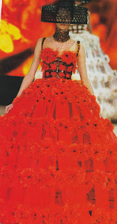
BRIGHT RED was popular in all sorts of different fabrics, as long as it came on strong and bright. 

Metallic red for
Jean Paul Gaultier
Alexander McQueen
Red chiffon for
Valentino
I found this red lycra and polyester lace at Rolls & Rems Lewisham

This design is by Barbara Bui. The GEOMETRIC PATTERN is more interesting/ elegant than many of the patterns used by other designers. I found this piece of jersey that reminded me of it. (Although the original looks more like printed linen).


This is a Celine ensemble showing the contrast of satin and matt.
I found some white 'embossed' fake leather, and polyester lining fabric that in life, if not in this scanned version, show a similar contrast.
 
This one shows a Lanvin combination of plain and
textured leather, which, among many other examples,
inspired me to collect these two black fabrics -
a polyester taffeta and a ridged stretch fabric, both in black. 

I also found some 'shimmer crinkle' in gold and black pinspot tulle, both 100% polyester, to represent the frequent use of similar fabrics by the designers.

The last page below shows some of the fabrics which I did not manage to 'match'.
These four come from Chanel.
There were some geometric fabrics in the shop in the same colours as the left hand picture, but by the time I found them I had exhausted my cheek and didn't want to ask for yet more free samples.
The black outfit is made of crochet. The ruff is fake pearls.
The white dress is decorated with covered buttons with a gold rim in classic Chanel style.


The dress on the right of the page is embroidered with flowers. I recognised the style and colours from an old kimono which I grew up with.

It was at this point that I recognised how much Japanese influence there is in next season's designer clothes. Shown in the choice of colours, the straight down silouette, and the many oriental models.

Other common themes I could not find were thick bright colour/ white or black/ white stripes. They seemed to be everywhere in the collections, and nowhere in the shops.